This week there were many user interface and performance improvements — some quite consequential. So let’s get right into it!
Notable New Features
Plasma 6.6.0
Windows can now be selectively excluded from screen recording! This can be invoked from the titlebar context menu, Task Manager context menu, and window rules. (Stanislav Aleksandrov, link)
Notable UI Improvements
Plasma 6.6.0
With a dark color scheme, the blur effect now produces a blur that’s darker (ideally back to the level seen in Plasma 6.4) and also more vibrant in cases where there are bright colors behind it. People seemed to like this! But for those who don’t, the saturation value of the blur effect is now user-configurable, so you can dial it in to your preferred level. (Vlad Zahorodnii, link 1, link 2, and link 3)
When clicking on grouped Task Manager icons to cycle through their windows, full-screen windows will no longer always be raised first. Now, windows will be raised in the order of their last use. (Grégori Mignerot, link)
Did a round of UI polishing on the portal remote control dialog to make it look better and read more naturally. (Nate Graham and Joshua Goins, link 1link 2, link 3 and link 4)
When you open the Kickoff Application Launcher and your pointer happens to end up right on top of one of the items in the Favorites view, it won’t be selected automatically. (Christoph Wolk, link)
The Kickoff Application Launcher widget now tries very hard to keep the first item of the search results view selected — at least until the point where you focus the list and start navigating to another item. (Christoph Wolk, link)
Discover now uses more user-friendly language when it’s being used to find apps that can open a certain file type. (Taras Oleksy, link)
You’re now far less likely to accidentally raise an unintended app when a notification happens to appear right underneath something you’re dragging-and-dropping. (Kai Uwe Broulik, link)
KMenuEdit now lets you select multiple items at a time for faster deletion. (Alexander Wilms, link)
The QR code dialog invokable from the clipboard has been removed, and instead the QR code is shown inline in the widget. This makes it large enough to actually use and also reduces unnecessary code. (Fushan Wen, link)
Notable Bug Fixes
Plasma 6.5.3
Fixed a rare case where KWin could crash when the system wakes from sleep. (Xaver Hugl, link)
Worked around a QML compiler bug in Qt that made the power and session buttons in the Application Launcher widget overlap with the tab bar if you resized its popup. (Christoph Wolk, link)
Plasma 6.5.4
Fixed a regression in menu sizing that got accidentally backported to Plasma 6.5.3. All should be well in 6.5.4, and some distros have backported the fix already. (Akseli Lahtinen and Nate Graham, link)
Fixed a Plasma 6 regression that broke the ability to activate the System Tray’s expanded items popup with a keyboard shortcut. (Cursor AI, operated by Mikhail Sidorenko, link)
Fixed a regression caused by a Qt change that broke the clipboard’s Actions menu from being able to appear when the configuration dialog wasn’t open. (Fushan Wen, link)
Fixed a bug that could make the Plasma panel’s custom size chooser appear on the wrong screen. (Vlad Zahorodnii, link)
Fixed a bug that could make the clipboard contents get sent many times when it’s being set programmatically in a portal-using app. (David Redondo, link)
Fixed a memory leak in Plasma’s desktop. (Vlad Zahorodnii, link)
Fixed a memory leak in the clipboard Actions menu. (Fushan Wen, link)
KWin’s zoom effect now saves its current zoom level a little bit after you change it, rather than at logout. This prevents a situation where the system is inappropriately zoomed in (or not zoomed in) after a KWin crash or power loss. (Ritchie Frodomar, link)
Fixed a bug that made the optional Textual List representation of multiple windows in the Task Manager widget fail to get focus when using medium focus stealing prevention. (David Redondo, link)
Plasma 6.6.0
Worked around a bug in some XWayland-using games that made it impossible type text into certain popups. (Xaver Hugl, link)
Clearing KRunner’s search history now takes effect immediately, rather than only after KRunner was restarted. (Nate Graham, link)
With a very narrow display and a high scale factor, the buttons on the login, lock, and logout screens can no longer get cut off; now they wrap onto the next line. (Nate Graham, link)
Frameworks 6.21
Fixed a bug that could confuse KWallet — when being used as a Secret Service proxy for KeePassXC — into becoming convinced that it needed to create a new wallet. (Marco Martin, link)
Fixed two memory leaks affecting QML-based System Settings pages. (Vlad Zahorodnii, link 1 and link 2)
Apps that use the Keyboard Shortcuts Portal to set shortcuts can now remove them in the same way. (David Redondo, link)
You can now use Spectacle’s Active Window mode to take a screenshot of WINE windows. (Xaver Hugl, link)
Plasma 6.6.0
Made a major improvement to the smoothness of animations throughout Plasma and KWin for people using screens with a refresh rate higher than 60 Hz! (David Edmundson, link)
Reduced the amount of unnecessary work KWin does during its compositing pipeline. (Xaver Hugl, link)
When you delete a whole category’s worth of shortcuts on System Settings’ Shortcuts page, all the shortcuts get grayed out and cease to be interactive, and a warning message tells you they’ll seen be deleted and gives you a chance to undo that before it happens. (Nate Graham, link)
Frameworks 6.21
KConfig now parses config files in a stream rather than opening them all at once, which allows it to notice early when a file is corrupted or improperly formatted. This prevents freezes in several places. (Méven Car, link 1, link 2, and link 3)
When using the Systemd integration functionality (which is on by default if Systemd is present), programs will no longer fail to launch while there are any environment variables beginning with a digit, as this is something Systemd doesn’t support. (Christoph Cullmann, link)
How You Can Help
Donate to KDE’s 2025 fundraiser! It really makes a big difference. Believe it or not, we’ve already hit out our €75k stretch goal and are €5k towards the final one. I’m just in awe of the generosity of the KDE community and userbase. Thank you all for helping KDE to grow and prosper!
If money is tight, you can help KDE by directly getting involved. Donating time is actually more impactful than donating money. Each contributor makes a huge difference in KDE — you are not a number or a cog in a machine! You don’t have to be a programmer, either; many other opportunities exist.
If there’s one area where people should stay clear from LLMs, it’s definitely when they want to learn a topic. That’s one more study showing the knowledge you retain from LLMs briefs is shallower. The friction and the struggle to get to the information is a feature, our brain needs it to remember properly.
Wondering what happened at Cloudflare? Here is their postmortem, this is an interesting read.
Now for Rust developers… this is a good illustration of why you should stay clear from unwrap() in production code.
Kind of ignore the security impact of the needed upgrades, but apart from this I largely agree. Most applications try to push more features in your face nowadays, unneeded notifications and all… this is frankly exhausting the users.
No, don’t go assuming you can use disks instead of ram. This is not what it is about. It shows ways to get more out of your disks though. It’s not something you always need, but sometimes it can be a worth endeavor.
I don’t get why object oriented programming gets so much flack these days… It brings interesting tools and less interesting ones. Just pick and choose wisely like for any other paradigm.
Interesting point of view. Indeed, you probably want things to not be available 100% of the time. This forces you to see how resilient things really are.
Interesting move on the Scrum definitions to move from roles to accountabilities. The article does a good job explaining it but then falls back into talking about roles somehow. Regarding the tech leads indeed they can work in Scrum teams. Scrum don’t talk about them simply because Scrum don’t talk about technical skills.
How to Avoid Solo Product Leadership Failure with a Product Value Team
Tags: tech, agile, product-management
I wonder what the whole series will give. Anyway I very much agree with this first post. Too often projects have a single product manager and that’s a problem.
When I started work on the text tool, I had planned it in three phases.
The first phase was going to be the on canvas editor. And I handled inserting and removing text, moving the cursor around, and creating simple wrapping areas. IME support and simple copy-paste was also handled during this phase.
The second phase was about rich text editing. I created a text properties docker, implemented a font database, style presets, a glyph palette and went over each property individually to make 100% sure it worked. I wrote a bunch of blogposts about this in the past (text layout, fonts, OpenType, metrics, and more).
Which brings us to phase three…
Removing the old Rich Text editor and shortcuts.
Previously, Krita used a dialog to allow rich text editing. The dialog happened because after several years of working on Calligra (which Krita was part of for a good while), none of the core devs were confident in their ability to conjure a full-featured on canvas rich text editor in a short amount of time. Then, the plan became to have a SVG source editor as the main way to interact with text… But then we realized that SVG text is very verbose, even compared to the pretty verbose HTML. Furthermore, we only had a few weeks left, so we had to quickly put something together that could produce SVG output without being too alienating.
The old rich text editor window, next to the preview on-canvas. In a dark mode, the theming issues become especially prevalent, here the text is black both in the editor as in the preview, but the background is dark grey. This was one of the core headaches with this editor.
It’s interesting to reflect back on this, we had assumed at the time that the artists using our program would be quite technically competent. Over the past few years however Krita has picked up so much steam that it frequently ends up being the program to teach people that there’s such a thing as “working memory” and that one can run out of said memory when they, for example, try to make a 60 fps animation at 4K resolution.
The rich text editor also didn’t help matters here because the conversion to and from SVG text wasn’t optimal: SVG 1.1 doesn’t have a concept of lines or line wrapping, being more a graphical description format like PDF than say, a rich text document. Furthermore, there were endless issues with theming, font size handling, differences between Qt’s rich text implementation and HTML overall, fonts, you name it.
So, given that the first two phases left us with a functional on-canvas text editor that can style text, it felt good to remove the rich text editor. The source editor remains, because it can still do some advanced tricks if you know SVG very well, but for the vast majority of text tasks it is unnecessary.
That left the shortcuts. Because the rich text editor was implemented with KXmlGui, each of the entries in the toolbars was a QAction that could be configured. I went and implemented the majority of those as shortcuts in the text tool. Because the majority of these shortcuts just changed a single property value, I took inspiration here from how the old artistic text tool was implemented, which is to say, using the setData() function on QAction. The setData takes a struct that contains simple instructions on which property to edit, and how to edit it (increase it, or set a specific value, for example), and this is then used to test the toggledness on the action or generate the appropriate property setting command.
The shortcuts are a little interesting in that the text tool needs to do its own shortcut matching, instead of using the global system. This is because the text tool needs to be able to discern text input from shortcuts, as well, all QKeySequence::StandardShortcuts for text navigation and selection have been implemented directly into the text tool. The latter needed to be handled directly because if you are working with vertical text you will want to have the up/down keys be for navigating forward/backwards in the text. In practice, this means that the tool first tests non-modifier arrow keys and basic input. Then it checks the direction and writing mode of the text, and ensures that any directional keys get replaced by their expected variants for said direction and writing mode. It then checks the shortcuts and finally the standard sequences. This latter order is because some standard sequences use the same shortcuts that are typically reserved for property changes (for example, deleting a line and setting underline can both have the Ctrl + U shortcut).
Only a few pre-existing shortcuts are supported right now, because I was feeling the end of the project looming. It is also a very good starting point for people who are interested in hacking on the text tool, as it makes you think about how the text properties function, so I have left it alone for now.
Replacing the tool options.
Next up was replacing the tool options. Tool options within Krita are specifically for changing the behaviour of the current tool, as well as accessing extra functionality, and Krita’s text tool had one that allowed you to set some properties for new text creation, as well as accessing the separate editing dialog.
The old tool options with a “create new text with” group of widgets and an “Edit Text” button.
This was a QWidgets based UI element, and one of the things I’ve been doing with the text tool is that every UI element would be written in primarily QML, using QWidgets only as a fallback. Beyond that, we’ve been trying to use Lager to keep track of data-editing, and tool configuration is a good candidate for a lager model.
The new options are both longer, because there’s more toggles, but at the same time also simpler to use…
As for the options themselves. Like the old options, they allow selecting the default text that new texts are being created with. However, instead of replicating the text properties docker in its entirety, it now provides a drop down to select a style preset. Beyond that, there’s a toggle to use the current presets in the text properties docker.
The text properties docker itself also has a button to open it inside the tool options. This is because I observed multiple people trying to use the “new texts are created with” options (that were labelled as such) in the old widget to manipulate the selected text. Hopefully this’ll guide people to the text properties docker.
Then, there’s the two options for the text tool itself: “Paste Rich Text By Default” and “Use Visual Cursor”. The former is about whether Ctrl + V should paste the rich text or the plain text, while there’s separate actions for pasting plain or rich text explicitly. For some reason the majority of word processors always paste rich text by default and never allow you to configure this, even though this is not how anyone wants to use a word processor. It therefore made sense to make this a toggle.
The other is for bidirectional text. The default is the “logical” order of the bidirectional text, that is, the order in which you read it. This has always been a little bit of a headache to programmers, because you end up with a cursor that skips positions and will in some cases go into the opposite direction of the key you’re pressing. This is why a lot of programs offer a “visual” cursor, which will try to follow the direction the keys are pressed in. This too is configurable, as it depends per person which of the two is more intuitive.
Finally, there’s several buttons, some for opening the dialogs like the Glyph Palette or the Source Editor, others for toggling Type Setting Mode and finally a set of buttons for the converter actions. More on these latter two in a bit.
Annoyingly, QML cannot handle popups properly while used together with a QQuickWidget: the popup is clipped by the QQuickWidget bounds (specifically, it’s internal QML scene). In Qt6 there’s a toggle to not have Pop ups clipped to the scene, but that crashes in QApplication when used inside a QQuickWidget. This is a problem because it makes it hard to provide the style preset dropdown (or the font dropdown for that matter). I am trying to find a solution, but in the meantime I’ve made the delegates much smaller.
The CSS style presets now have much more compact delegates to handle being inside a dropdown. I hope I’ll be able to fix the pop-up problem in the coming weeks though, as this is kinda annoying.
PSD text and vector support.
This was a somewhat tangential project, and I had written most of it even before I had written the on canvas text editor.
PSD vectors are stored as a vector mask on a fill. Because I had previously already written support for the fills, supporting vector masks meant supporting vector shapes. Then, figuring out which layer data describes the stroke, and which describes ‘meta shapes’ like rectangles, ellipses and stars was the rest. The vector masks, in particular PSD’s path format, are interesting in that they have a particular floating point format. Luckily, Scribus already supported loading those paths, so I was able to reference their parsing code and concoct writing code based on it. Most of the work by far was making sure the transforms were 100% correct. I was helped here by Deif Lou, who provided me with a ton of test files to check against.
Text was not as simple. Text in PSD is stored as a PDF structure, which, if you are unfamiliar with PDF, is format not dissimilar to JSON. You can see the way text is stored by opening up a PSD with text as a text file in a given simple text editor. Unlike most PSD data, which is stored in binary (and is best inspected with a hex-editor), the text data is largely stored as ascii text (with actual strings being stored in 16bit BE). Some inspection reveals that the text itself is stored in a range based manner. The whole plain text is written at the start, and then a list of character “sheets” is presented. After all those, a list of numbers of equal size, each presenting what range is occupied by the sheet with the same index. Idem for paragraph properties (PS, unlike SVG 2, can have multiple paragraphs. SVG 1.2 did have multiple paragraphs, but there’s only one real implementation of SVG 1.2 (Inkscape) due its complexity). PSD text is also, notably, stored and sized in pixels, regardless whether the format is saying points (this is because within the Apple ecosystem the two units are the same, while outside it, a digital point is always 1/72th of an inch).
But there were still a number of mysteries. Like, where were the text paths stored? And how about the advanced OpenType features? After I asked on Krita-Artists for sample files, I found the answer: There’s another chunk of advanced text data at the end of the document. This second chunk is far more complex, and, worryingly, it uses numbers for the keys for more recent versions of the Adobe products.
Thankfully, it turns out that this second chunk is in fact shared between the Adobe suite, and the Inkscape project had already done a lot of reverse engineering. While I am now able to read this data and load text from it, there’s still some missing information. It seems there’s like, Line and Cluster-specific positioning and glyph info present in this extra data, and if you write it without said data, Photoshop will complain it is missing. I haven’t had the time to look into this properly, so we can’t write advanced text objects as of now.
Another wrinkle is that text and vectors are per-layer in PSD, while in Krita each vector layer is its own SVG document. So I also had to write some code to explode the Krita vector layers so each shape is written as a separate PSD layer. Similarly, despite being able to load a lot, Krita’s SVG+CSS based text layout is fundamentally different from Adobe’s, so text loading isn’t perfect. None the less, it should provide valuable for people’s archive. Because of these differences, Krita will ask whether you want to load the text layers as text shapes or whether you want to load them as raster data.
I do want to eventually return as figure out that final missing data. As well, because PSD doesn’t do inheritance, I need to fiddle a bit with selecting which properties to set on the paragraph, as the paragraph metrics are important for Krita’s baseline aligment.
Text on Path/Text in Shape.
Text on path and text in shape were actually going to be tackled in the first phase. But then when Alvin, who was helping me, tried to take a stab at it, he was blocked because Dmitry was extremely unsure about the design. This was a bit frustrating, because I had already made sure that the layout algorithms for both worked fine. I myself decided to focus on getting rich text editing to work, and it wasn’t until I was nearly done with rich text editing that we returned to the discussion about text on path and text in shape.
I never talked about text in shape previously, as it was implemented after I wrote the big text-layout blog post back in 2022. So lets do that now:
The current look and feel for a complex text-in-shape while editing the text. Yellow ellipse, pink triangle and blue polygon are “Inside” shapes. The green rotated rectangle is a “subtract” shape. Both shape padding and margin are applied. The arrows indicate the order of the flow shapes. Icon on the top right is a button for contour mode.
SVG 2 allows wrapping text in shapes, and has some sophisticated toggles to configure how the text is flown into shapes. The simplest is a single text in a single shape with a single subpath.
However, those single shapes can handle multiple subpaths (in which case the line is broken up), and there can be multiple shapes that text can flow into, one-by-one (much like CSS columns).
These flow areas can in turn have other shapes subtracted from them. Finally, shape padding and margin can be used to modify the distance of the text to the related shapes.
Most text-in-shape layout algorithms will do so by taking the shape, drawing line boxes from top to bottom, and fitting the text in the first reasonable line box. This is what SVG 1.2 specified for it’s text in shape. For SVG 2 however, the first line needs to sit snugly against the border of the text wrapping area. For this I implemented an algorithm described by Hans Muller, originally devised for CSS shapes.
Once we have the first position, we want to create a line box. One problem here is the question “how tall is the line box?”, especially in rich text: Text can have different font sizes, and different font sizes can lead to different line widths, depending on whether those differently sized sections get onto the line or are wrapped to the next.
The solution here is to estimate the line height: We check all glyphs that might fit in the next shape-bounding-box width (or height for vertical), and get the max line height from this. Then, the line box is determined, with a single line being able to hold multiple line fragments if the shape boundaries cut through the line. Text is then laid out onto these lines (logically if we take bidirectional algorithm into account), breaking where it is allowed. Finally, text is reordered so it lays out visually, text alignment and justification takes place, and the final line height is calculated. The whole text is then shifted (block wise) upwards by the difference between the estimated line height and the actual line height. I was able to figure out this solution because I kept trying to figure out what Inkscape was doing here, and was able to induce a bug that suggested it does something similar. Said bug got reported.
Some oddities are present in the SVG 2 spec here. For one, it doesn’t ever say whether to include the local transform of the shapes that is being flowed into. Text on path does require this, and usage would become incredibly annoying without it (if you want to flow text into two rectangles, you will need to apply a transform to one of them), which means it is expected, but its absence is very odd. Inkscape does do this, so I implemented this as well. Another thing that can be odd is that because the shapes get linked to the text shape, it is possible for the text to be rotated and be out-of-sync with the linked shape. The only way to have both rotate together is when they are in the same group.
In the context of SVG this linking behaviour makes sense. You can easily imagine a magazine layout where a few rectangles provide columns, and a pull-out quote is laid out into a circle. Said circle then overlaps these rectangles, without overlapping the text.
However, while that makes sense in a magazine context, there was a worry that it might be too complex to interact with. Especially because Krita doesn’t have an object outliner like Inkscape or other specialized vector applications have, so going in and out of groups can be frustrating. Eventually we decided to make it so that Shapes that text flows into is always a child of said text. The text is then stored as a group with shapes and text inside SVG, making it 100% compatible with Inkscape, while within Krita we could simplify the interaction, while keeping all the powerful transformation features.
There’s a downside to this method though: When we resize text in shape, we resize the child shapes. However, the child shapes affect the slow text layout (in particular, the shape-offset operations, which are quite slow), but because the child shapes are children of the text, it becomes next to impossible to update this text independently from the resized shapes. Very frustrating because I did pay a lot of mind to keeping the text layout thread-safe, so had we stayed with a linking model, the text shapes could’ve just been sent to another thread to sort themselves. Thankfully Dmitry decided to take responsibility for taking care of this slowdown. We now block text layout during resizing and update it after the fact. Because of the way bounding rects are calculated however, this does mean we cannot afford to have any text drawn outside the text shapes, which means we’re forced to have our overflow to be always clipped (and truthfully, there’s no clear answer to what overflowed text should look like with SVG 2 anyway, so maybe it’s for the best…).
UI wise, the simplest way to set text in shape is by clicking a shape. Clicking on a border will instead set the text on path, and set the click location as the starting point. This is necessary because right-to-left text needs to be aligned with the end of the path due the way text on path interacts with text anchor in SVG.
The less simple but advanced manner is to use the context menu in the Shape Selection tool to flow texts in Shape. This method allows for setting up a complex flow structure. Similarly, the default tool allows changing the flow shape order, and setting subtract shapes. Both this and the previous method are ways in which such shapes are set up in other programs, so people should be able to find either without consulting the manual.
When a text-in-shape or text-on-path is created, a new button appears that can be clicked to go into contour mode. There, each contour shape can be manipulated as needed. Within the text tool, text on path gains a handle to move the start offset, while text in shape allows dragging the text area to set the shape padding and margin.
Text-on-path doesn’t have an advanced mode like text-in-shape, right now artists will only be able to create texts with a single text path. However, Krita’s text layout can handle multiple text paths in a single text, and even a mix of text and positioned paths. That kind of thing is currently limited to the SVG source editor, as I ran out of time to ensure that the interaction would be nice. Something for the future.
Type Setting Mode
Type setting mode is a separate mode in the text tool that allows for on-canvas fine tuning and interaction with font metrics. It differs from regular editing mode in that it will show editable font metrics when activated. When the text doesn’t auto wrap, it even shows handles so that the SVG character transforms can be modified over the selection.
Type Setting Mode is kinda interesting in that at first glance it seems like an unnecessary toy mode. After all, if you want to edit the font size, the text properties docker is much more suited, right?
Yet, when gathering input about what artists needed from the text tool, some expressed that they wanted to be able to edit things like font size and line height by on canvas widgets. Others protested: it would interfere with text editing, which seemed a reasonable concern. So it was clear that if such a thing would be introduced, it needed to be optional.
Then there was the issue of the Baseline features. Krita is currently one of the rare text layout implementations that implements alternate baseline alignment. But the baselines are kind of abstract, especially as font makers rarely fill out the OpenType BASE table from which these baselines are derived, meaning they frequently have to be synthesized. So there was also a need to allow people to see the available baselines on canvas.
But there was one final issue. Let’s talk about kerning.
If we conceive of text as being comprised of glyphs, and each glyph can fit onto a little rectangle, like in (movable type) print, and we imagine printing with this.
Then it’s very likely that there will be huge gaps between the glyphs while printed. Therefore, font makers would make the base rectangle smaller and let parts of the letter overhang, a so-called “kern”, so the glyphs would interlock a bit more elegantly.
Movable type was never the only text printing technology. For posters for example, lithography was widely used, and the text printed with lithography was typically hand drawn by the artists. This meant that artists would be able to manually decide the best spacing for a given piece of text. Then, there’s a number of in-between technologies. There was a particular one where designers would work with letter sheets than could be transferred onto a given piece of paper, and I seem to recall there’s a similar technique that relied on clever use of photocopiers.
The precise technologies aren’t very important here, but rather I want to impress that there’s a western practice of spacing glyphs in a text just right, and that the underlying technology greatly affects what is possible. As such, this practice is taught to students of design, and seen as one of the important details that distinguishes a well done piece of typography from a rush job. For the western typographer, to get the kerning just right is to say you care.
Now, in the digital era, font makers are able to very quickly define kerns for any pair of glyphs, and while doing text layout the shaper will apply these kerns. This is generally good enough for the majority of use cases… However there’s a technological limitation.
See, if you do rich text layout, you first need to itemize the text into ranges where the font, direction, and script is the same before you hand it over to the shaper to shape. In the above example, you can see that the first letter is much larger than the rest, and there’s no kerning. This is because the font size is different, and thus, during itemization, it’s a different font, and a different glyph run. The shaper cannot apply kerning between these two different runs.
Typically, this is worked around by adjusting the tracking or kerning. CSS however, only has letter-spacing, which is meant to be applied to ranges of text. Meant. In practice, the majority of implementations make it so that letter-spacing modifies the spacing to the right of clusters of glyphs. But not all: some implementations do it to the left when text is right-to-left! If that weren’t enough of a headache, right now, the CSS working group is changing the way letter-spacing works all together.
Using letter-spacing for this is not much of an option then. The CSS-WG suggests that if you really want to do manual kerning, you need to create a special span with reduced margins, as this will give the most control. SVG doesn’t have margins though, as SVG doesn’t have the CSS box-model. But we do have character transforms in SVG.
Character transforms in SVG have been there since the beginning. There’s 5 parts to character transforms: absolute x and y, relative dx and dy, and rotate. Absolute X and Y set the current text position in absolute coordinates to the text origin, and, these break shaping, much in the way line fragments do with auto wrapped text. When the SVG text specifications talk about text chunks, it means ranges of text that have been positioned this way (and since SVG 2.0, also other forms of line fragments). Dx and dy conversely, accumulate, starting from each text chunk start. They don’t break shaping, nor does rotate, which means these three are very suited for this need for manual adjustment. They just needed to be editable.
So when I was looking at these three issues (on canvas adjustments, baseline selection and character transforms) and was deciding on my design, it became clear we needed this separate mode to handle these three things, and also that it wasn’t all that optional: spacing and kerning are a pretty important practice after all.
I then spend 10~ days to get the character transforms right. This was because I decide it would be more useful to calculate the relative positioning from absolute positions rather than to set the relative positions directly. This way, I would only need to calculate where I want the glyph to be, and let the function itself sort what kind of delta positioning that requires. This required me to kind of backtrack from the final position to calculate the point at which the delta x and y are added. This was quite tricky as there’s a lot of modifiers on where a particular transform ends (ligatures, utf32 vs utf16 codepoints, and of course, white space collapse), as well as going backwards, as that involves removing the text-path adjustment, text anchor calculation, absolute offset and finally the textLength offset.
The actual editing of this is provided by two handles at either side of the active selection. Dragging the square handle offsets the whole selection, while dragging the round handle scales and rotates the selection, using the square one as the hinge/origin. I am not fully sold on how this is handled, especially in RTL, and I want to see if I can handle the offsetting better.
With type setting mode, you can transform each glyph individually, allowing for some pretty advanced looking typography. The lines are the metric lines. Hovered line is the Descender, hence it saying “Font Size”.
Next up was changing on canvas properties. This is right now, limited to Font Size, Baseline Shift and Line Height. The baseline shift is modified by dragging the baseline, the font size is modified by dragging either the ascender or descender, and the line height by moving the line height markers, which are ascender and descender + the line-height on either side. Artists will be able to tell which they’re modifying by the hovering name.
Krita slogan in Hindi. Here, we use type setting mode to adjust the size of the second word, and then select the “hanging” baseline to align the text to the head stroke.
Setting the dominant/adjustment baseline can be done by pressing Shift, which switches the visible lines to the baselines. Clicking them will set that as the dominant baseline. There’s still an issue here with overlapping lines, and I need to sit down and think about which lines should have priority.
This is pretty useful already, but there’s still a number of unanswered questions:
Right now, I add a counter transform at the end, this is because when using it, the counter transform felt more intuitive. However, it can also make sense to not have that. Maybe it needs a toggle?
Similarly, the scaling/rotating code can easily only do scaling OR rotating, and it makes sense to use either. But I am unsure how to provide that in the UI.
Thirdly, there’s right now no way to set the Absolute transform. I got some functioning unittests for it, but some edge cases look weird and it needs more work before I can expose it to the UI.
Right now, the Font Size, Baseline Shift and Line Height are all adjusted in Points. I was unsure whether to have them in relative font size, and we’ll need to see if that’s something people prefer.
I can imagine that some people would like to see a line over the x-height, but the thing is that there’s no real related metric for that. There’s font-size adjust, of course, but newer versions of font-size-adjust are also possible against the capital height, or even the ideographic height. So I just left it out for now.
The metrics that can be adjusted are all of a certain type, what western Typographers call “vertical metrics”. There’s no controls yet for Tab size, text indent, word spacing and letter spacing, though they could be easily imagined.
In a similar vein, one could imagine handles for italic/slant, weight or width. These I have been avoiding because of these, only slant can be predicted, the other two are unique to the type face.
Finally, there’s of course associated shortcuts. I’ve implemented four for moving the offset in any of the four directions, but none for scaling/rotating. This is because I assumed people would definitely want to offset with the keyboard, but was unsure about the others.
Part of these are because Type Setting Mode came in very late. It was always going to be added as last, because, from a surface level it sounds like a frivolous toy mode. When I expressed my intent to create it, some artists even told me they were never going to use it. Not strange: There has been over 30~ years of digital type setting that didn’t need a separate type setting mode. But once you see the whole picture, and more specifically, realize that not all text layout systems are the same, the purpose starts to make a little bit more sense. Whats more, because SVG character transforms have been there since the beginning of the SVG spec, they’re pretty widely supported, so it’ll be very interesting to see what people will come up with.
There’s still a snag though: SVG relative character transforms don’t apply on auto-wrapped text. There’s a little note in the SVG 2.0 spec that these were considered, but ultimately seen as unnecessary. Little bit annoying, but not the end of the world, as someone who aims to wrap in shape, but then fine tune, can do just that. Wrap in shape, convert to pre-positioned text, and fine tune the spacing…
Let’s now finally talk about the converters.
Conversion actions for text types.
Because previous versions of Krita only supported SVG 1.1 text, it was important that there would be a way for people to convert away from that format. Similarly, if someone had put text-in-shape, or created an Inline wrapping area without intending to, there needed to be a quick way to convert.
Converting away from “Pre-Positioned Text” (SVG 1.1 text with white space collapse), required first removing all collapsed white spaces. Then, inserting new lines for each SVG text chunk with absolute positioning. All of this needed to be done in reverse because insertion and deletion changes the indices. By going in reverse the indices that still needed to be modified were kept the same until modification. For inline size, the inline-width of the text is tested before conversion, and set after conversion.
Converting towards Pre-Positioned text on the other hand was much easier, as it was a case of figuring out the current position and making sure it was being set as an absolute transform. Because we are just working with the layout results, we can convert from text-in-shape to pre-positioned and keep the lines positioned the same.
The leftmost polygon here is a text in shape, while at the right, the text has been converted to pre positioned SVG 1.1 text. The difference is only visible because of the different selection rectangles.
These actions were implemented in the text tool for single shapes and in the shape select tool for multiple ones.
Wrap up
And that was all of Phase 3, which means I am done for Krita 5.3. As of writing, we’re in feature freeze. This means I will be focusing on fixing bugs in the coming few months. But also writing documentation, and release notes. I am slightly worried, as I didn’t get a lot of feedback near the end, and am left wondering what kind of bugs I will see in the coming months.
Some things didn’t get in from the original plan. Most notably: color and stroke setting. Krita can set these things, the controls for it need to be ported to QML, and I was told to avoid it, as it would be too big. Due these missing controls, stroke can only be set for the whole text, while the fill can only be a color for a selection, or gradient set on the full text. Beyond that, a visibility mode for formatting marks (that show where the spaces are and what type of spaces they are) didn’t get in either. It’s by itself not complex to implement, but it needs good design of the marks, and I just didn’t feel like I could give it the attention it deserves because of the amount of work that went into text in shape. It is also not yet a full implementation of SVG 2. Text-orientation is the biggest missing element here, but I told myself I wasn’t going to work on that until there was a decent enough text editor. There’s also things like better justification, hyphenation and color font support, but those were never going to be in 5.3.
It’s going to be interesting to see how the usability is going to be tweaked over the coming years. A good number of properties can be found directly on the canvas and the main dockers, so I do feel everything is pretty discoverable. However, I did have to put the advanced text-in-shape actions into a right click menu, and generally people don’t find those. It will also be interesting to see what people will do with the type setting mode and how that’ll evolve. I know people want an on canvas property editor, but I had been holding off on that because the design would be tricky to get right, as well, in Qt5 Android platform integration doesn’t yet obey the enum value that asks for the copy-paste menu to be hidden. So that menu would probably float over any on-canvas property menu. Qt6 fixes this, but I don’t know if it does for Apple products as well.
Overall, this was a pretty ambitious project. One thing that probably didn’t bleed through in all these blog posts is that probably at a least a third of the work was communication. I myself understood that when I started it, but I think it has a tendency to get lost when you read tech blogs, so I’ll expand a little about it. Basically, every step I took, I spend some time talking with the other Krita developers (primarily Dmitry, who reviewed all my work) what I wanted to do, and how I was going to approach it. This isn’t just to get the design sorted, but also to avoid blind-siding people.
I also wrote these blog posts, and wrote little feature introductions for the people on Krita artists. The purpose of the latter was to get people to understand with what I am trying to do, I am unsure how successful I was there. The technical blogposts did appear to be pretty helpful, and I got a lot of feedback from other FOSS people that these blog posts were useful. While text layout is not a rare programming topic, advanced text layout is only really done by a handful of people, and I imagine a lot of them are too exhausted after they got the thing to work to write a blog post about it.
Anyway, when I first started, my colleague Agatha had described text layout like a “Hydra” and that every update I made felt like I was chopping those heads off one-by-one.
I declare the Hydra dead: Krita has a decent text tool now.
Appendix
SVG Character Transforms.
Just checking how widely supported the SVG character transforms are… Inkscape and Chromium do pretty well. Firefox does a little bit odd. SVG Tiny 1.2 does include the character transforms, but QtSvg doesn’t support them (or Gwenview isn’t using QtSVG). Then there’s a lot of epub readers that have varying degrees of support. The sample SVG-based epub3 files do use multiple character transforms, but that by itself doesn’t mean much. KoReader for example only supports the first transform, even with text-on-path, which is interesting given that LunaSVG, which it uses, does seem to have support for it if you look at the code. KoReader does apply textLength, which is useful, but then other epub readers I’ve tried don’t apply textLength, but only transforms. It’s a bit of a mixed bag, but the wide browser support is heartening (good enough if you just want to tweak spacing while maintaining an accessible SVG text element).
Our “The Two Towers” sample in Firefox 145. Firefox doesn’t support baseline shift (but does support white-space, so we can preserve the line break… but then doesn’t support SVG units, so all units need to be suffixed with px)
Chromium 142, it supports SVG 1.1 fully, but no white space, so I had to convert to pre-positioned text for this to work. Neither browser supports optical size in SVG, so the large capitals are less delicate than in Krita.
The sample in Inkscape 1.2, I had to convert the font from Amstelvar to DejaVu Serif, as it didn’t seem to like Amstelvar (probably because it is a variable font).
It’s by far more widely supported than SVG 2 text wrapping though, of which the only known (to me) implementations are Inkscape and Krita. Ideally, Krita, like Inkscape, would ensure there’s fallback positioning written. The absolute transforms are 100% intended to provide a fallback when the auto wrapping is not yet supported. The reason Krita isn’t doing this is because it needs a separate code path so it only saves this to exported SVG layers, and as well, I am not 100% confident in my conversion code. When that time comes it might also prove useful to save the textLength, but I’m still mulling over this.
A final note is that Krita, like Inkscape, has a “convert text to paths” function. When converted to paths, text can be modified as desired, but then it loses the accessibility of being text that can be selected, which you’d want to avoid in an interactive environment.
Automotive companies spend too much on commodity software. Co-creating multiplies their investment through community collaboration. This frees resources for true differentiation. Read about, the concepts and ideas to master, that support this strategic journey.
For the past few weeks, we have been working on a few areas around the design system for Plasma. Keep in mind that I am only speaking of the graphic side, not code. Work is ongoing with the Union engine and the team is focused on replicating our current Breeze style using Union.
There have been talks about creating the first components based on the design system, but that is more in the future.
Meeting with PenPot
We held a meeting with the PenPot team and Pablo Ruiz, their CEO, met with us to discuss new changes in the PenPot app. This was a follow up to their recent conference PenPot Fest.
Their team announced a few things that should make it much easier for the Plasma Design team to adopt PenPot. For example:
Make several queries optimization on comment threads Github #7506
With these additions, it was much easier to move assets into PenPot than before. There was less work we needed to do.
We begun a migration to PenPot for the second layer of basic components and also started building more complex components. Here are some screenshots:
Buttons
Button Groups
Badges
Inputs
Dropdowns
Toggles
Checkboxes
Checkbox Groups
Avatars
Tooltips
Progress Indicators
Sliders
These components are shared components. Then we moved into application components and this is what we have so far.
Application Components
Modals
Pagination
Tables
Video screen (Miscellaneous)
Breadcrumb
Tabs
Alerts and Notifications
Date Pickers
File Upload
Section Headers
Content Dividers
In this list, you see a lot of graphics. Each of these is supposed to represent a different state of the graphic. Users wouldn’t work with these variant sets very much, instead, they would simply search in the component catalog for what works in their design and only edit organization and labels. However, to get to that level, the designers need to create interpretations of each of these states graphically. This leads to a lot of work and a lot of graphic memory usage.
There are a few more components that can be created. However, given PenPot’s reliance on the browser DOM, the more complex the components, the more lag the application runs into. Because of this issue, we have contacted PenPot to become beta testers of their new rendering engine when it comes out.
They are almost at the point where they can put this out. We are eager to try and see how much faster we can go. The issue is not on PenPot but the engine that powers the editing screen. Still, we have to wait a little bit to continue.
In the mean time, we can dedicate ourselves to making more application icons and completing the work there.
FOSDEM
Additionally, we are setting up a workshop with the PenPot team during FOSDEM 2026. This workshop will focus on brainstorming ideas on how to more easily distribute and contribute to a design system using PenPot.
For example, there is a list of ideas we proposed:
Exclusions and inclusions into the design system library. This way, the original copy of the design system remains consistent with the base components unalterable. This should make it easier for casual designers looking to build a quick mockup without getting bogged down by sub components that don’t need edits. This can also ensure that the many users taking the components are using a consistent copy to the original.
Automatic sharing and updating to users not in the immediate instance team.
Generate a review system for components as external users to the main instance propose changes.
An easy way to re-publish the design system after applying suggested changes.
…and a few other ideas.
Hopefully, there are good ways to get this done. We are still waiting to move our icons into PenPot. Likely, this is more of a reality once the new rendering engine is in place. The team let us know that there are a number of shape manipulation improvements app
In addition to all of these changes, we keep submitting bug reports and feature requests to the PenPot team to make the app even stronger.
Crop tool in Photos, Sudoku in Kirigami and sprinting
Welcome to a new issue of "This Week in KDE Apps"! Every week (or so), we cover as much as possible of what's happening in the world of KDE apps.
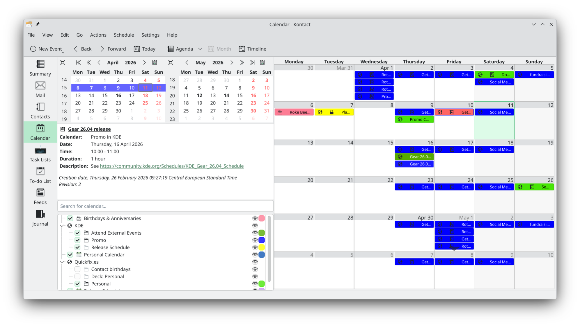
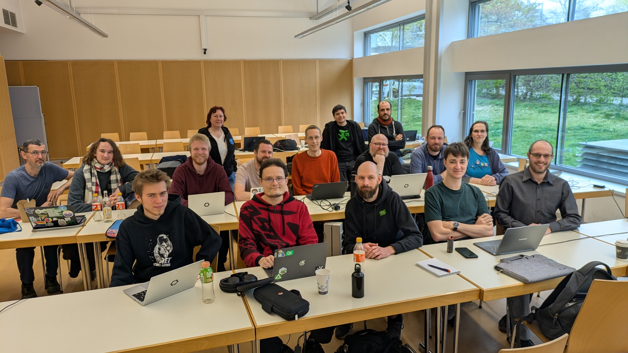
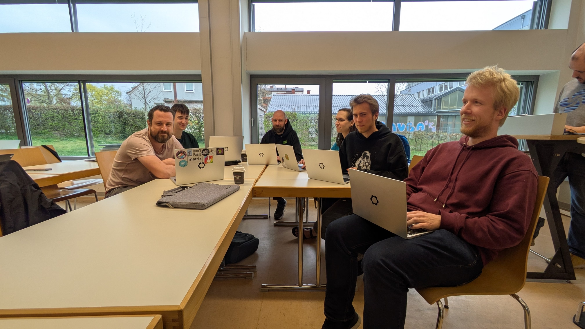
Last Saturday a bunch of KDE devs (and a guest) met in my kitchen for a "Kitchen sprint". As always, we discussed and worked on quite some exciting stuff, mostly around Itinerary and public transport infrastructure in KDE, but not only. Here is a short overview of what some of us worked on: Jonah experimented with integrating maplibre in our apps, Nico demoed his new online account integration for applications, and, outside of cooking some Käsespätzle for the whole group, I spent some time packaging Merkuro as a flatpak!
Outside of that, and as part of our end-of-the-year fundraiser, you can adopt one of KDE's apps and we can share with the whole world how awesome you are and how much you're doing to support us. Thanks to everyone who already donated, this is super helpful!
Getting back to all that's new in the KDE app scene, let's dig in!
Nate Graham reverted a change which impacted keyboard-driven folder manipulation (25.12.0 - link).
Oliver Schramm fixed trashing files from temporary folders. Now they no longer end up in your home trash bin. (KDE Frameworks 6.22 - link)
PIM Applications
Merkuro Calendar Manage your tasks and events with speed and ease
Tobias Fella fixed setting the calendar name (25.12.0 - link). He also disabled the calendar editor when we don't have permission for it (25.12.0 - link).
Tobias Fella simplified the process to unlock the key backup by providing only one text field (26.04.0 - link) and it is no longer behind a feature flag (link).
Loïs Rioul fixed login with GoToSocial (25.12.0 - link).
Games
Pumoku
Anders Lund pushed the first early alpha version of his Kirigami based sudoku application called Pumoku. It is still a bit basic but very promising.
Third-Party Applications
Easy Effects - Audio Effects for PipeWire Applications
Wellington Wallace released Easy Effects 8.0.3 containing a bunch of fixes for regression from the major 8.0.0 release.
Giusy Digital fixed some translations issues in the spinboxes (link) and the number validator (link)
Carl Schwan ported the settings to KirigamiAddons ConfigurationView (link)
Carl also fixed various spacing issues in the effect pages (link), ported the navigation menus to normal tool buttons (link), ported the application metadata to KAboutData and FormCard.AboutPage (link) and various other small graphical changes.
For a complete overview of what's going on, visit KDE's Planet, where you can find all KDE news unfiltered directly from our contributors.
Get Involved
The KDE organization has become important in the world, and your time and
contributions have helped us get there. As we grow, we're going to need
your support for KDE to become sustainable.
You can help KDE by becoming an active community member and getting involved.
Each contributor makes a huge difference in KDE — you are not a number or a cog
in a machine! You don’t have to be a programmer either. There are many things
you can do: you can help hunt and confirm bugs, even maybe solve them;
contribute designs for wallpapers, web pages, icons and app interfaces;
translate messages and menu items into your own language; promote KDE in your
local community; and a ton more things.
You can also help us by donating. Any monetary
contribution, however small, will help us cover operational costs, salaries,
travel expenses for contributors and in general just keep KDE bringing Free
Software to the world.
To get your application mentioned here, please ping us in invent or in Matrix.
For many years Plasma comes with its own system online accounts system, known as KAccounts. The idea is simple: In Systemsettings you log into a given online service once, and then several applications can use that login, instead of loggin in inside each application separately.
The number of services available and applications making use of them changed a bit over recent years. As of right now the following services are supported:
Nextcloud: This is used by Dolphin to add a shortcut for file access via webdav to the Network section, as well as the Purpose framework to allow uploading files to Nextcloud.
Owncloud: Used for the same things as Nextcloud.
Google: Used by Purpose for uploading to YouTube. In theory also used by kio-gdrive for browsing Google Drive, but access to this is currently blocked by Google.
OpenDesktop: Used for reviewing store.kde.org content in Discover
This isn’t all that much. Notably absent here is KDE PIM, which could greatly benefit from integrating with the Nextcloud and Google accounts. This is something many users have asked for over time. Plus, there’s more services that are used across applications and could benefit from a systemwide online accounts system, like Mastodon or Matrix.
Overall the situation with online accounts support in KDE is unsatisfactory, and it’s not for a lack of trying. Over the last few years there have been several smaller improvements to the system. However there have been no changes to the overall architecture. At this point I am convinced that the architecture is what’s holding us back, and we need to do something about that.
The current system is based on the Accounts SSO framework. It consists of several libraries and processes, split across about a dozen different repositories. This makes for a rather complex system for what is effectively reading and writing to a sqlite database and some OAuth handling. It also receives very little development activity, to the point where it was hard to get the required patches for Qt6 support in. Using an external accounts system as based for KAccounts only makes it harder to iterate on our system, while providing no meaningful interoperability with other parties.
The system also isn’t designed for a sandboxed world. Apps have direct access to the accounts database and keychain, so there is no ability to restrict which apps can use which accounts. While per-application access control wasn’t really feasible for traditional Linux packaging, with sandboxed formats like Flatpak we can and want to restrict apps to only be able to access select accounts.
Having pondered the problem for a while I came to the conclusion that we need a fresh start for our online accounts story, a new system that fullfils the following goals:
It’s actually used by relevant KDE and third-party software
Easy to hack on and extend
Easy to be integrated into consumer software, with minimal dependencies
Can be extended with third-party providers
Account data is stored reasonably securely, with per-application access control (for sandboxed applications at least)
Based on these goals I have developed a prototype for how such a system could look like.
At its core there is a daemon process that manages the accounts, and exposes them via a DBus interface. Applications uses this DBus interface to list availble accounts as well as their parameters and credentials. Only accounts the app has been granted access to are visible that way. Application authentication works in a way that’s inspired by how xdg-desktop-portal works.
An application can trigger a request for accessing a new account. The dameon will then handle the whole login flow and, if successful, will return a handle to the new account. Alternatively the user can log into a given service in the systemsettings module and give access to relevant apps though that.
Currently the following services/apps are supported:
It is still very much a prototype, which is by no means ready for production, but it shows the basic concept. If you have input on this please get in touch, for example by filing an issue.
Transitous, our community-run public transport routing service, has been the
topic of several discussions:
Ways to deal with GTFS static feed rotation happening out of sync with
corresponding realtime feeds. This results in time periods where available realtime information cannot
be matched to base schedule data and thus gets needlessly discarded.
How to best configure GBFS provider groups as supported by MOTIS v2.7.
Integrating GBFS data from Citybikes, which would substantially increase the amount of available rental vehicle data.
Assessing what it would take to add Transitous as an additional routing option to the OpenStreetMap website.
Investigating how far along the OSM Road Closures GSoC project is,
as that kind of data is obviously very interesting to integrate eventually.
Exploring whether FOSSGIS e.V. would be a suitable organisational home
for Transitous.
Available rental vehicles shown on Transitous' map view.
KPublicTransport
KPublicTransport, KDE’s client library for accessing different
journey planning services used by Itinerary and KTrip, got
a few improvements to catch up with Transitous and MOTIS v2.6 and v2.7 changes:
Access to agency/operator URLs.
Querying available station-bound and free-floating rental vehicles from MOTIS.
Support for direct booking URLs for station-based rental vehicles.
Station-bound rental vehicles other than bikes are now also displayed with the correct vehicle
icon on the map.
Itinerary's station map showing a car rental station and two free-floating rental bikes.
Indoor mapping
Indoor mapping was of course also on the agenda:
I got to try Tobias’s JOSM patches improving level filtering.
Especially the option to filter on elements without a level tag
is helpful for fixing level tagging in existing buildings for me.
We talked about ongoing tagging discussions from TU Munich’s BIM import, in preparation for the next
quarterly OSM Indoor Meetup.
We discussed whether we should have another in-person Indoor tagging workshop following
the one from 2022, in order to
have some time to work on finalizing tagging proposals and updating the current indoor tagging documentation.
Emergency and weather alerts
At the CAP Implementation Workshop
two weeks ago a WFS/OGC feature layer for CAP
alerts was mentioned, and presented as something so far only offered by a commercial entity.
With my almost non-existent GIS knowledge this looked like something that shouldn’t be too hard to provide by our
CAP alert aggregation service as well.
And thanks to the input from the right people I got a basic prototype set up
in less than an hour. All the magic is provided by pg_featureserv,
which can expose a PostGIS database (which we already have)
in a way it can be consumed by e.g. QGIS.
QGIS with a CAP alert message layer.
One important difference here is that unlike its proprietary counter-part this doesn’t expose many CAP fields yet, as we hold only the bare
minimum as dedicated database columns right now. However, should anyone actually need this, adding more columns isn’t a big deal.
Event planning
We also looked at upcoming events in 2026 and how we could have Transitous specifically and the Open Transport
community more generally represented there:
39C3, 27-30 Dec in Hamburg Germany.
We’ll try to have some kind of Transitous meetup there.
FOSDEM, 31 Jan-1 Feb in Brussels, Belgium.
The CfP
for the Railways & Open Transport track is still open and we have poked a few people to submit talks.
FOSSGIS-Konferenz, 25-28 Mar in Göttingen, Germany. The CfP is already closed, a few proposals
have been submitted.
Still further out is next year’s State of the Map
which will be end of August in Paris, France. That’s obviously something where Transitous should be present as well,
and where we might have the option of a travel-optimized adjacent Transitous sprint along the way.
Ideas for a 2026 edition of the
Open Transport Community Conference
are also floating around already, volunteers to drive this still very much needed though.
You can help!
Hack weekends how this is called in the OSM community or sprints as this is known in the KDE community
are immensely valuable and productive. There’s a great deal of knowledge transfer happening, and they are a big
motivational boost.
However, physical meetings incur costs, and that’s where your donations help! KDE e.V.
and local OSM chapters like the FOSSGIS e.V.
support these activities.