Segmented Buttons for Qt 6.6
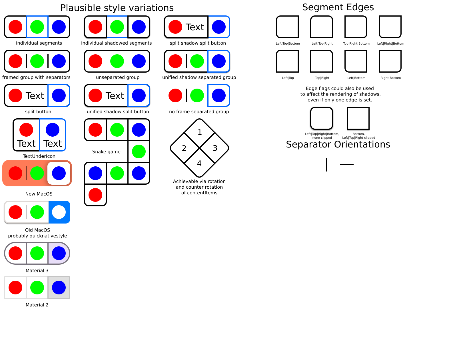
While at the 2023 Plasma Sprint at the Tuxedo Computers office in Augsburg, Germany, I created a patch to add ButtonSegment, SegmentedControl and SegmentSeparator to Qt Quick Controls 6.6: https://codereview.qt-project.org/c/qt/qtdeclarative/+/476564
The patch has not been merged yet and may change significantly.
ButtonSegment is a Button subclass with an edges property that can be used to specify which edges are exposed to the outside of the group. The base flags available are NoEdges (0), TopEdge (Qt::TopEdge), LeftEdge (Qt::LeftEdge), RightEdge (Qt::RightEdge) and BottomEdge (Qt::BottomEdge). Why the outside and not the inside? It doesn’t matter a whole lot, it’s just what I decided to do. My thoughts were "These are the edges where extra visuals will be." There are also flag combination values like AllEdges, TopLeftEdges, TopRightEdges, BottomLeftEdges and BottomRightEdges to make your lines of code shorter.
SegmentedControl is a Control subclass with flat and down properties. This control doesn’t actually do much. Its main purpose is for providing a way to define unified graphics for a segmented button group (e.g., macOS Big Sur has a background underneath all of the button segments). flat can be used to define flat and raised appearances. down can be used to define a unified pressed/down appearance (e.g., a shadow used by a unified raised background could disappear when any segment is pressed). down does not change in response to ButtonSegment::down changes by default. You must set that up yourself. There are ways to make this behavior more automatic, but I have not used them yet. I might make the behavior more automatic because otherwise it will be difficult to support down when button segments are created from delegate components.
SegmentSeparator is a Control subclass that has orientation, vertical and horizontal properties. It has the same API as ToolSeparator. Its purpose is to provide styling for separators between button segments.
Automatic Behavior VS Boilerplate Code
Unlike similar controls provided by Flutter (SegmentedButton) and AppKit (NSSegmentedControl), there is no built-in API for getting/setting the current selected button(s), index(es) or other value(s) from segments. This isn’t a big problem in QML because it is easy to add the additional behaviors or properties you need. You can even choose the ones that suit your use cases the best. Don’t forget that you have ButtonGroup, ActionGroup, Repeater, ListView, GridView and various ways to define models.
Some, maybe even many of you may have felt a bit disappointed after reading the paragraph above. You may have been thinking something along the lines of "Why doesn’t it just do what I want without having to write extra code?" It’s a good question. When people (including myself) try to reduce the amount of code they need to write by making controls do things automatically, they often cause more harm than good. If the problems were obvious and the temptation wasn’t so strong, then people (including myself) wouldn’t make those kinds of mistakes over and over. What often happens is that controls that were intended to be generally useful become more specialized for certain use cases and the people implementing the automatic behavior don’t realize it until they discover that a valid use case they weren’t thinking about has become more difficult or even impossible to support. There are examples of great automatic behavior out there and specialized components where a lack of flexibility is completely acceptable. My point is that people should be careful when implementing automatic behavior. I chose greater flexibility at the cost of requiring users to write more code.
Example Code
This creates three independently checkable segments in a row.
SegmentedControl {
    id: control

    ButtonGroup {
        buttons: control.contentItem.children
        exclusive: false
    }

    contentItem: Row {
        spacing: control.spacing

        ButtonSegment {
            edges: ButtonSegment.TopLeftEdges | ButtonSegment.BottomLeftEdges
            checkable: true
            text: qsTr("Segment 1")
        }

        SegmentSeparator {}

        ButtonSegment {
            edges: ButtonSegment.TopEdge | ButtonSegment.BottomEdge
            checkable: true
            text: qsTr("Segment 2")
        }

        SegmentSeparator {}

        ButtonSegment {
            edges: ButtonSegment.TopRightEdges | ButtonSegment.BottomRightEdges
            checkable: true
            text: qsTr("Segment 3")
        }
    }
}
Planned Supported Styles
