Skip to content

Monday, 15 June 2026

New Kirigami-Addon's Onboarding Module

Even well-designed applications can become difficult to understand when their main workflows involve multiple controls, pages, or unfamiliar interaction patterns. Expecting users to discover these features on their own may lead to frustration, abandoned tasks, and additional support requests. Kirigami-Addons' onboarding module addresses this problem by presenting contextual guidance directly in the user interface, highlighting relevant elements and explaining them when they matter. When implemented through reusable and non-intrusive components, it can improve the user experience without requiring substantial changes to the existing application code.

Kirigami-Addons' onboarding module provides a complete set of features for defining and running contextual walkthroughs in Kirigami applications:

  • Declarative steps: attach guidance text directly to existing QML elements without restructuring the interface.
  • Source areas: define the UI region covered by a walkthrough and containing its onboarding steps.
  • Automatic sequencing: visit steps according to their declaration order.
  • Walkthrough groups: create multiple onboarding flows, such as basic and advanced tutorials, over the same interface.
  • Conditional steps: disable individual steps dynamically; disabled or destroyed elements are skipped automatically.
  • Visual highlighting: outline the current element while dimming and blurring the surrounding interface.
  • Configurable appearance: adjust the highlight padding and the intensity and quality of the background blur.
  • Adaptive tooltips: position guidance above, below, or within the available space around the highlighted element.
  • Navigation controls: move forward or backward, or cancel the walkthrough, using buttons, keyboard shortcuts, or QML methods.
  • Lifecycle hooks: prepare or restore the interface before a walkthrough or individual step is displayed.
  • Dynamic interface support: navigate between pages, tabs, views, dialogs, or other containers before highlighting their elements.
  • Custom content: add application-specific metadata and present images, animations, videos, or other QML content inside the onboarding tooltip.
  • Responsive geometry tracking: keep the highlight synchronized when elements move, resize, or change parents’ positions.
  • State monitoring: observe the active walkthrough, source, current step, guidance text, geometry, and navigation availability.
  • Accessible navigation: provide accessible button labels, keyboard operation, right-to-left layout support, and platform-consistent styling.

Adding Onboarding to Your Kirigami Application

This section explains how you can add onboarding features to your Kirigami appplication.

Basic onboarding declaration

New Kirigami-Addon's Onboarding Module
Basic usage of Kirigami-Addons' onboarding module

After importing the onboarding module, mark a common ancestor of the UI elements with Onboarding.isSource. This source defines the area where the module creates its overlay, applies the background effect, and searches for onboarding steps. Steps are declared directly on descendant elements using attached properties. Here, Onboarding.texts associates guidance with the Create project button, while Onboarding.start() begins the walkthrough. Steps are presented in declaration order, allowing onboarding to be added with minimal changes to the existing QML structure. You can use Onboarding attached properties to highlight/explain individual controls, layouts/groups, and even sub-controls.

Defining multiple onboarding workflows

New Kirigami-Addon's Onboarding Module
Defining multiple onboarding workflows

The Onboarding.sourceGroups property declares the workflows available from a source area. The empty string represents the default workflow started by Onboarding.start(), while named groups, such as advanced, are started by passing their name to Onboarding.start().

Each step uses Onboarding.groups to select the workflows in which it participates. The entries in Onboarding.texts correspond by position to those groups, allowing the same UI element to provide different guidance in each workflow. In this example, Create project belongs to both workflows, while Enable version control appears only in the advanced one.

Extending onboarding tooltips with additional data

New Kirigami-Addon's Onboarding Module
Using additional custom data in onboarding tooltips

The Onboarding.additionalData property associates application-specific metadata with a step. In this example, the metadata provides an animated WebP and its caption. A custom component reads the current step through Onboarding.currentItem.additionalData and displays this content using AnimatedImage and Label. Finally, binding the component to Onboarding.additionalDataComponent inserts it into the default tooltip between the guidance text and navigation controls, allowing applications to enrich onboarding steps without replacing the complete tooltip implementation.

Examples

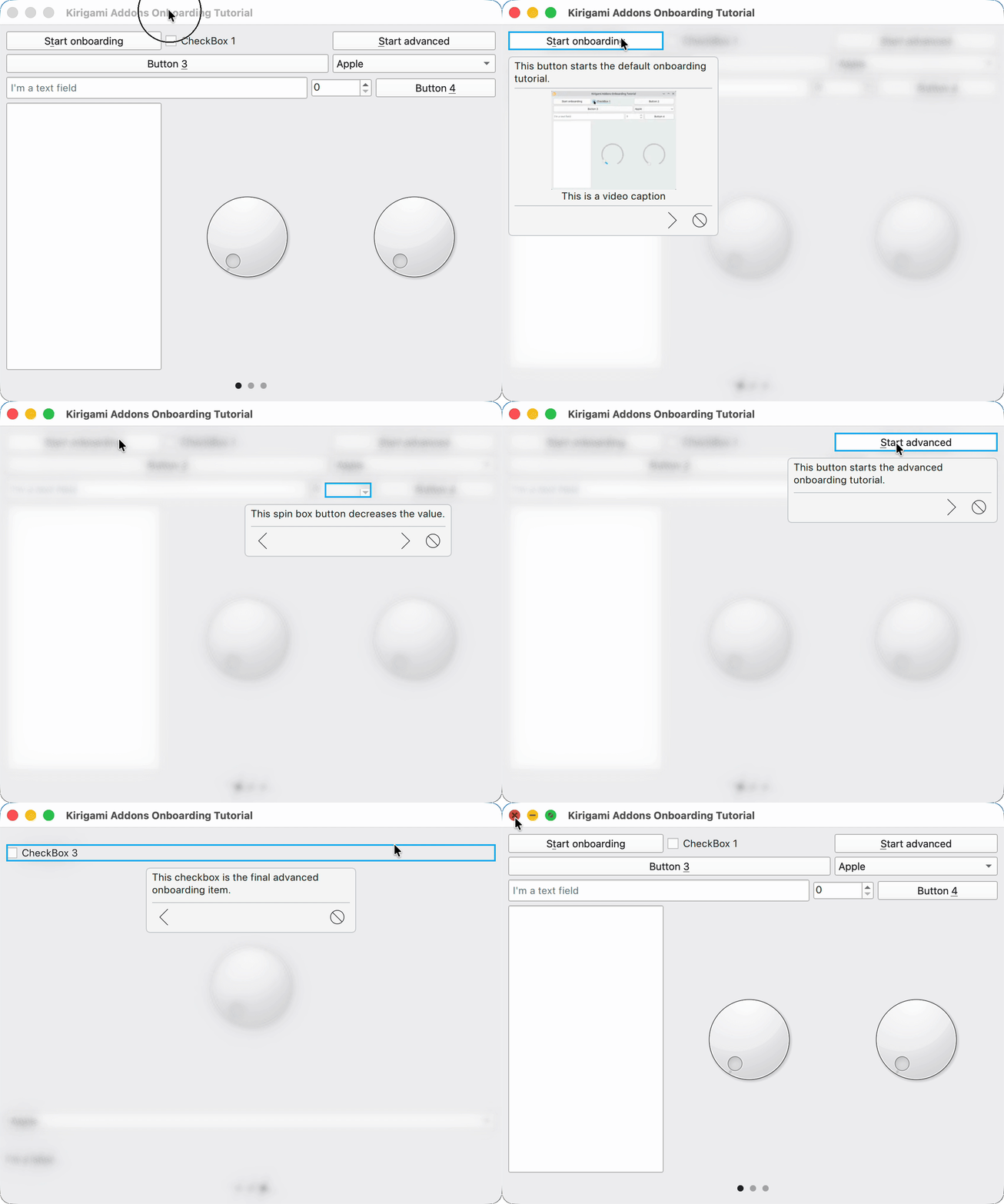
This is the example tutorial included in the Kirigami Addons repository. It demonstrates how the onboarding module can highlight individual controls, groups of controls such as layouts, and even sub-controls. It also shows how to attach additional data to onboarding steps, such as a video and its caption, and how to define multiple onboarding workflows within the same application.
New Kirigami-Addon's Onboarding Module

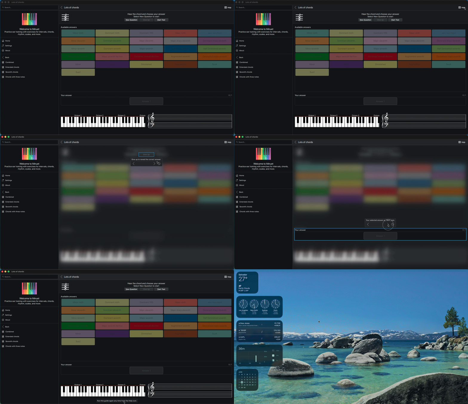
And this is the onboarding module in Minuet: a short guided walkthrough that highlights the most important parts of the exercise screen, explains what each control does, and helps new users understand the flow without leaving the application.
New Kirigami-Addon's Onboarding Module

The onboarding module provides a declarative and non-intrusive way to introduce users to important controls and workflows in Kirigami applications. With support for multiple workflows, dynamic interfaces, custom tooltip content, lifecycle hooks, and configurable visual effects, it can address both simple guidance and more advanced onboarding scenarios.

A possible direction for future work is allowing each onboarding step to wait for a specific user interaction before continuing. Instead of relying only on the Next button, a step could advance after the user clicks a highlighted control, changes a value, or completes an expected action. This would extend the module beyond explanatory walkthroughs and enable fully guided, interactive tutorials in which users learn application workflows by performing the actual operations.

Give the module a try in your application and share your experience, suggestions, and use cases. Feedback is especially welcome while these APIs are still being refined for an upcoming Kirigami Addons release.

Sunday, 14 June 2026

For almost two decades, the PackageKit package management abstraction layer has shipped with pkcon as its command-line client. pkcon does its job, but it was always kind of a “testing” front-end for the PackageKit daemon rather than a tool designed for everyday use. The focus has instead been on the GUI tools, automatic system updates, GUI application managers and other front-ends. Its command names mirror the D-Bus API almost one-to-one (get-details, get-updates, get-depends), output is very plain, and there is no machine-readable mode for scripting. Most importantly though, there has been no development on it at all for almost a decade, so pkcon was stuck in its rudimentary state from that era.

Since a lot of changes will be coming to PackageKit, and testing the daemon and working with it from the command-line was not very pleasant anymore in 2025/2026, I decided to modernize the tool as part of my work as fellow for the Sovereign Tech Agency last year. pkgcli is the new command-line client for PackageKit. It is built from the ground up to be pleasant to use interactively and easy to drive from scripts.

Why a new tool?

Of course, instead of introducing a new tool, I could have just expanded pkcon instead. The problem with that approach is that the pkcon utility has been around for so long and its command-line API had ossified so much, that rather than changing it and potentially breaking a lot of scripts relying on its quirks, I decided to introduce a new tool instead. pkcon can still be optionally compiled for people who need it in their scripts and workflows.

The goals for pkgcli, and the features it now has are:

  • Human-friendly command names. Verbs that read the way you’d describe the task, instead of mirroring the D-Bus API 1:1: show, search, list-updates, what-provides, instead of get-details and friends.
  • Readable, colored output by default (still respecting NO_COLOR and degrading gracefully).
  • A real scripting mode. A global --json flag emits JSONL instead of fully human-readable output when possible, to make it easier to use the tool for scripting purposes.
  • Sensible defaults. A few defaults have been changed, such as the metadata cache-age, or automatic cleanup of unused dependencies being enabled by default. This is more in line with current defaults by other tools and frontends. We also print package information in a slightly different, more readable way.
  • Better handling of internationalized text. Text should now align properly in the terminal window, and we should no longer have completely chaotic text output on non-English locales (especially Chinese/Japanese).

Why not pkgctl?

Originally, this tool was called pkgctl, to match other common cross-distro tool names. However, that name was already taken by an Arch-specific distro development tool. When this issue was raised, we decided to just rename our tool to pkgcli with the next release, to avoid the name clash on Arch Linux.

Examples!

Here are some examples on how to use the new tool (some of which include the abridged output pkgcli prints).

Search for anything containing the string “editor” in name or description, then look at the details of one result:

$ pkgcli search editor
Querying                  [████████████████████████████████████████] 100%
▣ ace-of-penguins 1.5~rc2-7.amd64 [debian-testing-main]
▣ acorn-fdisk 3.0.6-14.amd64 [debian-testing-main]
▣ ardour 1:9.2.0+ds-1.amd64 [debian-testing-main]
✔ audacity 3.7.7+dfsg-1.amd64 [manual:debian-testing-main]
✔ audacity-data 3.7.7+dfsg-1.all [auto:debian-testing-main]
▣ augeas-tools 1.14.1-1.1.amd64 [debian-testing-main]
▣ emacs 1:30.2+1-3.all [debian-testing-main]
▣ gedit 48.1-9+b1.amd64 [debian-testing-main]
▣ gedit-common 48.1-9.all [debian-testing-main]
▣ gedit-dev 48.1-9+b1.amd64 [debian-testing-main]
[...]

$ pkgcli show nano
Package: nano
Version: 9.0-1
Summary: small, friendly text editor inspired by Pico
Description: GNU nano is an easy-to-use text editor originally designed as
 a replacement for Pico, the ncurses-based editor from the non-free mailer
 package Pine.
[...]
URL: https://www.nano-editor.org/
Group: publishing
Installed Size: 2.9 MB
Download Size: 646.0 KB

Search only within package names rather than descriptions:

$ pkgcli search name python3

Check for updates. refresh updates the metadata, then list-updates reports what’s available:

$ pkgcli refresh && pkgcli list-updates
Loading cache            [████████████████████████████████████████] 100%
▲ cme 1.048-1.all [debian-testing-main]
▲ gir1.2-gdm-1.0 50.1-2.amd64 [debian-testing-main]
▲ imagemagick 8:7.1.2.24+dfsg1-1.amd64 [debian-testing-main]
▲ imagemagick-7-common 8:7.1.2.24+dfsg1-1.all [debian-testing-main]
▲ imagemagick-7.q16 8:7.1.2.24+dfsg1-1.amd64 [debian-testing-main]
▲ libdlrestrictions1 0.22.0.amd64 [debian-testing-main]
▲ libfftw3-bin 3.3.11-1.amd64 [debian-testing-main]
▲ libfftw3-dev 3.3.11-1.amd64 [debian-testing-main]

Explore relationships between packages:

$ pkgcli list-depends inkscape  # list what inkscape depends on
$ pkgcli list-requiring libappstream5  # list what requires libappstream5

Find the package that provides a capability, here the AV1 GStreamer decoder:

$ pkgcli what-provides "gstreamer1(decoder-video/x-av1)"
✔ gstreamer1.0-plugins-bad 1.28.3-1.amd64 [auto:debian-testing-main]

You can also have JSON output for most commands! Attach --json to any query and pipe the result straight into jq. Each line is a self-contained JSON object:

$ pkgcli --json list-updates | jq -r '.name'
cme
gir1.2-gdm-1.0
imagemagick
imagemagick-7-common
imagemagick-7.q16
libdlrestrictions1
libfftw3-bin
libfftw3-dev
libfftw3-double3

Try it

pkgcli is built by default alongside the rest of PackageKit since PackageKit 1.3.4. If your distribution ships a recent enough PackageKit, it should already be on your PATH. You can read its man page man pkgcli for more information. Feedback, bug reports, and patches are very welcome.

Saturday, 13 June 2026

Quite a few things have happened around the Android platform support for KDE applications in recent months, so high time for another update on that.

Qt 6.11

As already mentioned previously, we have updated the Qt version to 6.11. That has the unfortunate consequence of losing support for Android 8 and older. Due to that we also removed the ARM32 builds, as devices running Android 9 or higher are very likely capable of using ARM64 builds anyway, cutting down the CI cost by a third.

The previously often annoying interactions between input focus and the virtual keyboard seems to have improved somewhat with Qt 6.11. Changes in how the back key/gesture is handled however also caused a few regressions, like a double page pop in more deeply nested applications (Kirigami MR 2100).

SafeArea support

While the previous focus of dealing with “safe” screen areas (ie. parts of the application window not being covered by screen cutouts or system controls like the Android status and navigation bars) had been on not breaking horribly due to Android’s changed default behavior we have meanwhile been working on polishing this to actually look decent.

If you spot places where this still doesn’t work correctly, let us know in the #kde-android Matrix channel!

Notifications

There’s also a number of improvements and extensions for notification handling:

  • Fixed interactions with notification actions or the notification itself having no effect (MR 200).
  • Implemented confirming inline replies (MR 202). This fixes the notification showing a spinner animation indefinitely after submitting an inline reply.
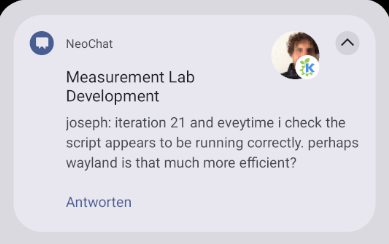
  • Improved icon handling. We can now properly distinguish between what Android calls the “small” and “big” notification icons, a symbolic application icon and an image of e.g. a chat avatar. This will require small changes to applications to get the best result, in most cases providing a symbolic application icon should be enough already (MR 201).
  • A new API for cross-platform notification configuration is in review (MR 203). This will also benefit Flatpak applications.
Screenshot of a chat notification from NeoChat showing the sender and room avatar images next to the message text.
NeoChat notification with avatar images.

Safe JNI usage

Interaction between our C++ code and Android’s Java platform APIs happens via the so-called Java Native Interface (JNI). That’s a rather low-level C interface with little to no type safety and the need for error-prone handwritten arcane signature strings. Already back in the Qt 5 era I had therefore written a few helpers for a more type-safe use of this in KAndroidExtras.

Much of this functionality is meanwhile available in Qt 6 in a very similar fashion, with the JNI array support being the latest addition in Qt 6.9. Compared to raw JNI use this is already a massive improvement, see e.g. MR 204 making use of this in KNotifications. It avoids practically all hand-written JNI signatures as well as much of the manual type conversion.

One part is still missing though, type-safe wrappers so that function arguments and property types are checked at compile-time. That has been extracted and rebased on top of Qt’s JNI code in KJniExtras now. It’s only 10% of the code, with most of the complex template magic gone.

As a small downside we are unfortunately losing the ability to test JNI code on Linux with this, as the old approach provided a mock implementation when not building for Android.

Calendar access

With the type-safe JNI wrappers small enough now to be copied as a single header file, this finally unblocked the move of the Android platform calendar backend from Itinerary upstream to KCalendarCore (MR 242).

Together with the calendar runtime permission API already in Qt, this should make e.g. an “add to calendar” feature for Kongress or KTrip easy to add now.

File dialogs and remote files

An often reported issue against several of our applications is that they seemingly don’t do anything when opening a file via the platform file dialog. This happens for files on a cloud share, which the Qt Quick file dialog silently discards due to not being local files, making this look like as if the user has canceled the dialog to the application. Therefore just nothing happens and no error message is shown either.

Interestingly enough, that problem also happens on KDE Plasma, where the native file dialog also can select remote files, it’s just much less common there. But since we can tell the Plasma file dialog to only allow selecting local files, this one is easy to fix (CR 742273, available in Qt 6.12).

On Android we don’t have that option, nor would that be really satisfying anyway, opening files from a cloud share is a very valid usecase. Therefore there’s now also a proposed change to the Qt Quick file dialog to optionally allow selecting arbitrary URLs, similar to what its Qt Widgets counter-part already offers (CR 743681). This wont automatically fix the problem, but it would at least give applications a chance to do something about this.

Locale-aware sorting

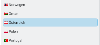
Something fairly basic that Qt on Android so far didn’t do properly (at least when not bundling it with multi-10MB worth of ICU libraries) was locale-aware sorting. When using English you might not notice that, but in many other languages this results in weird and confusing lists. In German for example the letter “Ä” gets basically treated like “A” for sorting, while so far it ended up after “Z” on Android.

There’s now a proposed Qt patch (CR 741548) implementing a QCollator backend for Android using platform infrastructure. This uses Android’s native ICU flavor when available and otherwise falls back to the less efficient and less featureful Java API.

Screenshot of KTrip's country selector, with Austria in German being sorted correctly between Oman and Poland.
Austria is no longer last in the list when using a German locale.

Crash reporting

While we have automatic crash reporting on Linux since some time (see e.g. Harald’s LAS talk for more details), crashes on Android were not handled at all by our applications so far.

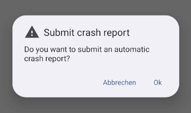
Based on discussions at the Graz Sprint in April this has now changed, KCrash can now detect a previous crash when starting an application, and offers to submit an automatic crash report to KDE’s Sentry instance.

Those reports have been very helpful on Linux already, providing very important information about issues and allowing to prioritize those with the most impact, but it’s nevertheless crucial we don’t submit anything without user consent.

Android message box asking whether or not to submit a crash report.
Crash report dialog on next application start.

The bulk of the implementation is in KCrash MR 101, a few changes are necessary for integrating this into applications as well though.

In your build.gradle, add sentry-android-core as a dependency:

dependencies {
  ...
  implementation 'io.sentry:sentry-android-core:8.43.0'
}

In your AndroidManifest.xml, add a meta-data entry configuring the Sentry DSN for your application:

<application ...>
  <meta-data android:name="io.sentry.dsn" android:value="https://<token>@crash-reports.kde.org/<app-id>"/>
</application>

And finally, remove the build system and preprocessor conditions excluding KCrash use on Android. Note that verifying this part is crucial, without KCrash you’ll get the aggressive default behavior of Sentry, uploading without user consent.

Inhibition

Earlier this year KGuiAddons got a new API for inhibiting system actions such as locking the screen. The obvious usecase for this is a video player, but e.g. Itinerary uses this as well for ensuring your screen stays on while showing a barcode to be scanned at a ticket check.

Android platform support for this has also been added (MR 203), allowing the removal of corresponding code in applications.

Outlook

While all of that is good progress, things are likely about to change. Later this year Google is planning to roll out measures making it significantly harder to provide and install applications on Android.

Logo of the Keep Android Open campaign

For more information check out Keep Android Open, a campaign supported by the KDE e.V. among many other organizations.

Regardless of how this will eventually materialize, the direction is clear, Android isn’t going to be a viable long-term platform for FOSS software, not even in its Google-free form. I have mostly considered it a stop-gap solution until Linux on the phone is ready anyway, so this is another reason to increase the effort into that direction.

Thursday, 11 June 2026

Structure of code and logic for tournaments in the Mankala Engine.

So, we want the tournaments to be able to:

  • Create custom game rooms (with different variants, number of players, and time limit)
  • Join the rooms with room codes.
  • Create elimination brackets for players.
  • Have empty slots filled with computerized opponents.
  • A scoreboard after the game for final rankings.

The tournament is going to be part of the Multiplayer variant. For that, when a person clicks on Multiplayer game mode, they will be asked to select from the given two options of a casual 1 to 1 game or another a tournament. Then they will be asked to either create a room or join the room with the code.

Key elements to implement:

  • Room codes will be created by mapping XMPP MUC JIDs (e.g., A3F7K2 → tournament-a3f7k2@conference.server.com).
  • Fill computerized opponents: When it is detected that there is an absence of required players, the game will be filled with computer opponents in all the empty spots, just like we have for the vs AI game mode.

Here is an example of how the tournaments.cpp can be implemented:

class TournamentManager : public QObject {
    Q_OBJECT
    Q_PROPERTY(QVariantList tournaments READ getTournaments NOTIFY tournamentsChanged)
    Q_PROPERTY(QVariantMap activeTournament READ getActiveTournament NOTIFY activeTournamentChanged)
    
public:
    // --- Tournament duration ---
    Q_INVOKABLE QString createTournament(
        const QString& variant,       // "Bohnenspiel", "Oware", "Pallanguli"
        int maxPlayers,               // eg. 4, 8, 16
        int durationDays,             // tournament duration
        const QString& organizerJid   // creator's XMPP JID
    );
    
    Q_INVOKABLE void joinTournament(const QString& roomCode, const QString& playerJid);
    Q_INVOKABLE void startTournament(const QString& tournamentId);
    
    // --- Match management ---
    Q_INVOKABLE void reportMatchResult(const QString& matchId, 
                                        const QString& winnerJid);
    Q_INVOKABLE void advanceBracket(const QString& tournamentId);
    
    // --- Computer Opponents ---
    Q_INVOKABLE void fillEmptySlots(const QString& tournamentId);
    
    // --- Room codes ---
    Q_INVOKABLE QString generateRoomCode();
    Q_INVOKABLE QString resolveRoomCode(const QString& code);

signals:
    void tournamentsChanged();
    void activeTournamentChanged();
    void matchReady(const QString& matchId, const QString& player1, const QString& player2);
    void tournamentComplete(const QString& tournamentId, const QVariantList& rankings);
    void playerJoined(const QString& playerJid);
};

For filling empty spaces we can use the logic as:

struct Match {
    QString matchId;
    QString player1Jid;   // empty string = unfilled slot
    QString player2Jid;
    QString winnerJid;
    int round;            // 0 = first round, 1 = quarter-finals, etc.
    int position;         // position within the round
    bool isAIMatch;       // true if one/both players are computer
};

class TournamentBracket {
public:
    void initialize(int playerCount);              // builds bracket tree
    void seedPlayers(const QStringList& playerJids); 
    void fillWithAI();                             // fills empty slots
    Match getNextMatch() const;
    void recordResult(const QString& matchId, const QString& winnerJid);
    bool isComplete() const;
    QVariantList getRankings() const;
    
private:
    std::vector<std::vector<Match>> m_rounds;  // rounds[0] = first round, etc.
    int m_totalRounds;
};

At the end of the elimination cycle and the tournament bracket, we can get the results and show them on our created leaderboard page with the XMPP icons, usernames, and the number of games the players won.

What more can be added?

I plan to research more on whether we can store and display these games in the player profiles and create a communication channel for the players and spectators during the ongoing game, which could be both text and voice chat using XMPP and other relevant communication protocols.

Thanks for reading. 👀

Wednesday, 10 June 2026

This is a weekly update from my Google Summer of Code 2026 project with KDE, improving effect widgets in Kdenlive.

Week 2 was about getting feedback and doing it right.

After opening the draft MR for the Curves Widget, my mentor Jean-Baptiste reviewed the approach and suggested a cleaner architecture. The original implementation packed all 4 channel parameters into a single compound parameter. JB's feedback: each channel should be its own separate av_curve parameter in the effect XML, and AssetParameterView should share one CurveParamWidget across all of them; similar to how m_mainKeyframeWidget works for keyframe parameters.

This was a significant refactor but the result is much cleaner:

  • avfilter_curves.xml now has 4 separate parameters; av.master, av.r, av.g, av.b, each with its own name and description
  • AssetParameterView creates the CurveParamWidget on the first av_curve param, then calls addAvCurveTab() for each subsequent one
  • Each tab is tied to its own model index; valueChanged fires per-parameter independently
  • serializeAllChannels() is gone entirely;each channel just emits its own value

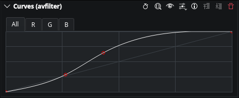
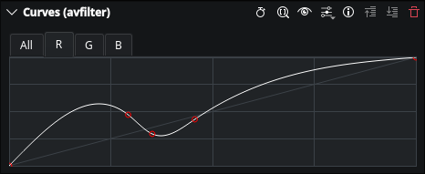
All four tabs (All, R, G, B) are working correctly. Per-channel state is preserved when switching tabs. Project save and restore works. The MR is now updated with the refactored approach and waiting for JB's review.

The All tab applies a curve to all channels simultaneously:

Curves widget — All tab

Switching to the R tab adjusts only the red channel independently:

Curves widget — R tab with red tint

Week 3 is already underway; the MR is pushed and waiting for JB's review. More updates next Sunday.

Monday, 8 June 2026

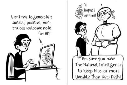
E.P. Unny is a notable Indian political cartoonist, who worked/works with famed Shankar’s Weekly and news papers such as The Hindu and Indian Express.

Since 2020, all his cartoons (also 2025, 2026 so far) are published — every week — open-access by Sayahna Foundation.

Unny was using a font based on his handwriting style for the cartoons, designed by K.H. Hussain of Rachana. Recently, a new font designed by Varshini KVSS & ‘Kandam Collective’ is developed by Rachana Institute of Typography to use in the cartoons, and it is released as open source — see the specimen and download links.

The character set of the font is Latin only. There are plenty of alternate glyphs (for upper case and lower cases of i, j, l, g, etc. — for instance check the double ‘l’ in ‘Intelligence’ on the specimen above). Such characters are rendered alternately to give a feel of the randomness that handwriting evokes.

The source (and issue tracking) are available at RIT fonts repository.

Sunday, 7 June 2026

digiKam 9.1.0 Preview Canvas Displaying an HEIF Photo Taken With Apple 15 Pro

Dear digiKam fans and users,

After three months of active development, bug triage, and feature integration, the digiKam team is proud to announce the stable release of digiKam 9.1.0. This version builds on the foundation of 9.0.0, introducing new features, performance improvements, and a significant number of bug fixes to enhance stability, usability, and workflow efficiency. This release focuses on database migration, preview enhancements, advanced search, and usability improvements across the board.

Saturday, 6 June 2026

Size Maters 🔗

Nuno Pinheiro pinheiro 21:40 +00:00
RSS

So… more Oxygen icons 🙂

This weekend I been filling some of the more obvious holes in the icon set and recently these 2 landed.

The first one is for KeepSecret, the application that is replacing the old KWallet.

Security icons are funny. There are only so many ways to draw "keep your stuff safe" before you end up with another lock icon. Or a key. Or a lock pretending not to be a lock.

I ended up going with a small vault door. Which is basically also a lock pretending not to be a lock but at least it looks kinda cool, and more important I think it looks as smart as our users are...

The other one is for generic package managers.

And apparently software still arrives in wooden crates. 😀

I dont know who started this visual convention but after all these years I kinda stopped questioning it. Software packages are boxes. Everybody understands boxes. Lets move on, and debate the real important things such as the relevance of the save icon as a flopy device 😉

One thing that I love about icon design is how different the process becomes depending on size.

At large sizes you can spend hours messing around with materials, reflections, shadows and tiny details.

At small sizes all that disappears and suddenly you are fighting for every pixel. trying to keep the meanigfull details and creating a source svg monster in Oxygen repo 😀

I think icon design is really just the art of deciding what can be removed before the whole thing falls apart.

Talking about things that may or may not fall apart…

I've also been spending some time exploring styling in QML and thinking about possible future directions for O².

Nothing concrete yet.

Mostly experiments.

Some ideas are sensible.

Some ideas are absolutely not sensible. On propose 😀

The main goal is realy to show range of things I would ike to see available on Union.

Those are usually the interesting ones.

Right now I'm more interested in exploring the range of possibilities than deciding what a final result should look like. There are some surprisingly fun things hidden in there.

If all goes well we will soonish publish a video with KDAB showing some of these experiments and crazy ideas.

Or at least the ones that dont completely explode before then 😉

So stay tuned.

And as always, thanks for using Oxygen.

This old project still finding new excuses to keep going.

The second maintenance release of the 26.04 series is out with the usual batch of bug fixes and improvements for workflow and stability. This update comes with fixes to rendering, timeline editing, project file handling, and Windows, MacOS, AppImage and Flatpak packaging.

One noteworthy bug closed in this version is a fix on Windows to finally allow exporting your videos to a network drive, closing a 4-year-old bug.

Head to our download section to get the latest binaries, or check the updates from your package manager. Please note that for Linux only AppImage and Flatpak are supported by the Kdenlive team.

For the full changelog continue reading on kdenlive.org.

Thursday, 4 June 2026

This week, I completed the port of KeepSecret's actions to the new org.kde.kirigami.actioncollection API from kirigami-app-components, a recently introduced library developed by Marco Martin (notmart).

Before working on this task, actions were defined separately throughout the UI. With ActionCollection, I could define each action once in a central place and then reuse it wherever it was needed. This makes the code easier to maintain and also integrates KeepSecret with KDE's standard shortcut system, allowing users to configure shortcuts through the usual KDE interface.

The main change was creating a dedicated Actions.qml file with AC.ActionCollectionManager as the root element. Inside it, actions are now centrally defined across three collections — one for the wallet list, one for wallet contents, and one for item details. These include actions such as New Wallet, New Entry, Search, Lock, Unlock, Copy Password, Save, Revert, and Delete.

During review, additional actions were added, dependencies were simplified, and Flatpak build issues were addressed. Since kirigami-app-components is still very new, some CI and packaging adjustments were needed before everything built correctly.

The merge request !29 has now been reviewed, approved, and merged into KeepSecret.

Next up is the Import/Export feature — I'll be studying KeepSecret's wallet data structures and designing the file format this week.