New features in Krita, Calligra Plan ported to Qt6 and a simplified Itinerary UI
Welcome to a new issue of "This Week in KDE Apps"! Every week (or so) we cover as much as possible of what's happening in the world of KDE apps.
Getting back to all that's new in the KDE App scene, let's dig in!
Travel Applications
Last weekend, some of the developers behind Itinerary and KTrip were in Vienna for the first edition of the Open Transport Community Conference, where there were many discussions relevant to Itinerary and Transitous.
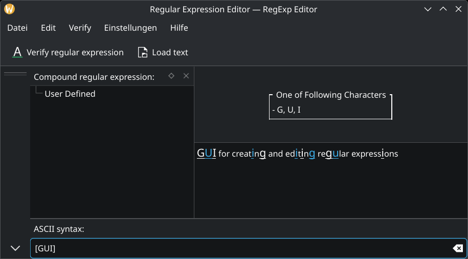
Jonah Brüchert simplified the journey selection by moving the mode of transport selection to a separate page (25.12.0 - link) and by asking for a trip group after selecting a journey (25.12.0 - link).
Jonah also brought back the top-level import action in the trip group list page (25.12.0 - link)
Volker Krause added the altitude information to the live status map when the information is available (25.12.0 - link).
David Pilarčík added 10 new extractors and improved some existing ones (25.12.0 - link)
Joshua Goins made the United extractor more resilient when parsing multi-passenger tickets (25.12.0 - link)
PIM Applications
Volker Krause and Albert Astals Cid fixed some safety issues found by the newly added OSS-Fuzz tests in KMime (25.12.0 - link 1 and link 2).
Carsten Hartenfels added a Marker blend mode to Krita, which works like Alpha Darken but properly adheres to channel flags (so it e.g. obeys alpha lock and inherit alpha) and interpolates colors without artifacts. When you use it on a brush in build-up mode, it will only increase opacity up to your stroke's intended opacity but not compound what's on the layer, while the colors get interpolated. It works like Paint Tool SAI's marker tool, hence the name. (link)
Wolthera van Hövell improved the support for loading and saving PSD files and now text, shapes, and guides are supported (link).
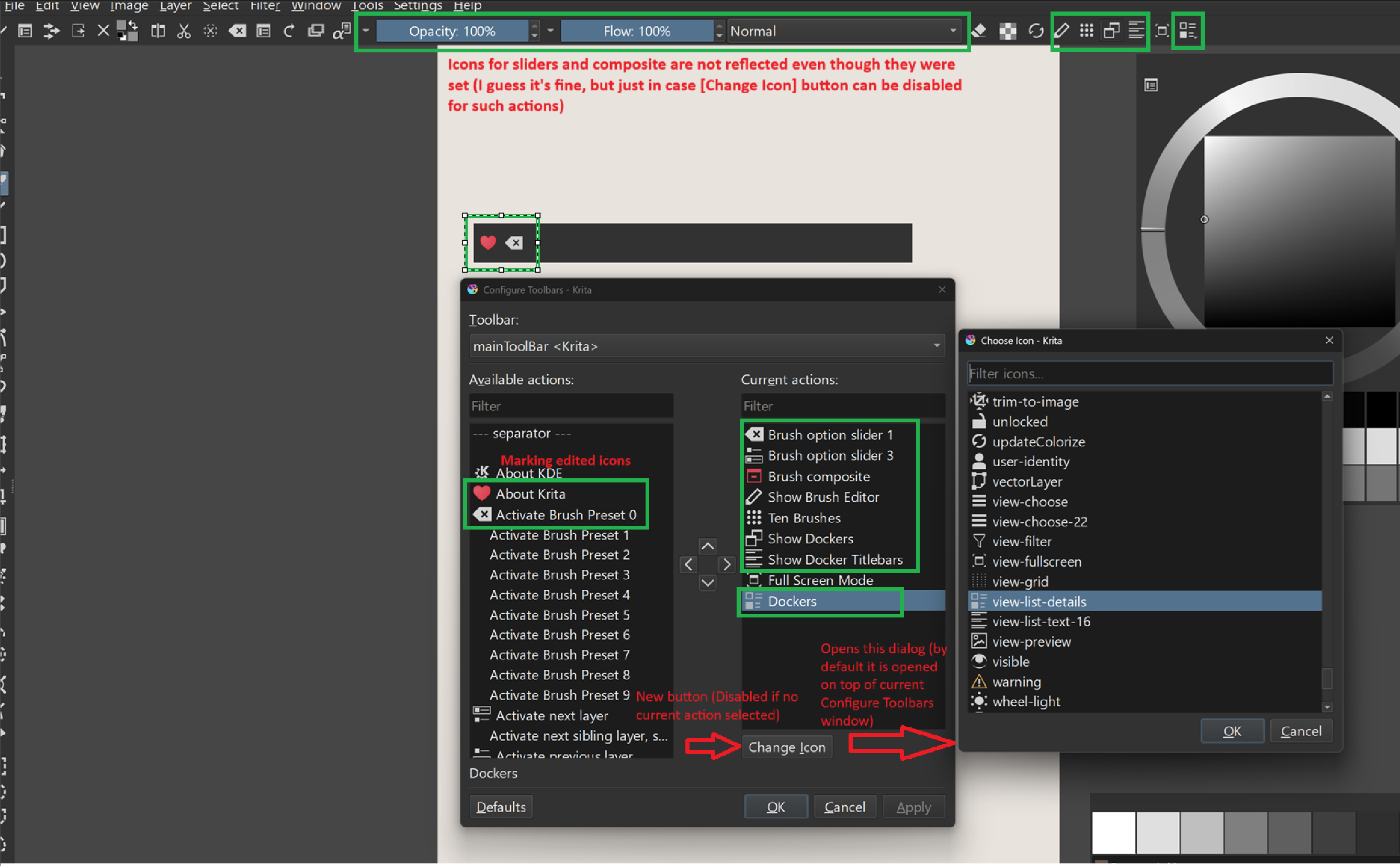
Pavel Shlop added the possibility to edit icons for toolbar actions in the toolbar editor (link).
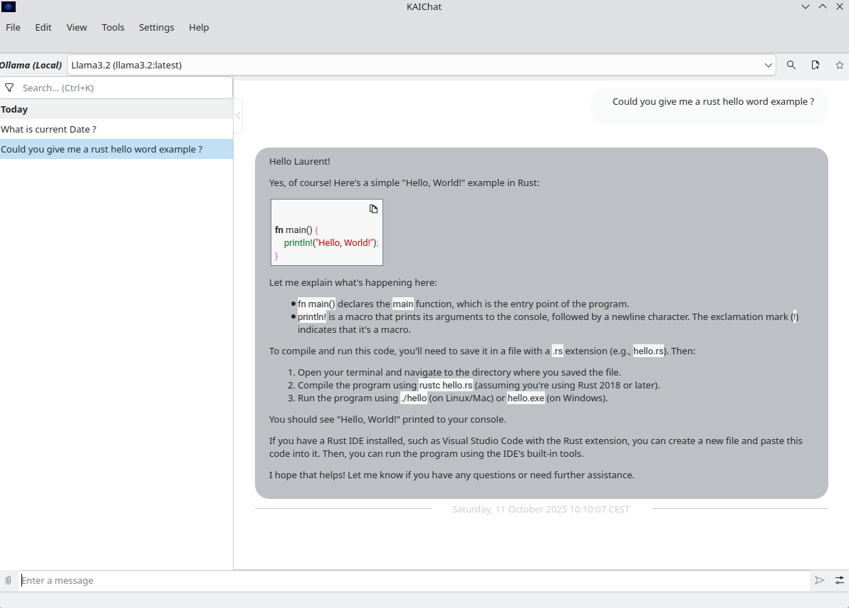
Laurent Montel released a new version of KAIChat. This version adds tools support, make it possible to download Ollama on Windows and macOS and add some configuration options to some plugins.
For a complete overview of what's going on, visit KDE's Planet, where you can find all KDE news unfiltered directly from our contributors.
Get Involved
The KDE organization has become important in the world, and your time and
contributions have helped us get there. As we grow, we're going to need
your support for KDE to become sustainable.
You can help KDE by becoming an active community member and getting involved.
Each contributor makes a huge difference in KDE — you are not a number or a cog
in a machine! You don’t have to be a programmer either. There are many things
you can do: you can help hunt and confirm bugs, even maybe solve them;
contribute designs for wallpapers, web pages, icons and app interfaces;
translate messages and menu items into your own language; promote KDE in your
local community; and a ton more things.
You can also help us by donating. Any monetary
contribution, however small, will help us cover operational costs, salaries,
travel expenses for contributors and in general just keep KDE bringing Free
Software to the world.
To get your application mentioned here, please ping us in invent or in Matrix.
Today I’d like to talk about package management a bit. The lack of a user-facing package manager is a big difference between KDE Linux and most other Linux distros (even immutable/atomic ones), so it bears some discussion!
Let me start by saying:
I absolutely love package management.
No, really!
Before Linux, I came from the Mac world which lacks real package management. To install apps back then, you would fail to successfully drag them to the /Applications folder. Software requiring more integration was installed using Windows-style wizards with no dependency management and no provision for uninstalling them later. (!!!!!)
Moving to Linux was a revelation.
You mean I can just do sudo apt install thingy to get my thingy instantly? And it gets upgraded with the rest of the system automatically? And I can easily remove it if I don’t want it anymore?
It’s just 1000% better. We all know this. It’s a crowning jewel of our ecosystem.
However! There’s package management to get add-on software… and then there’s package management for assembling the base OS on your own computer.
The former is incredibly convenient and amazing. The latter is a Tool Of Power best suited for use only by OS builders and true experts.
I feel it’s a problem that historically we’ve used this amazing tool for both of those use cases, because building the base system from packages on users’ computers suffers from a number of nearly unsolvable challenges:
It deteriorates and explodes
As you install, remove, and update packages on your system, you inevitably encounter problems over time:
Conflicts and incompatibilities with add-on repos
Heisenbugs from orphaned packages still present on the system
The ability to uninstall important functionality without realizing it, breaking the system
Updates that break bootability due to some untested condition present only on your system
True experts and OS engineers can usually resolve these issues as they crop up.
What about everyone else? There’s usually no recovery method exposed in a normal-person-friendly manner, or at all. You’re just screwed unless you have a second computer or a phone set up to be able to talk to the distro developers on Matrix or IRC, and one can walk you through fixing it live.
It’s not a targetable platform
No installation of a package-based operating system can be guaranteed to have the same set of system software and libraries as any other one.
This means if you’re a developer, your software can’t make safe assumptions, and it’s running in an untested environment pretty much all of the time. You can contend with this complexity via a forest of conditional “if this thing is present, enable that behavior” logic, but versions of dependent libraries you didn’t test with can still break your app, and users will report bugs that you can’t reproduce.
It’s a barrier to raising quality levels
Package-based OSs allow for and encourage self-service to fix problems. Install this package. Edit that config file. Replace the version of some package with the one from another repo.
This is great for current you in the short term. But it’s less great for future you, after you’ve forgotten about your local fixes and encounter the same bugs the next time you re-install on a new computer, or after the local fixes have become unnecessary and are now causing issues that nobody will be able to debug.
It’s also less great for the whole project, its ecosystem, and others who might encounter the same issues but lack your level of technical skill or available time for troubleshooting.
But what about the really good distros?
I do think these challenges are manageable, even if they can’t be fully eliminated. My best experiences with a package-based KDE-focused distro have been with Fedora KDE, where they do a great job of it:
They prevent removing critical packages that would break the system.
They have a huge main repo with almost everything you could want, and RPMFusion (the only add-on repo you really need), has a close relationship with the primary packagers so conflicts are rare.
They work hard on shipping a good product out of the box, rather than making you fix bugs yourself, and they regularly make bug-fixy tweaks to improve the out-of-the-box experience.
In 4 years of usage, I’ve never had a system update break bootability.
And the result is fantastic. I 100% recommend Fedora KDE to anyone who wants a good experience with a GUI-focused package-based operating system. It’s hard to go wrong with it.
And obviously those of us building KDE Linux also think Arch Linux is great, since we use their packages for building our base system! It’s is an amazing tool for OS builders and experts wanting to create the personal OS of their dreams.
Others that I have less experience with are excellent, too. But still, none of them can fundamentally solve the problems I outlined earlier. It’s not for lack of labor or expertise; these simply aren’t easily solvable problems with a mutable system-level package-based design.
So what’s the solution?
Well the world is messy and everything has drawbacks. So there’s no solution that’s better in every way, and worse in none. But the approach we’ve chosen in KDE Linux does solve the above problems:
Stability
In KDE Linux, we build the base system out of Arch packages, but freeze the contents and take responsibility for the result being functional; we don’t offload responsibility onto the user.
Updating the system swaps out the old OS image for the new one; it’s both fast and safe. And you can keep around the old OS image (three of them, in fact) and easily roll back if you have a problem. It doesn’t become “quirky” and degrade over time.
It isn’t 100% perfect, of course. Users can still mis-configure their software and manually install user-level libraries that conflict with system-provided libraries. But it’ll be more obvious that you’re about to shoot yourself in the foot.
Being a platform
Specifically, Flatpak is a platform.
With Flatpak, developers target a specific version of a discrete SDK and its corresponding runtime. This runtime will be the same on every user’s computer. Now developers can make safe assumptions and reproduce bugs — at least, bugs not caused by hardware problems or users’ configurations differing from their own.
And developers who target this platform make their apps available not only on KDE Linux, but also most other Linux-based operating systems, too.
There are problems with Flatpak, of course; I’m not gonna claim it’s perfect. It’s opinionated, restrictive, can’t be used for deeper parts of the OS the way Snap can, and multiple installed versions of each runtime can end up consuming a lot of space. But it solves the platform problem, and traditional system-level package management just can’t.
Quality
Every KDE Linux user is going to to have image and video thumbnails, all the KDE wallpapers, the Desktop Cube effect, KDE Connect, a working installation of Plasma Vault, well-tuned power management, and support for as much exotic hardware as we could stuff in. None of this comes in optional add-on packages you can find yourself missing. You’ll just automatically have it.
If you find that something significant is missing or broken, you’ll need to tell the developers, and then they can fix it for everyone. If you’re an expert who likes fixing problems, you can still make those fixes; you’ll just be doing it for everyone in the world and not just yourself! The project and its entire userbase will benefit.
But what about the glaring, obvious drawbacks?!
The most obvious drawback of not having a package manager, is, well, not having a package manager. I’m pretty sure I don’t need to explain the lost benefits to anyone reading this. We all know how amazingly flexible and powerful real package management is.
Thing is, its absence isn’t a problem for regular people because they weren’t using package managers to install gimp and rust and waydroid and whatever anyway. The Discover graphical app store is a waaaaaaay more user-friendly way to get GUI apps from Flathub or anywhere else. It isn’t actually a problem.
Pictured: a usable way for normal people to find and install apps
But the lack of a package manager does become a problem for power users and software developers. Let me group the usages into a few broad categories and explain how KDE Linux handles them:
GUI apps not on Flathub
This category shrinks all the time as Flathub cements its position as the de facto repository of GUI apps on Linux.
Still, for the remaining omissions, there are other options such as Snap, finding an AppImage of the app, or installing it using the package manager of another distro using a container. But these don’t offer the level of integration we’re aiming for in KDE Linux, so for that reason, we focus on boosting Flathub as its primary supported repository of GUI apps.
Command-line productivity and software development tools
In KDE Linux, we already pre-install most of the common and modern ones. This includes:
Performance monitoring/debugging:drm-info, htop, iotop, lsof, lspci, lsusb, nvtop, powertop, and loads more
Productivity/automation:kdialog, rg, tree, vim, wget, wl-clipboard, ydotool, and many more
Network management:hostnamectl, ip, iw, resolvectl, tracepath, and more
Version control:git and svn
Compilers etc:ccache, gammaray, gcc, gdb, llvm, and lots of ancillary tools
For anything you need that isn’t pre-installed, there are multiple options including containers and the add-on Homebrew or Nix package managers. We even include a custom “command not found” handler that can direct you to available options:
Drivers and support packages for hardware
This is a tricky one, as a lot of these include kernel drivers or need to be installed systemwide. So we pre-install as many as we possibly can: support for printers, game controllers, filesystems, fingerprint readers, drawing tablets, smart card readers, braille displays, Yubikeys, specialized audio/video processor boxes; lots of stuff. However there are cases where this isn’t possible, which is a legitimate problem with KDE Linux right now.
Input methods
KDE Linux aspires to pre-install state-of-the-art input methods so you don’t have to install and configure everything yourself. However we haven’t reached this goal yet. We’re building a virtual keyboard with built-in support for CJKV languages, but it’s still a work in progress.
Languages
KDE Linux pre-installs support for all available languages; any that are missing are the result of bugs we should fix!
Support packages for VM guest OS integration
KDE Linux pre-installs all the ones that are available on Arch Linux. Similarly, anything missing is something for us to fix.
Software development languages and toolkits
Qt is obviously included, and so is GTK. There’s also Python, JavaScript, and Rust.
But we can’t pre-install everything here, as software dev stuff tends to be huge. If a large high-level toolkit/language/build dependency/etc. that you need isn’t pre-installed, the best way to use it anyway is by installing it or its development environment a container. Distrobox and Toolbox are fully supported.
And that should about cover it, I think!
Basically, we’ve tried to eliminate the need for traditional package management as much as we can, while preserving your ability to use a package management tool if you’re an expert or a developer who benefits from one. It should just be a userspace package manager (via a container, Homebrew, or Nix — your choice) so it can’t impact the stability of the system so strongly, and so any problems can be easily undone.
And to be clear, if you prefer a traditional OS that’s 100% mutable using a system-level package manager, that’s completely fine. There’s no shortage of Linux-based operating systems using this model out there, and KDE Linux is an admittedly opinionated divergence from it.
On the other hand, if all of this seems really exciting, please feel free to install KDE Linux somewhere and help us build it! At the time of writing, we’re a little over 40% of the way through the Beta milestone, at which point we’ll declare it suitable for general use by current Linux users. Progress is steady but slow; with more help, it can become a polished product much faster!
We’re excited to share a major milestone in the development of the Ocean Design System for the Plasma Desktop! The project is moving away from Figma and fully migrating to the open-source platform Penpot.
This shift was made possible by significant improvements in Penpot, which now supports critical features needed for a robust design system.
The Move to Penpot: Open Source and Component Cleanup
The team begun a clean-up and migration of all design assets into Penpot. We’ve created the Ocean Design Systems Foundations Library, which is the central Penpot file housing all our graphical assets. It contains all the foundational elements of the design system, but now features shared assets.
Progress Highlights in Penpot
Foundations and Shared Component
These are the second level, or more advanced design elements used in ui. Buttons, sliders, progress bars, etc. Using these elements, users are able to actually compose and deliver small UI elements for developers to use.
New Feature: Variants
A massive win for our design process is Penpot’s new support for variants. Variants allow us to group components with different states (e.g., a badge with an icon or an avatar). This makes it incredibly easy to design on the fly—you can drop a component and quickly switch its size, state, and type without having to manually redesign.
Exciting News from Penpot Fest 2025
The recent Penpot Fest brought some fantastic announcements that will further accelerate our work:
New Rendering Engine: Penpot is developing a new rendering engine based on Skia and Web Assembly (like what Chrome uses) to dramatically improve performance and speed, especially for math-oriented design work. We’ve already signed up for the beta!
Layer Blur and Tokens: They are bringing layer blur into the system and allowing for the creation of more tokens for things like typography and complex multi-layered shadows.
Better Shape Control: The new engine also promises better shape control, which is great news as we explore creating our Ocean icons directly in Penpot.
Sharing the Library
We’ve now published the first iterations of our Ocean Design Foundations library. To enable worldwide collaboration, we are periodically exporting the Penpot file and uploading it to our GitLab repository (currently hosted in a personal repo, but moving to a Plasma-backed one soon). This means anyone can clone the repository and work with the same assets we do.
A little side project I just published is a KSplash theme (the loading screen while logging into a Plasma session) that uses BGRT, the ACPI Boot Graphics Record Table. Basically: a KSplash theme that displays the vendor logo that also your UEFI shows during the boot process.
KSplash theme featuring a conspicuous manufacturer logo
I’ve always been looking for a seamless startup experience, back then playing around with various Plymouth themes, login manager themes, KWin effects, and so on. Say what you will about Windows 8 but ever since its release pretty much every x86 desktop system out there boots up with a black screen and a vendor logo in the middle. Many Linux distributions also ship a BGRT Plymouth theme (the boot splash). Fedora if I recall correctly have also been pioneering a flicker-free boot effort. It included various changes to the Linux kernel, drivers, and other parts of the graphics stack to keep the console from briefly showing up or inadvertently clearing the frame buffer anywhere during the boot process and so on.
This KSplash theme is forked off from the upstream Plasma splash screen, including “Plasma by KDE” tagline, but the Plasma logo was replaced by the logo acquired from BGRT. It obviously is mostly meant for systems configured to automatically login. Right now, KWin Wayland starts rendering as soon as it’s ready which typically results in a couple of black frames with a mouse cursor before KSplash is actually up, breaking the illusion. Nevertheless, I wanted to publish this project for posterity for anyone who might find it useful. :) Since it contains C++ to interact with BGRT, it unfortunately cannot just be published on the KDE Store. It is, however, designed with the prospect of becoming an official part of Plasma in mind, should we want this.
In preparation for, and at the 2025 display next hackfest, I did a bunch of hacking on using more driver features for improved efficiency and performance.
Since then, I polished up the results a lot more, held a talk about this at XDC 2025 and most of the improvements are merged and now released with Plasma 6.5. Let’s dive into the details!
Using more planes
The atomic drm/kms API exposes three important objects to the compositor:
connectors, which simply represent the connection to the display. In most cases there’s one per connected display
CRTCs, which roughly represent the machinery generating the data stream that’s sent to a display
planes, that are used to define which buffers are composed in which way to create the image on a given CRTC. There’s three types, primary, cursor and overlay planes
When trying to drive a display, the compositor needs to put buffers on at least one primary plane, connect it to a CRTC, connect that to a connector, and then do an atomic test to find out if that configuration can actually work. If the configuration doesn’t work, because of hardware or driver restrictions, the compositor needs to fall back to a different (usually simpler) one.
Up to Plasma 6.4, KWin (mostly1) only used primary and cursor planes. Using the GPU, it composited all the windows, decorations and co. into one buffer for the primary plane, and the cursor into another buffer for the cursor plane. Whenever the cursor plane wasn’t available or the configuration using it didn’t work, it would fall back to compositing the cursor on the primary plane instead (which is usually called a “software cursor”).
Why even use multiple planes?
While compositing everything with the GPU allows for fancy features, color management, blur, wobbly windows and more, it does require the GPU to process lots of data. Depending on the hardware, this may be somewhat slow or incredibly fast, but it always takes some amount of time, and often uses a lot of power.
By using a plane for the cursor for example, when you move it, the compositor doesn’t have to re-render the screen, but it can just set the new cursor position on the hardware plane, which basically immediately changes the image that’s sent to the screen - reducing both latency and power usage.
In other cases we don’t really care about latency so much, but power usage is more important. The best situation is possible with video playback: If the application uses hardware decoding and passes the decoded video to the compositor unmodified, it can put the video directly on a plane, and the rest of the GPU can completely turn off! This already works in fullscreen, but with more planes we could do it for windowed mode as well.
So now you know why we want it, but getting there was a longer story…
Preparing the backend
Our drm backend had a relatively simple view of how to drive a display:
every output had one primary and one cursor layer, with matching getters in the render backend API
this layer wasn’t really attached to a specific plane. Even if your hardware didn’t have actual cursor planes, you’d still get a cursor layer!
when rendering, we adjusted to the properties of the actually used plane, and rejected rendering layers without planes
when presenting to the display, the code made assumptions about which planes need which features
This was quite limiting. I refactored the backend to instead create a layer for each plane when assigning a plane to an output, have a list of layers for each output, and treat all of them nearly exactly the same. The only difference between the layers is now that we expose information about how the compositor should use them, which is mostly just passing through KMS properties, like the plane type, size limitations and supported buffer formats.
Last but not least, I changed the backend to assign all overlay planes whenever there’s only one output. This meant that we could use overlay planes in the most important case - a single laptop or phone display - without having to deal with the problems that appear with multiple screens. This restriction will be lifted at some later point in time.
Preparing compositor and scene
The next step was to generalize cursor rendering - compositor and scene both had a bunch of code specifically just about the cursor, listening to the cursor image and position changing and rendering it in a special way, even though it was really just another Item, just like every window decoration or Wayland surface. I fixed that by adding the cursor item to the normal scene, and adding a way for the compositor to hide it from the scene when rendering for a specific output. This allowed me to adjust the compositing code to only care about item properties, which could then be reused for different things than the cursor.
As the last cursor change, I split updating the cursor into rendering the buffer and updating its position. The former could and should be synchronized with the rest of the scene, just like other overlays, but the latter needs to be updated asynchronously for the lowest possible latency and to keep it responsive while the GPU is busy. With that done, the main compositing loop could use primary and cursor planes in a rather generic way and was nearly ready for overlays.
Putting things on overlays
The main problem that remained was selecting what to put on the overlay planes that are available. There are some restrictions for what we can (currently) put on an overlay:
the item needs to use a dmabuf, a hardware accelerated buffer on the GPU
the item needs to be completely unobstructed
the item can’t be currently modified by any KWin effect
To keep things simple and predictable, I decided to just make KWin go through the list of items from top to bottom, take note of which areas are obstructed already, and find items that match the criteria and get updated frequently (20fps ore more). If there are more frequently updated items than planes, we just composite everything with the GPU.
Last but not least, we do a single atomic test commit with that configuration. If the driver accepts it, we go ahead with it, but if it fails, we drop all overlays and composite them on the GPU instead. Maybe at some point in the future we’ll optimize this further, but the main goal right now is to save power, and if we have to use the GPU anyways, we’re not going to save a lot of power by merely using it a little bit less.
Putting things on underlays
The concept of underlays is quite similar to using overlay planes, just instead of putting them above the scene, you put them below. In order to still see the item, we paint a transparent hole in the scene where the item would normally be.
This is especially useful whenever there is something on top of the item that isn’t updating as frequently. The best example for that is a video player with subtitles on top - the video updates for example 60 times a second, but the subtiles only once every few seconds, so we can skip rendering most of the time.
There isn’t really that much more to say about underlays - the algorithm for picking items to put on overlays needed some minor adjustments to also deal with underlays at the same time, and we needed to watch out for the primary plane to have enough alpha bits for semi-transparent things (like window shadows) to look good, but overall the implementaiton was pretty simple, once we had overlay plane support in place.
The result however is quite a big change: Instead of getting an overlay in some special cases, KWin can now use planes in nearly all situations. This includes the newly introduced server-side corner rounding in Plasma 6.5! We simply render the transparent hole with rounded corners, and we can still put the window on an underlay with that.
There is one thing that did not land in time for Plasma 6.5 however: The current algorithm for underlays only works on AMD, because amdgpu allows to put overlay planes below the primary one. I have an implementation that works around this by just putting the scene on an overlay plane, and the underlay item on the primary plane, but it required too many changes to still merge it in time for Plasma 6.5.
Required changes in applications
Most applications don’t really need to change anything: They use the GPU for rendering the window, and usually just use one surface. If the entire window is getting re-rendered anyways, like in the case of games, putting the surface on an overlay or underlay is quite simple.
There are however some situations in which applications can do a lot to help with efficiency. If you’re not already using the GPU for everything, you’ll want to put the quickly updating parts of the app on a subsurface. For example, mpv’s dmabuf-wayland backend puts
the video background on one surface with a black single pixel buffer
the video on separate surface
playback controls and subtitles on another separate surface
which is the absolute best case, where we can basically always put the video on an underlay. If the video is also hardware decoded, this can save a lot of power, as the GPU can be completely turned off.
You also want to support fractional scaling properly; while some hardware in many situations is fine with scaling buffers to a different size on the screen, there are sometimes hardware restrictions on how much or even if it can scale buffers.
Using drm color pipelines
The described overlay and underlay improvements are great… but have one big flaw: If presenting the Wayland surface requires color transformations, we have to fall back to compositing everything on the GPU.
Luckily, most GPU hardware can do some color operations on the planes. The API for those color operations has been worked on for a long time, and I implemented support for it in KWin. With the relevant kernel patches, KMS exposes color pipelines - each a list of color operations, like a 3x4 matrix or per-channel 1D and 3D lookup tables, which the compositor can program in whatever way it wants. Every time we attempt to put an item on a hardware plane, we also attempt to match the required color transform to the color pipeline.
With the patchset for that, on my AMD laptop I can open an HDR video in mpv, and even if the video has subtitles, is partially covered by another window and the screen is SDR, the video is presented correctly without the GPU being involved!
How much does it really help?
Now the most interesting part: How much power does this actually save in the long run? I did some measurements with all the patches put together.
To test this, I played each video on a Framework 13 at 50% display brightness, with “Extended Dynamic Range” enabled and the keyboard backlight turned off, and recorded the power usage from the sysfs interfaces for battery voltage and current. The results you see in the table are the averages of 15 minutes of video playback, so the numbers should be pretty reliable.
On the application side, I used YouTube videos in Firefox with gfx.wayland.hdr enabled. As YouTube didn’t allow me to play HDR videos for some reason, I used mpv with the dmabuf-wayland backend to play back a local video instead.
Video
without overlays
with overlays
4k SDR in Firefox
13.3W
11.5W
1080p SDR in Firefox
11W
9.6W
4k HDR in mpv
13.4W
12.4W
Or in terms of (estimated) battery life:
Video
without overlays
with overlays
4k SDR in Firefox
4.6h
5.3h
1080p SDR in Firefox
5.5h
6.4h
4k HDR in mpv
4.6h
4.9h
As a reference for these numbers, the laptop being completely idle with the same setup uses about 4.5W, which equals about 13.5 hours of battery life. So while this is a good start, I think there’s still a lot of space to improve. At XDC this year I was told that we may be able to do something about it on the application side by using the hardware decoder more efficiently; I’ll do another run of measurements whenever that happens.
When can I start to use this?
Due to various driver issues when trying to use overlays, like slow atomic tests on AMD as well as display freezes on some AMD and NVidia GPUs, this feature is still off by default.
However, if you want to experiment anyways or attempt to fix the drivers, starting from Plasma 6.5, you can set the KWIN_USE_OVERLAYS environment variable to enable the feature anyways. If you test it, please report your findings! If there’s problems in the drivers, we’d like to know and have bug reports for the GPU vendors of course, but also if things work well that would be nice to hear :)
When we can enable it by default isn’t quite clear yet, but I hope to be able to enable it by default on some drivers in Plasma 6.6.
If there was no cursor plane, it was able pick an overlay plane instead, but that was it. ↩
Recently, I’ve worked on making certain “less obvious” system settings more accessible for Plasma Mobile users. The modules I’ve worked on fall just outside the typical mobile phone use-case, but can be important to users of other types of devices. Specifically, users that plug in or connect a keyboard once in a while and need to change its layout or language, or devices that are connected using an ethernet cable, as often is the case with embedded industrial devices.
Mobile keyboard settings
Wired network settings
These two settings module offer a subset of their “desktop companions'” settings and cater to simpler use-cases while sporting a leaner and more focused user interface. Most of the business logic and the more complex UI components are also shared with the desktop versions.
Reviewers needed!
The merge requests for both are currently under review and I’d appreciate if people could help ironing out issues so we can go ahead and merge the code:
With great power comes great responsibility, and your task is to depict an object to be worn by those with authority to physically or mentally remind them of that burden. Read the topic for further explanation, and find out how much you're power willing to take on.
Featured Artwork
Best of Krita-Artists - August/September 2025
This month's Best of Krita-Artists Nominations thread received 19 nominations of forum members' artwork. When the poll closed, these five wonderful works made their way onto the Krita-Artists featured artwork banner:
Krita is Free and Open Source Software developed by an international team of sponsored developers and volunteer contributors. That means anyone can help make Krita better!
Support Krita financially by making a one-time or monthly monetary donation. Or donate your time and Get Involved with testing, development, translation, documentation, and more. Last but not least, you can spread the word! Share your Krita artworks, resources, and tips with others, and show the world what Krita can do.
Other Notable Changes
Other notable changes in Krita's development builds from September 24, 2025 - October 20, 2025.
Stable branch (5.2.14-prealpha):
Touch Input: Improve the behavior of long-presses. Sliders now enter edit mode when double-clicking, not long-pressing (bug 471473). Long-press now summons context menus instead of making a right-click (bug 506042, bug 510229), which can be toggled in settings under General->Miscellaneous. (Change, by Carsten Hartenfels)
Touch Input: Make the Bezier Curve Tool's autosmoothing and double-clicking work with touch drawing. (bug report) (Change, by Carsten Hartenfels)
Android: Fix showing the Android supporter badge on the welcome page if previously purchased. Purchasing is still disabled pending replacement. (Change, by Carsten Hartenfels)
Android: Fix a crash when failing to save a document. (Change, by Agata Cacko)
Nightly Builds
Pre-release versions of Krita are built every day for testing new changes.


 #this-week-kde-apps:kde.org
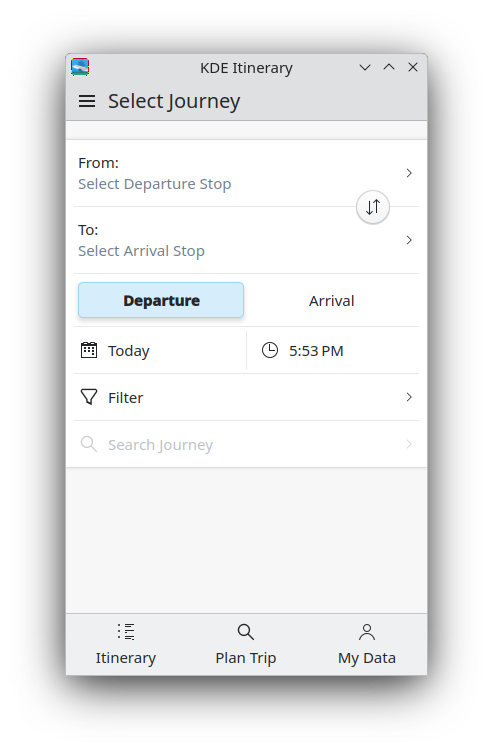

 ngraham
 best suited for use only by OS builders and true experts.

 We all know how amazingly flexible and powerful real package management is.


