During all my time with KDE projects, I've never made an app from scratch.. Except now.
Today my first KDE app ever, KomoDo, was released on Flathub!
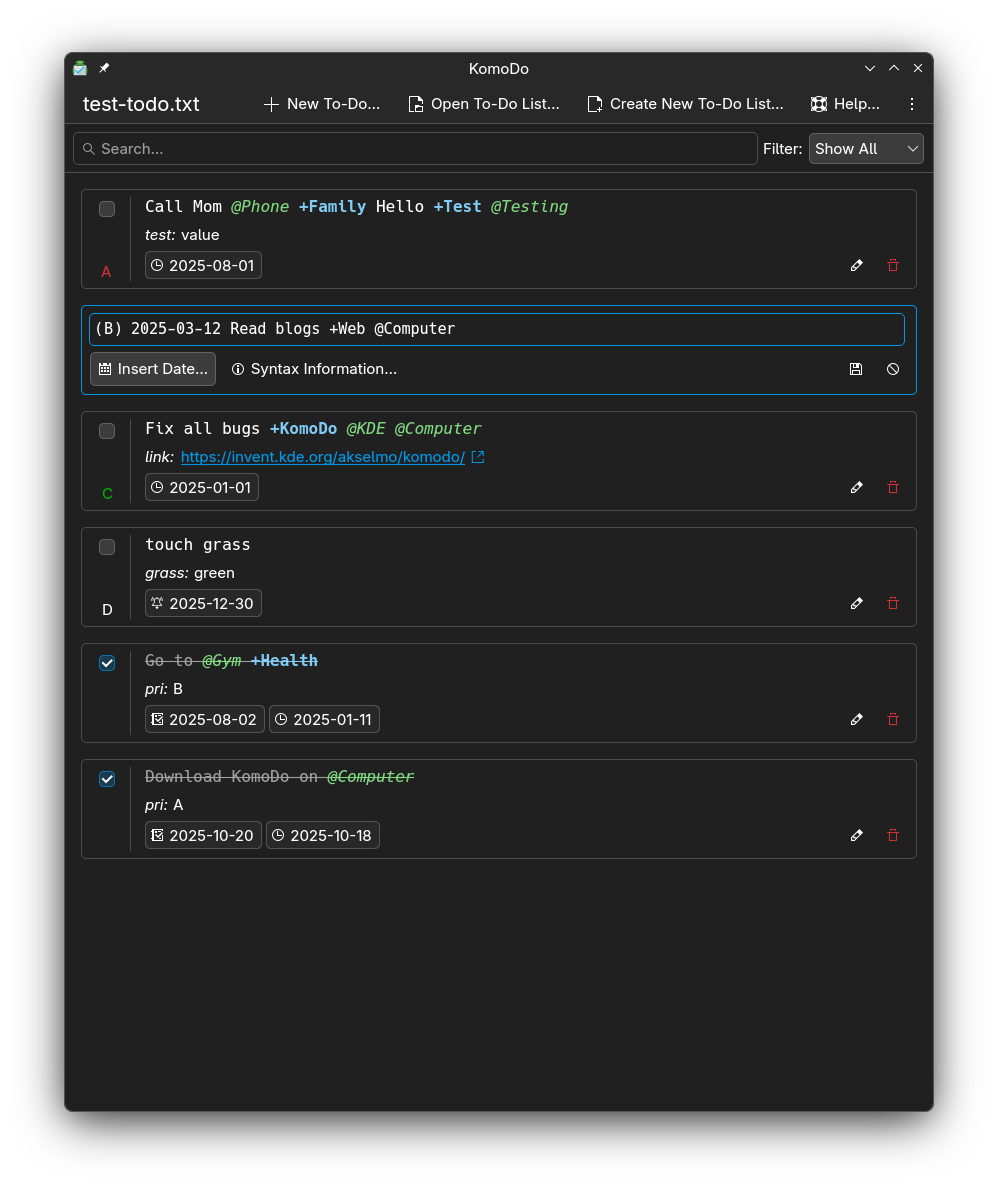
It's a simple todo application for todo.txt format and parses todo.txt
files into a list of cards. One task is one card.
The application has help sections for any of the rules todo.txt format follows, but you can
use as many or as little of them as you want.
I wanted to go through in this blogpost about the process, or what I remember of it anyway.
I've always just fixed bugs in Plasma or Frameworks or even in apps like Dolphin, but never made anything from scratch.
So I thought that writing this down might be helpful for someone in similar position.
As with any KDE project, it's open source and the repository can be explored right here: utilities/komodo.
Starting a Qt project using KDE libraries, especially QtQuick, is not that difficult in the end.
KDE has really good documentation for starting up.
I mostly followed this guide to get started: https://develop.kde.org/docs/getting-started/kirigami/setup-cpp/
There is also guides for Python and Rust if you wish to use those instead of C++.
I also highly recommend using kde-builder for building
and running the applications. It makes things so much easier.
Other than that, there's not much to tell about the setup.
Working on the application was not that bad either. I've worked on various C++ and QML files
during my work on KDE software, so I had easy time getting into the flow.
I think the most difficult part for me was the CMake files: I couldn't really understand them or
what they do, I mostly followed what other projects did and replicated them.
This of course caused me to do unnecessary things, like installing libraries I made for the app:
TodoModel which the QML code uses to parse the todo.txt file and generate the view was accidentally installed
among the system libraries, which was not ideal, since I'm not building a framework.
Luckily with tons of help and reviews from my friends in the KDE fam, we got CMake to build things nicely.
Then with kde-builder the feedback loop of code->build->test was fast enough, especially in small app like this,
that I could iterate on the application in a good pace.
I also had a lot of help from a friend with the CI and sysadmin stuff. That side of development is
very confusing to me so I'm glad with the help. I dunno if you want to be named so I didn't, but you know
who you are: Big thanks. :)
Since Qt is reliant on the model-view system, I had to make a "model" that parses
the todo.txt file and spits out Todo objects, which can then be parsed
by the QML code, which is the frontend code.
If you have never worked on model-view systems, it can take some time to understand.
To me, the model-view as words was always a bit confusing: I would have understood it better
if it was worded something like data-ui. But tech jargon has always been my weakest point.
The parsing is done by a RegExp nightmare I concocted with help of stack-overflow and tears.
Here it is, in its nightmarish glory, enjoy the nightmare fuel:
QStringLiteral("(?:^[ "
	"\\t]*(?P<Completion>x))|(?P<Priority>\\([A-Z]\\))|(?:(?P<FirstDate>"
	"\\d{4}-\\d\\d-\\d\\d)[ "
	"\\t]*(?P<SecondDate>\\d{4}-\\d\\d-\\d\\d)?)|(?P<Projects>\\B\\+[\\w\\d\\S]+)|(?P<"
	"Contexts>(?<=\\s)@[^\\s]+)|(?P<KeyValuePairs>[a-zA-Z]+:[\\S]*)");
Yyyeah. It's.. Something.
Due to the nightmare fuel that RegExp can be, I decided that unit testing would be great addition.
So I fought with CMake a bit and then made myself a proper parser testing file.
Thankfully Qt has nice QTest library that can be used to create tests.
They can be hard to parse at first, but when you understand how they work, they're really
quick and easy to work with.
Testing saved my rear a few times during this project, especially when modifying anything parser related.
When the model worked fine, I started concentrating more on the look and feel of the app.
The application went through various phases: At first, everything was done through a dialog, except
viewing the cards. It was kind of distracting that every time you wanted to modify or make new task,
the application would pop things up.
Over time though, I think I got it into a good spot: Most actions can be done in the task list, but when
user wants to delete a task, the app asks the user first if they are sure about it.
Then there is help menu and quick info for syntax related things.
Otherwise there's really no settings: I did not want to add any settings if I could avoid it.
The only setting the app saves to config file is the file you opened last time.
I also consulted the KDE Human Interface Guidelines (HIG) few times, but
it was never "in the way." It just helped me to make decisions sometimes when I wasn't sure what to do with
the design.
Also my lovely wife @tecsiederp made the application the most adorable icon ever.

Look at it. Just a lil guy.
Also, if you don't get your tasks done, he will get sad. So you better do those tasks!
It just makes me so happy and motivated to work on my tasks when I see this lil guy in my taskbar. :D
The icons however have to follow our guidelines, also mentioned in the HIG.
Luckily my wife is good with SVG files, and if she wasn't I already had two people wanting to help me with it, which
I very much appreciated. If I had to make an icon myself, it would.. Not be good. :P
Something I mostly struggled with though was getting a nice syntax highlighting for the task text.
I wanted to use our KSyntaxHighlighting library, but it would not match all colorschemes: Users
may use their own or third party colorscheme for the app, but the syntax highlighter does not have a colorscheme
that matches it.. So it would look bit odd.
So I made my own simple one that appends some color tags to the string, and the QML engine does the rest.
The text can have HTML tags like <span> in it which QML can parse automagically.
I think the app turned out to look pretty good. It also supports keyboard navigation
for getting around the app. (Though there might be some bugs with it still.)
KDE has documentation for the release process, so I just followed it to the letter.
During the release process, I have to wait for at least 2 weeks for people to give me reviews,
and so they did. And then I fixed things. And some more.
Eventually the app was good to go (though it was never directly told me, it was just implicitly agreed),
and I followed the last bits of relese process, setting up signing keys and such.
And now it exists as a tarball here, so any interested distros can go grab it: https://download.kde.org/stable/komodo/1.0.0/
I also recommend this patch to go with it, to make sure it doesn't install the static libraries in the system:
https://invent.kde.org/utilities/komodo/-/commit/57c6fa82719155bd32cb35b4c64cddae956c53e0
With Flathub, the submission process was rather painless in my opinion. I followed their
requirements and submission documentation and it all just
clicked together. Eventually someone was reviewing my PR and then.. The app is in Flathub.
I had to make a patch for Flathub specifically, but it was also really painless so I didn't mind.
What it all mostly took from me is time. Otherwise it was just nice and easy.
So at least in my experience, the whole process was rather easy. I didn't want to go into
nitty gritty details too much.. Because I don't remember everything + you can see the source code + the process itself
happens in the open.
I'm definitely interested in making more KDE apps, but also I have my game project(s).
And I really want to get back into gamedev. Like spend much more time into it.
At least now I have a todo app which fits my needs to keep track of the gamedev projects. :)
Thanks for reading! And if you're looking for new todo application, give KomoDo a try! :)

 @sitter:kde.org


 redstrate