I attended the Plasma sprint this year in Graz, Austria!
It has been a couple of years since I have last met KDE contributors in-person (Akademy 2022), so I really looked forward to finally being able to meet again. This sprint was the first time I met Bhushan, who is a long time contributor to Plasma Mobile, and was the one that initially guided me through contributions! He recently got funding to overhaul and improve the power management stack we have in Plasma Mobile, which you can read about here. I also met Luis for the first time, who has been contributing to the project for quite a while, notably having contributed the system navigation gestures we have now!
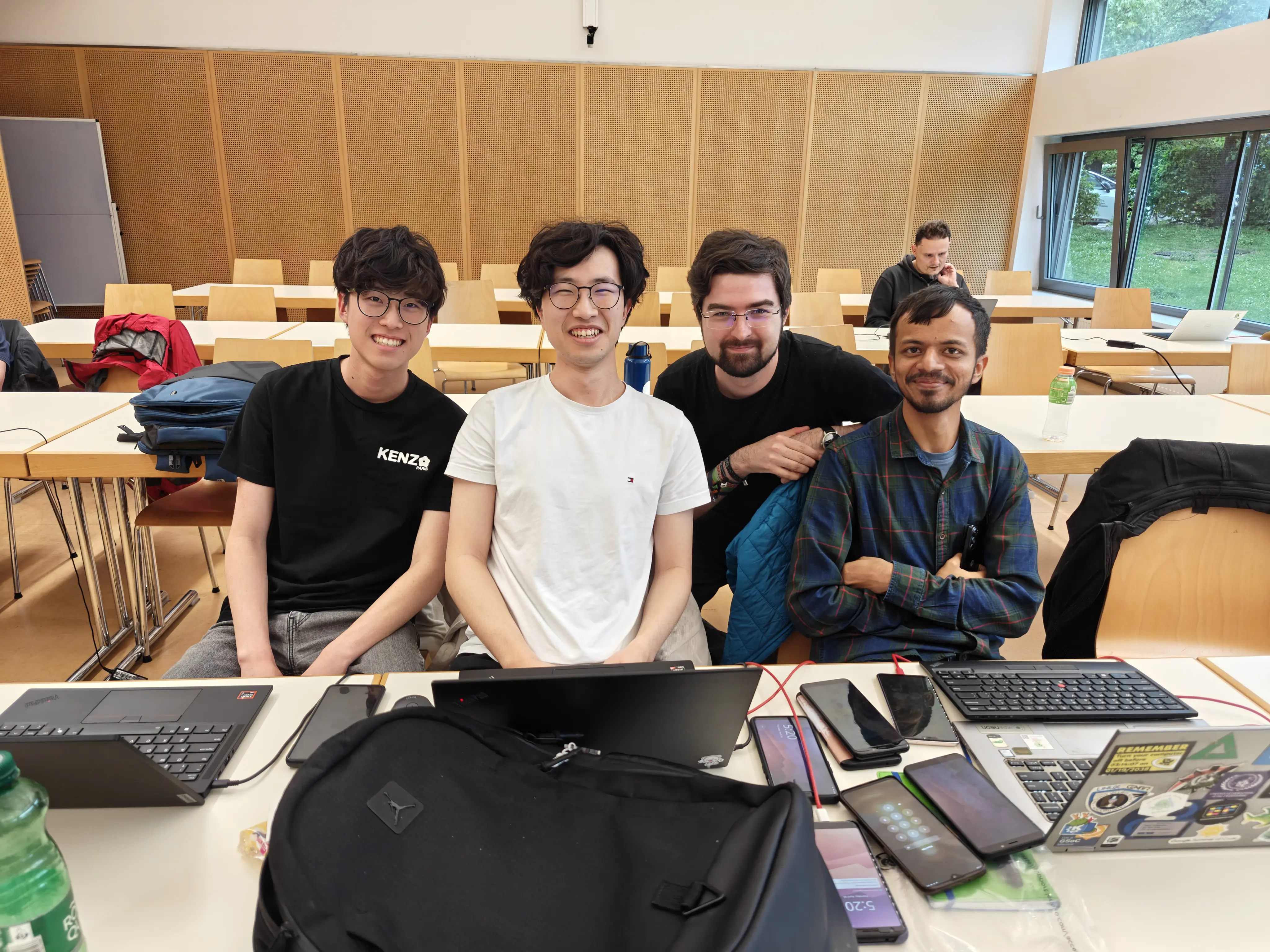
I brought my brother along as well, who is starting to also make contributions to KDE. After the sprint, we travelled around a bit (I will eventually have another post about it, link coming when that happens). This post will focus on just the sprint itself.
Be sure to also check out blog posts about the sprint by other Plasma developers over at planet.kde.org.
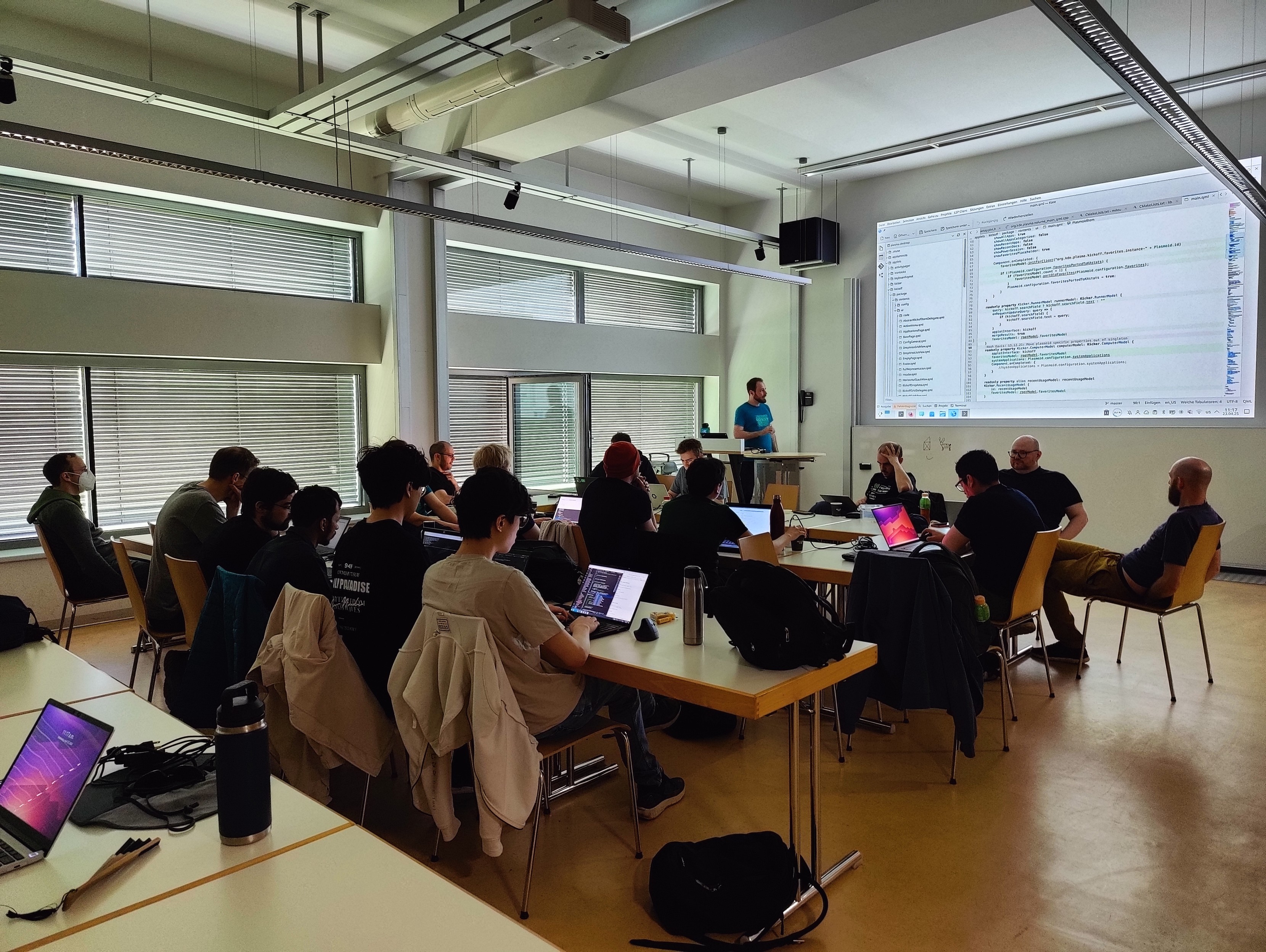
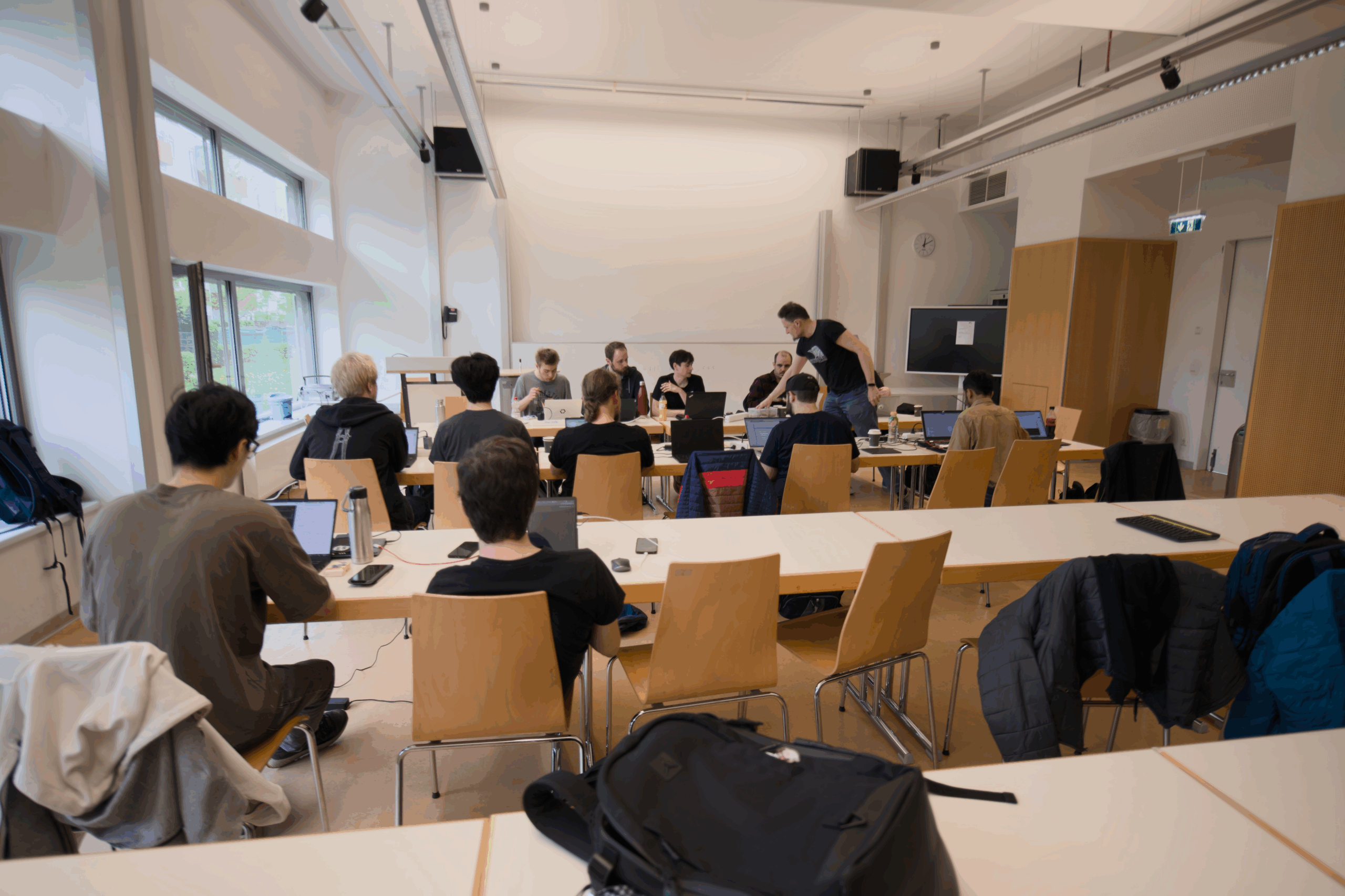
Photo by Kevin Krammer
Lockscreen overlays and more 🔗
A few years ago, Aleix implemented the ability to allow windows to be overlaid on top of the lockscreen. We utilize this for the Phone dialer application in order to have the call screen show up over the lockscreen. In the past, I had made some attempts to also have the power menu, status bar, and quick settings panel also shown over the lockscreen, but was unsuccessful. At the sprint, we were able to make it happen!
For the power menu, Bhushan first investigated why the holding the power button on the lockscreen did not get passed to the shell. After a rabbit chase through many different places, he was able to create a fix. With Luis and the KWin developers, he also figured out why lockscreen overlays would get stuck visually after they are closed (fix).
After those fixes were done, Bhushan and I spent some time figuring out why my old merge requests did not work. We were eventually able to fix it up and get it working (video in this merge request)! We also investigated overlaying the status bar and quick settings panel from the shell to improve the lockscreen load time. While I was not able to finish the implementation at the sprint, we got the fundamental parts working too!
I also did some more investigation into the performance of the lockscreen. We currently load a new status bar and quick settings panel when the device is locked (as part of the lockscreen theme), which have some components that load quite slowly.
Merge requests related to this investigation:
Kirigami 🔗
Marco was at the sprint, and so I had the opportunity to discuss some mobile related issues with him.
Marco made the following fixes:
Broader Discussions 🔗
We were able to discuss some topics together at the sprint with other Plasma developers!
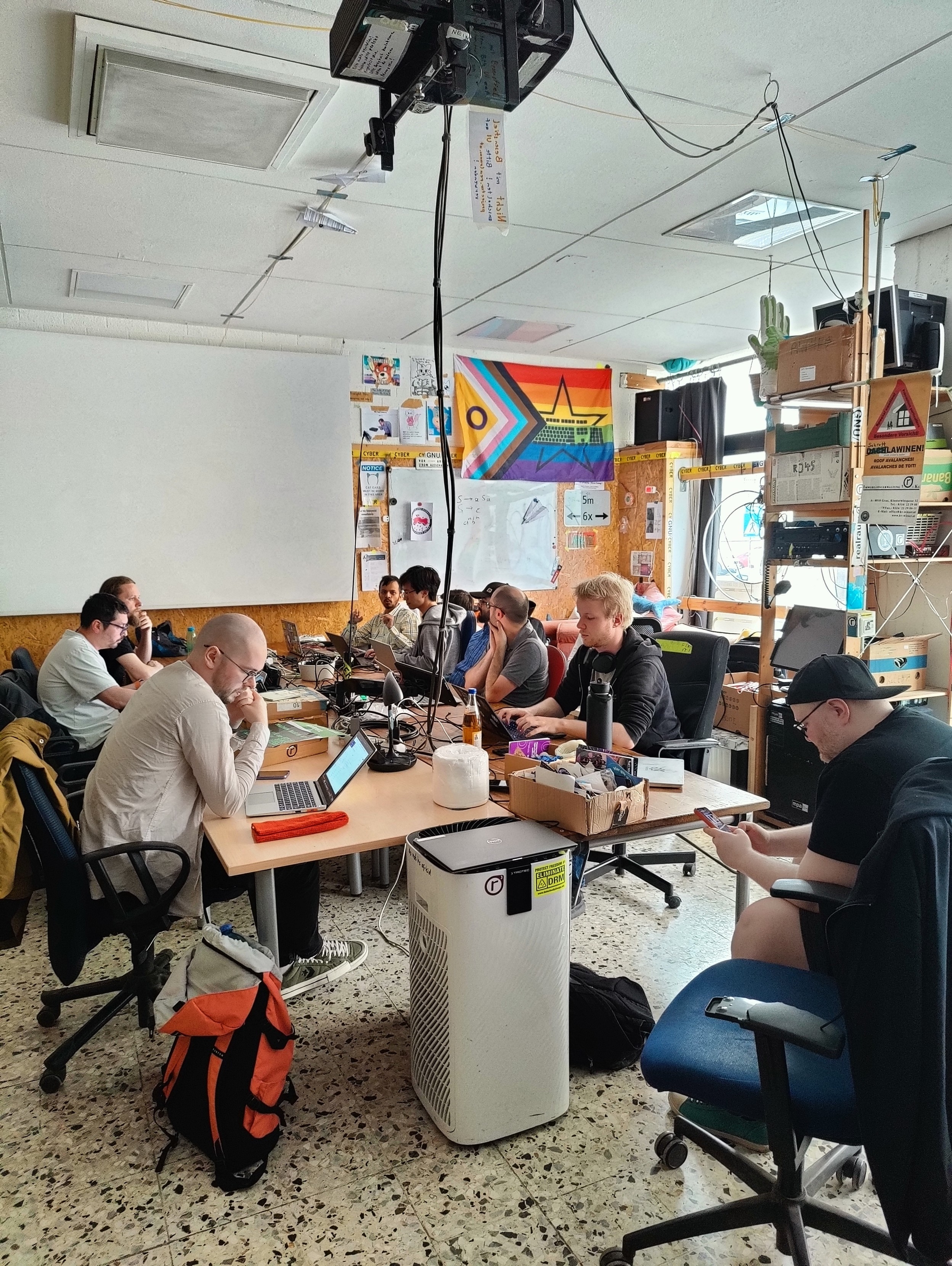
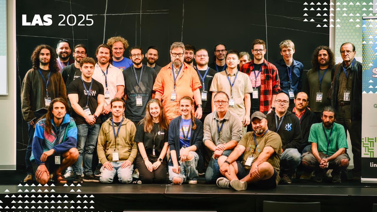
Photo by Kevin Krammer
Haptics stack 🔗
We discussed the stack that we use for vibrations and LEDs (issue). We currently use hfd-service (from Ubuntu Touch) as a backend to interact with the hardware, and QtFeedback on top for the system and applications to interact with them. However, QtFeedback is no longer developed by Qt (though we have forked it within KDE to port it to Qt 6), and gives a very simplistic API for vibrations (on and off with set durations). We also have had the issue that vibrations are not customized per-device, and so events that work fine on one device might feel too heavy on others, or not resonate at all.
We ended up deciding on giving feedbackd (used in Phosh) a try, using it directly in the shell and implementing a feedbackd backend in our fork of QtFeedback (KTactileFeedback) for backward compatibility. This allows us to potentially adopt the event system that feedbackd provides, so that they can be adapted to devices based on how they feel. While feedbackd does has an DBus API for applications, we will eventually want to look at having a generic portal API for applications on having haptics.
I created the following merge requests:
Notch Support 🔗
Plasma Mobile does not currently have any support for notches or rounded corners. Phosh developers have already proposed a new Wayland specification that will allow the shell and applications alike to receive information about screen cutouts. We discussed it with the KWin developers to get it on their radar, and decided upon pursuing an experimental implementation of it in KWin, and using it in the shell to make any UI adjustments necessary. Qt 6.9 also recently introduced a screen edge “safe areas” API (for Android and iOS), and so we can eventually also implement a backend there to support it on Linux.
Envmanager 🔗
Plasma Mobile has a service called envmanager that manages configurations that are used by both Desktop and Mobile, and swaps configuration as necessary between the sessions. There are many drawbacks to this approach because it affects the user’s Plasma configurations directly, and needs to run before session startup (and so bad stuff can happen if it is uninstalled before logging into the desktop session). We discussed having a more robust approach, and one of the ideas floated was to add a path to XDG_CONFIG_DIRS in the Plasma Mobile startup script, where we can have a “Plasma Mobile” folder that only the shell controls to provide our intended configuration. Our configuration framework (KConfig) supports overlaying config options from various locations, and so we can have the user’s config be overlaid on top of our “Plasma Mobile” config. envmanager can then directly write to this folder without having to affect the user’s configuration, and without affecting the Desktop session.
I created a merge request to implement this:
Power management 🔗
Bhushan has been doing a lot of work in this area recently, and did some work on this at the sprint (hopefully his blog post will come soon!). Jakob, who has done a lot of work on overhauling the power management stack in the past year, was also at the sprint. Together, we had a conversation about the future of the power management KCM. Currently, there are separate desktop and mobile KCMs for power, mainly because the desktop one contains far too many options that are not relevant on mobile. The mobile KCM has suffered from some bitrot in the past, and so I had moved the code to be located in the same repository as the desktop one in order to share code. We discussed potentially merging the two KCMs, but decided on continuing with the status quo for now because of the complexity involved in both having good UX, and in how to streamline the desktop settings to have some features apply more directly to mobile. It is a much larger topic that could perhaps be suited for a future GSoC project.
I created a merge request to share more code with the desktop KCM for the time being:
Thank you 🔗
I am really glad to have been able to finally attend an in-person KDE event, it was really productive! Thank you for having me!
I know I have not really shared many updates about Plasma Mobile in the past few years, mainly due to being busy with school and work. Rest assured, the project is still moving along, I plan to hopefully push through a new blog post on plasma-mobile.org in the coming weeks!

 TSDgeos


 @felixernst:kde.org


 Consider