After the criticism in the last post about the limitations of KUserFeedback (KUF) for doing data-driven UX work — let’s get more detailed and constructive:
What insights do we as KDE UX people needto do even better than we are currently doing?
Let us start with what we already get from KUF. We get usage data, like how many people are using Wayland vs. X11. But we only get usage data according to our telemetry policy. So we do not get any deeper insight into how users configure their sessions when using Wayland compared to X11. But this is the kind of information we would need to do proper data-driven UX. What settings are users changing? How many users have icons on their desktop, and which ones? Are people manually mounting network drives? Which System Tray icons are interacted with the most? And so on.
But while this information is already impossible to gather with our current approach, we’re only scratching the surface. We need even deeper UX insights, like understanding where people click. And where they click next (in terms of Markov chains). That way we can understand if people are using Plasma the way we intended when we designed it. Or, how long does it take them to get from point A to point B? Are they taking detours because we’ve laid out paths that users don’t understand in the way we intended?
None of these questions can be answered with our current approach to telemetry.
The basic problem is that we currently send all the raw data to the KDE servers to get the answers we need. And the data we need to collect in order to get the above described desired user insights could of course be used to “identify a specific user” – which is not allowed by our telemetry policy for good reason.
And yet we need even more data. We want to target all users, or only users who exhibit certain behaviors. We want them to fill out questionnaires to better understand why they behave the way they do, to understand their goals and intentions. This would be extremely helpful in understanding bug reports. Or to support our design discussions with relevant data from real users.
All of this can only be achieved with a fundamental change in the way we do telemetry.
Existing alternatives, such as the opt-out Endless OS metrics system, also do not allow enough user insights and share the problem that the data leaves the property of the data owners, the users. That is why we have been working on the privact ecosystem, which allows all the insights described above, while fully preserving users’ privacy. And because of that, we can not only ask for more intimate data, but we can also make participation opt-out and so get data from substantially more people. And why is that? Because with the privact ecosystem, there is no technical possibility that any individual’s personal data can ever be shared remotely. Never. But it would finally enable good user-data-driven UX work. For the sake of KDE and our users.
I am from now on writing my posts on GitHub pages. Apart from it being useful to keep my posts versioned using git, I had some issues with my previous blog.
The idea was to simply use write.as and publish a post from time to time. This worked well except for more than a month ago me wanting to do a post about my KRunner plugins.
It naturally contained a lot of links and thus the publishing was prevented and even the account blocked due to apparent spam. There was no response via mail for over a month.
So here we are not on another blog where I hopefully write more often and also be able to spent more time on KDE!
In the usual frantic activity in the tech sphere I say the innovation we see is limited, while we see an enormous growth of the monopolies in form of vertical silos. Apple’s eco system is closed, and the same applies to for instance Meta’s.
As a result, innovations on the market level remain limited. For instance, the Internet and the Web have innovated and advanced sub optimally the recent years. It is primarily used as infrastructure for these corporations. This needs to change.
Or take that e-books — books and reading, the very foundation of our civilisation — are locked by proprietary DRMs. Perhaps open DRM via blockchain combined with suitable governance is the way to go. This needs to be looked at further.
One effect of the lack of the development and advancement of open technologies is that the common denominator remains low. Innovation stays within the vertical silos, consumers become dependent on them, and the market remains stagnated.
It is my advice to those who want to see real innovation that isn’t locked to companies, involve themselves in the development of open specifications and technologies.
After five months of active maintenance and many weeks triaging bugs, the digiKam team is proud to present version 8.5.0 of its open source digital photo manager.
Generalities
More than 160 bugs have been fixed
and we spent a lot of time contacting users to validate changes in pre-release versions to confirm
fixes before deploying the program to production.
Application internationalization has also been updated. digiKam and Showfoto are released with 61
different languages for the graphical interface. Go to the Settings/Configure Languages dialog and change
the localization as you want. digiKam needs to be restarted to apply the changes. If you want to
contribute to the internationalization of digiKam, please contact the
translator teams, following the translation
how-to. The statistics about
translation states are available here.
KDE Gear is our release service for many apps such as mail and calendaring supremo Kontact, geographers dream Marble, social media influencing Kdenlive and dozens of others. KDE needs you to test that your favourite feature has been added and your worst bug has been squished.
You can do this with KDE neon Testing edition, built from the Git branches which get used to make releases from. You can download the ISO and try it on spare hardware or on a virtual machine to test them out.
But maybe you don’t want the faff of installing a distro. Containers give an easier way to test thanks to Distrobox.
Install Distrobox on your normal computer. Make sure Docker or podman are working.
Then start it with distrobox enter all-testing And voila it will mount the necessary bits to get Wayland connections working and keep your home directory available and you can run say
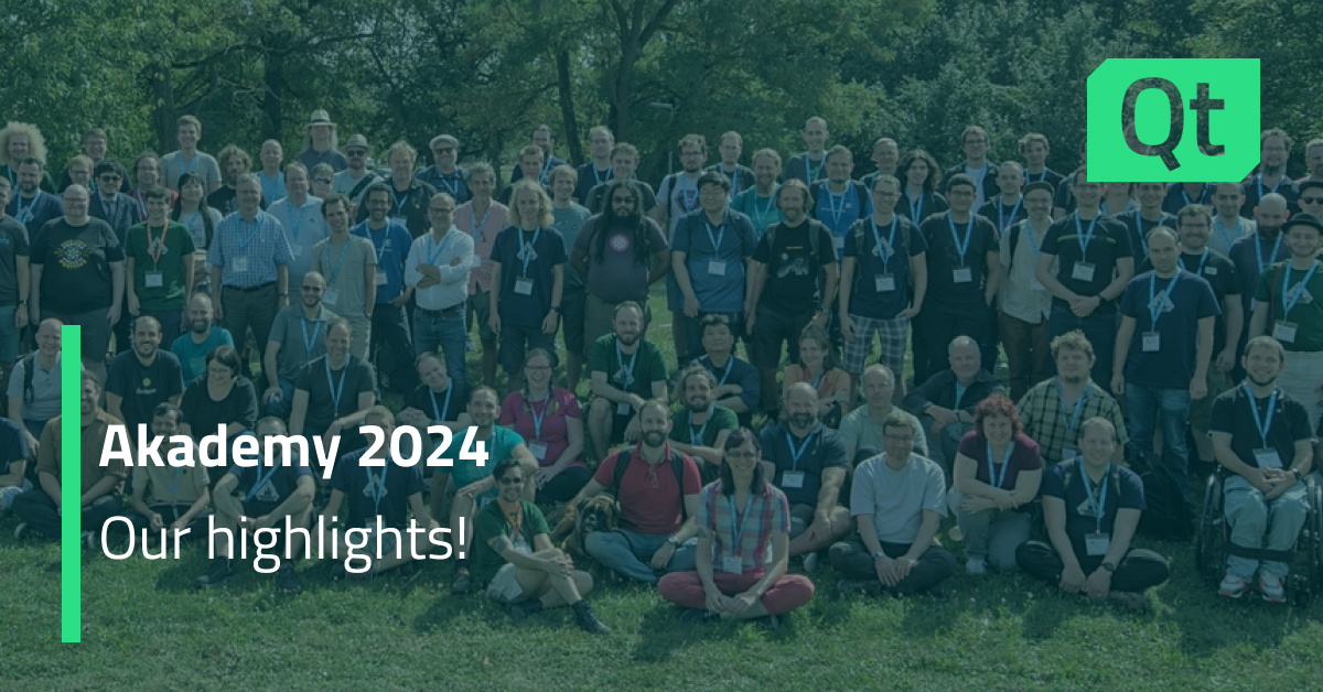
Earlier this year I had the pleasure of visiting the KDE Akademy 2024 in Würzburg. It had been a few years since my last visit to Akademy and it was great to see old friends and meet new ones. Besides socializing, my main task was to talk to as many KDE people as possible about the privact project and its integration into KDE. Knowing the KDE community, not surprisingly this resulted in lots of interesting discussions.
Most importantly, I gave a talk about the current state of privact’s integration with KUserFeedback. If you missed it, here is the recording:
As a follow-up, we had 2 BoFs on Monday to discuss the next steps. Felix was kind enough to join me to provide more technical developer insights than I can give.
As a first teaser for you: In the short term, the privact approach will allow KDE to do proper user research, thereby enabling us to do data-driven UX without compromising user privacy. In the longer term, privact aims to restoredigitalprivacy for everyone, even outside of KDE, even outside of FLOSS. You can learn more in upcoming posts or on the privact homepage.
The individual feedback on the privact approach during Akademy was very good, which is why we now want to start communicating with the largerKDEcommunity. So this post is not only to report about my attendance at Akademy, but also to start blogging again on Planet KDE and to check if the aggregation works.
It was once said over the grapevine that: "Our C++ API documentation has some issues, our QML API documentation has a lot of issues."
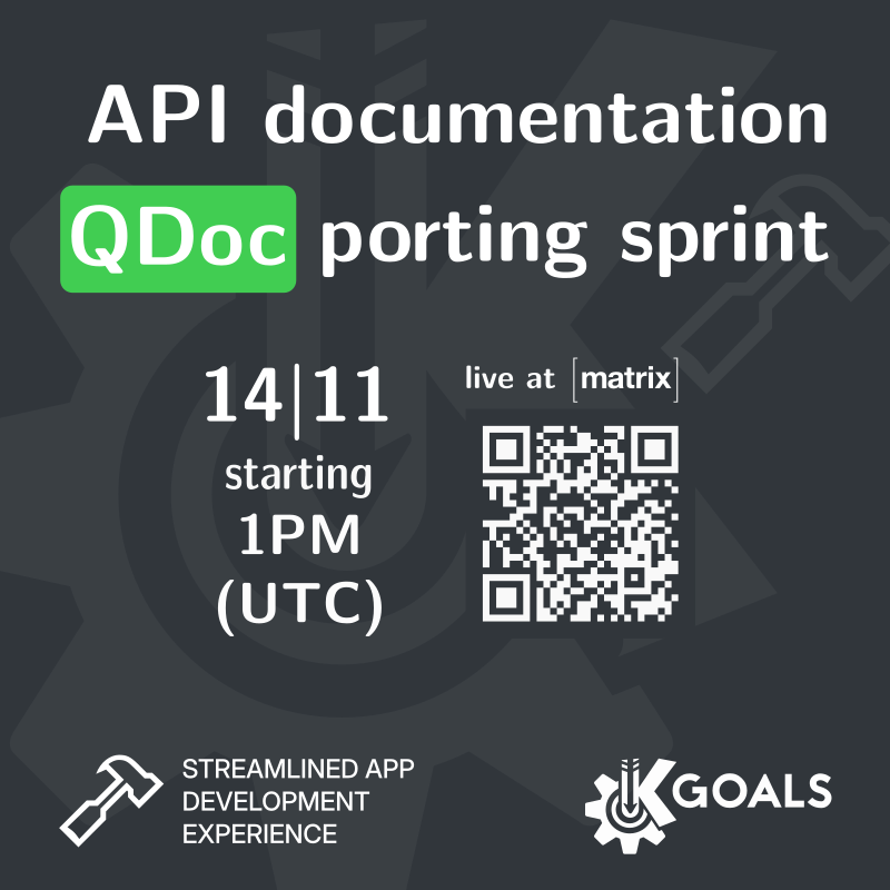
And it was true, but that is to change soon! As you might know, there is an ongoing effort to port our documentation from Doxygen to QDoc, and you can help with that.
We would like to invite you to join our porting sprint effort to finish this task. On November 14th at 1PM UTC, we'll be hanging out in the Matrix room working on this. Hope to see you there.
Here's our bi-monthly update from KDE's personal information management
applications team. This report covers progress made in September and October 2024.
Since the last report, 24 people have contributed over 1100 changes to the KDE PIM
code base. We also released a two bugfix releases of the KDE PIM Suite with
the Gear releases 24.08.1 and
24.08.2
Please note this is the last bi-monthly blog post for KDE PIM. We will continue to work
on KDE PIM but weekly improvements to KDE PIM are now included in the
This Week in KDE Apps blog.
We covered a few topics and made plans. In particular we touched upon contributions blockers,
we hope the milestone system will help and also working on the amount of repositories which
are not part of KDE Frameworks. Things are progressing in the right direction but slowly.
Feel free to reach out to help!
Milestones
Talking about the milestones. You can see what we got in store on the Gitlab
board. Some of them are progressing nicely
like the resurrection of Kontact for Windows or the port away from QCA.
If you see anything you fancy and you would like to help, reach out to us on the
#kontact:kde.org Matrix channel!
Applications
Itinerary
Our travel assistance app Itinerary got a new two-level trip/timeline view, an
extended public transport location search, a new full trip map view and better
Android platform integration. Read more in its own bi-monthly update.
But that's not the only bugs which got squashed. It's now possible to
wake from suspend when using RTC wake
and a crash has been fixed affecting systems where the kernel supports alarm timers.
Last but not least, the GUI has been improved around the run mode options in the
preferences dialog.
Merkuro
Claudio has been busy fixing regressions and improving the stability of
Merkuro. Notably, maps are now displayed again (if the event contains
coordinates). Also, the collection combobox in the editors are now initialized with
a valid collection and filtering features have been repaired.
KAddressBook and KOrganizer
The general improvements to support Plasma Activities is still on going.
It is not enabled by default as it requires Akonadi Resources support to
become really useful and the corresponding changes are not there yet.
KMail
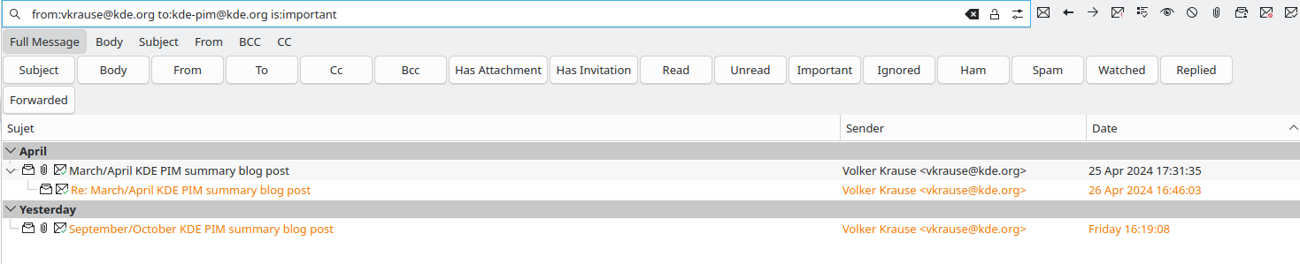
On the KMail front the search has been greatly improved. There is now
a custom syntax usable in the search text field. One can now use keywords
like subject:, body:, to, from, has:attachment, is:important,
is:replied and so on to make more precise queries.
For instance one could write "from:vkrause@kde.org to:kde-pim@kde.org is:important"
to get only the emails from Volker on the kde-pim mailing list which are also flagged
as important.

 @bjoernbalazs:kde.org
 alex1701c
 FransE
 Dear digiKam fans and users,