High Contrast Mode in Qt 6.10
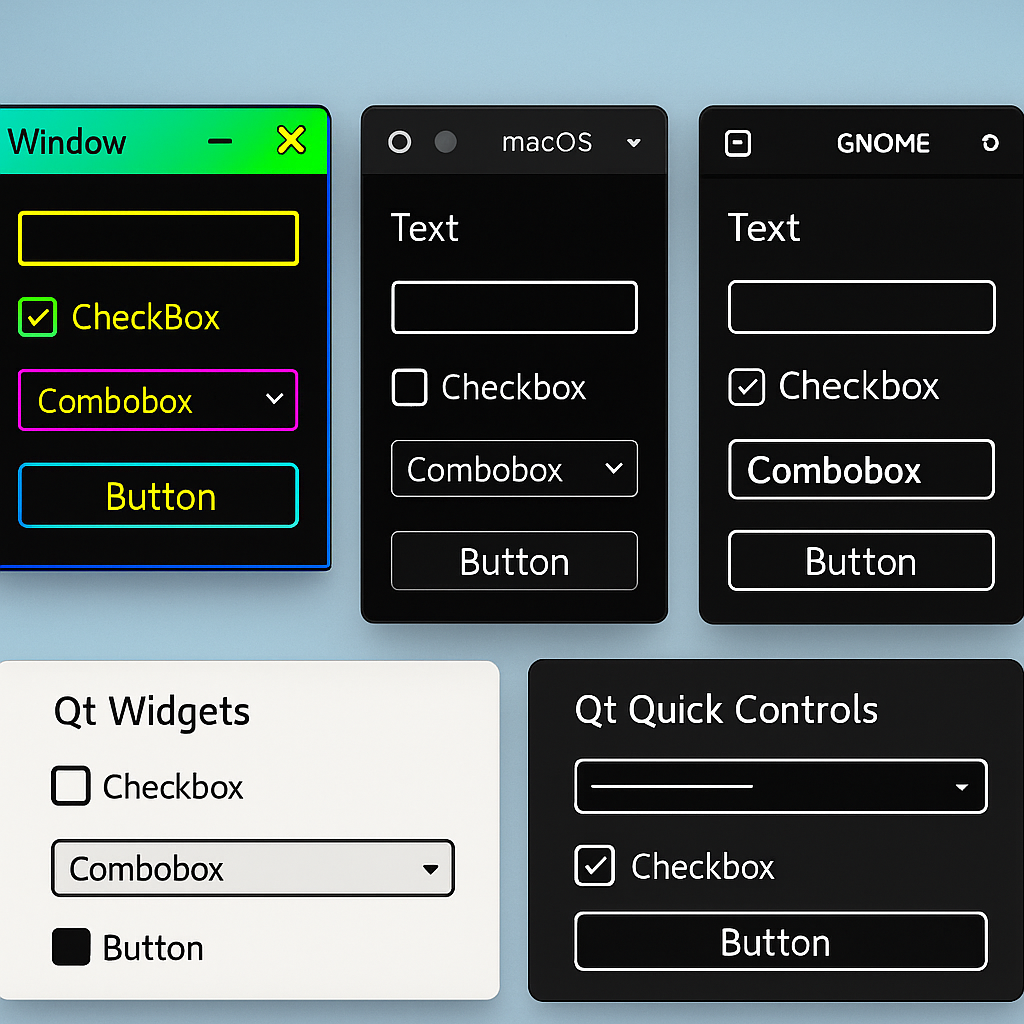
As accessibility continues to gain traction across major operating systems, high contrast mode has become a key feature for improving visual clarity and usability. With the release of Qt 6.10, applications built with Qt now readily get support for high contrast modeacross multiple platforms, ensuring more inclusive and visually adaptive UIs. In this post, I explore how Qt 6.10 supports high contrast mode, what it means across different systems, and what Qt now provides for built-in styles.
Check out this quick video on a high contrast mode example to get you started:
Enhancing Accessibility with Better Contrast
In recent years, major platforms such as Windows 11, macOS, and the Gnome desktop have introduced settings for a high contrast mode that enhances the contrast between foreground and background user interface elements. Adjusting these contrast settings typically updates the system color scheme and, in some cases, adds more pronounced outlines or other modifications to native UI controls. On macOS, iOS, and Gnome, users can enable increased contrast through a toggle in the accessibility section of the system settings, which reinforces outlines for most native controls. Windows 11 takes a more advanced approach with its Contrast themes feature, resulting in significant changes to the appearance of native applications when activated.