Going in depth on Font Metrics.
After tackling fonts and opentype features thoroughly, I decided to continue on with taking care of font metrics. This covered font size, line height, baseline alignment and shift, as well as text underlines and carets.
What are font metrics.
If a font is a designed collection of glyphs, then font metrics are the specifications to which those glyphs are designed. Well, some of them at the least. While there are ways to store stem thickness metadata into the font, in practice the font metrics that are most used are those used to lay out lines of text, and to determine the font size.
The main one of these is the EM size. This defines the coordinate system in which the glyphs are drawn. When setting a font size, you end up scaling the em-size to the font size value.
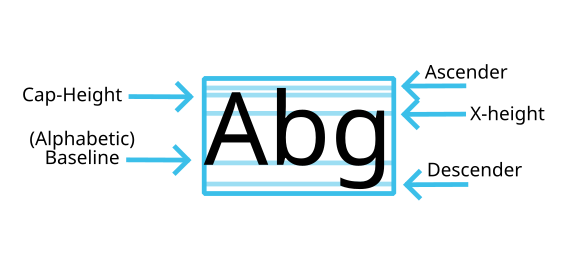
To place the origin of that coordinate system, the ascender and descender are defined. Usually, ascender plus descender equals em-size, but as we’ll discuss later, that’s not self-evident.
Beyond that, there’s often extra metrics stored like the x-height, cap-height, and super- and subscript positions.
But up till now, we’ve only discussed metrics that are mainly common in European scripts. Other writing systems have other metrics, and while some of these metrics can map to the European metrics, others, like em-box center and hanging baseline are unique to those writing systems.

North Brahmic scripts like Devanagari have a headstroke that glyphs of different sizes are aligned at.

Meanwhile, CJK ideographs are designed inside an Em-box, which itself contains a character face-square. The latter is usually used for a sort of optical alignment of CJK ideographs. The embox is used to calculate the centers, which in turn is used to align the character vertically. Horizontally, each of these points, plus the Latin baseline, could be used to align the text.

These too, can be stored inside the font, and need special attention how to use them within text layout.
Finally, text underlines and strike-throughs, as well as slanted carets have extra metrics. We’ll touch upon these at the end.
Font size and line height.
So, as mentioned before, the font size is the value that the em value the font was designed at is scaled to. So if a font has an em size of 1000, then that means all glyphs in that font are designed in a coordinate system relative to 1000. If you want to scale them to, say, 12px, you are effectively scaling all the glyphs’s coordinates by 12/1000 and then rendering the result to a raster bitmap. Bitmap fonts work a little different, and there you will need to see which of the available bitmap sizes (‘strikes’) is closest to the requested size. In the case of bitmap emoji fonts, it is typical to find the closest size and then scale them to the required size, but for non-color bitmap fonts I made Krita follow Qt; and apply no scaling.
Now, there’s a bit of a problem here: Freetype doesn’t allow setting the point size below 1, so you need to scale the resulting glyphs if you want to be able to have it below 1pt. However, while said scaling of color emoji is done via FreeType transforms, and Raqm handles and applies those transforms, I can’t get it to work for the below 1pt transforms. My suspicion here is that the scaling messes too much with the freetype coordinates which are stored in integers (64x the pixel size), so I had to apply that transform separately once we go from Freetype coordinates into floating point land. Not very happy about that, because that means two separate transforms for basically the same thing (getting proper font size).
Line height
So, line height is the height of the lines. Those of us that have done word processing before will know that it is not unusual for a manuscript style guide to say: “Double spacing”, meaning there’s a full line’s worth of white space between lines (useful to write all those editorial notes into!), while final texts often are at 1.2 to 1.8 spacing.
But then, what should the line height be? Is it a multiple of the font-size? Or whatever the ascender and descender add up to? Because those two things are not the same thing!
But actually what is the ascender and descender? Is it the same as the maximum and minimum extend? It seems that early text layout programmers thought so, because for the longest time, the OpenType values called “WinAscent” and “WinDescent” both served as the ascender, descender and the clipping region on Windows. Apple instead used the values ascent and descent from the hhea and vhea OpenType tables.
Now, thankfully, the CSS specs define the metric we need to use: sTypoAscender and sTypoDescender from the OS/2 table (the fifth way of selecting these values, for those keeping count!), regardless of whether any related bits are set. This is what most implementations use… Except Apple, which uses hhea and vhea still, even within their web browser.
Now then, we’ve got the ascent and descent for horizontal. But what should we use for vertical? The vhea table values? CSS-inline-3 says nothing about the vertical line-height, but thankfully, the SVG 2.0 spec does:
Within an OpenType font, for horizontal writing-modes, the ascent and descent are given by the sTypoAscender and sTypoDescender entries in the OS/2 table. For vertical writing-modes, the descent (the distance, in this case from the (0,0) point to the left edge of the glyph) is normally zero because the (0,0) point is on the left edge. The ascent for vertical writing-modes is either 1 em or is specified by the ideographic top baseline value in the OpenType Base table for vertical writing-modes.
That’s right, a sixth way of selecting ascender and descender!
Still, it is coherent with the way that the OpenType specs want us to calculate the em box (more on that later), where the height of the box should use sTypo values (if the baseline values are missing) and the width should use the baseline values.
There is a small annoying thing here with that vertical-writing modes tends to mean writing-mode: vertical-lr and vertical-rl, regardless of text-orientation, but I suspect that this is intended for the situation of text-orientation: upright, or mixed resolved to upright, because otherwise vertical but rotated text is not going to lay out correctly (For vertically oriented upright text this makes perfect sense).
Units
Another thing that needed tackling was the unit to set CSS lengths with. Many properties inside CSS text can use other units besides the default. Most interesting here are the percentages, but for something like tab size, you can choose to use a multiple of spaces.
Now, within Krita, all vector coordinates are in points, not pixels (see the appendix for their difference), and we keep track of a per document DPI to calculate conversions between the two. This is pretty standard for image editing applications like ours.
SVG mostly facilitates this: An SVG user-unit is explicitly not defined as anything particular, and the difference between the coordinate system set to the viewbox and the width and height set on the top level SVG element is what defines the scaling it’ll experience when used in an HTML context.
Except, CSS length values as used by SVG text do have explicit units. And the default user unit for those is CSS pixels. This is throughout all of CSS, so if the specs say “you can use an SVG path here”, then the coordinates of that SVG path are assumed to be pixels (especially relevant because SVG path definition does not allow units to be defined).
For us, that means we cannot actually store any of the absolute CSS values, that is, mm, inch, pixel, but instead convert everything to point under the hood and then store that as SVG units, and set the viewport and width/height accordingly. This mostly works, except with the line-height and tab-size values, which allow a number in addition to a length with unit. Which means those need to be set to px explicitly in those cases.
Ideally, we’d have a way to define the default CSS unit for unit-less situations like SVG, so that for our case, we could write line-height: 12pt; font-size:12;, and the parser would be able to understand that font-size is the same value as line-height here.
However, because we are converting everything to points, we can afford to offer pixels to be actual document pixels, and not the hard-coded-to-96ppi css pixels. This is useful because a number of our users don’t understand the difference between points and pixels, or PPI in itself. In the latter case, those tend to set the PPI to the pixel width, meaning that the document is exactly one Postscript point wide, and we get a bug report that the text is too large. For those artists, being able to divert them to use pixels might be a good solution (and to point out that their PPI value is useless). Then there’s of course the artists that want to use retro-style fonts for aesthetic purposes, and yes, pixels is useful there, but admittedly that also needs a little bit more work beyond the scope of this particular blog post.
Relative units.
There’s more to CSS values than absolute units. It has relative units. In particular, font-relative units. These units use metrics from inside the font to determine their resolved value. Think of the height of a small x, or the capital height. I in particular wanted to get these to work because eventually the idea is to have style presets, and being able to store something like “font-size: 0.5em” as a preset seems mighty useful.
For these (and the baselines later), I collect them inside a metrics struct. These are then used before text layout begins proper to handle inheritance and convert all such units to points.
Percentages are a separate thing from font-relative units, and are a bit weird. In SVG 1.1, percentages were largely relative to the root viewport, which is somewhat odd, but it is what the spec requires. In SVG 2.0, most of them are now linked to their CSS reference values. In the case of text-indent in particular, the inline-size of the wrapping area needs to be used to determine the percentage value, so that one is resolved during line layout.
Font Size Adjust
So, because the font-size is linked to a somewhat arbitrary value that is part of the design of the font, it can be useful to set the font-size by a more tangible metric.
Font size adjust allows just this, and is meant in particular to ensure that the given metric is at a decent size. CSS font-3 and 4 only allow setting the proportion of the x-height, which in turn is valuable because that can great affect the readability of the text. The idea is that you want to ensure that the x-height for all fonts is, say, 60% of the font-size. Then, you take font-size-adjust and set it to 0.6. Then during text layout, when the font-size is set, the x-height within the font is used to adjust the total font size. Setting font-size-adjust to 1.0 should then scale the font so that the x-height is the specified css font-size.
CSS-Fonts-5 has a proposal for more of these metrics, but is still very much in draft, so I’ve avoided it for now.
One thing I do want to mention is a bit of a problem: All of the proposed metrics can be adjusted by variable font’s parameters. That is to say, you can have an optical axis on a variable font, that sets the x-height higher on small sizes and lower on big sizes. Then, changing the font-size will change the x-height. This means that you could end up in some kind of cycle trying to get the right font size for the given font-size-adjust.
I don’t know how to fix this. For now, what I do is that I set the size (but not the axes), test against the default x-height, set the adjusted x-height and then set the axes, which will mean that something like optical size is at the very least the size the font is set at, but that may not be the size which was intended by font-size-adjust.
Baseline alignment and friends.
Baseline alignment is all about aligning glyphs to one another perpendicular to the line width. By default, most fonts are set up to align to the same baseline as that of Latin, because this gives the least trouble in mixed-script situations. However, when in single-script situations, especially those with font-fallback, it can look a little messy. Baseline alignment can reduce this messiness:

Now, of course, it is rather hard to find these baselines, and trickier still to synthesize them right. The Sharad76 font above, for example, is a handwriting font, so it is hard to synthesize a hanging baseline for it. So, OpenType has a place to store these: The BASE table.
According to that spec, the base table is supposed to make it so that glyphs of different scripts and fonts can align correctly. And to do so, it allows for defining, per script and run direction (vertical or horizontal), values for different baseline tags, as well as the preferred baseline for that script, and min-max extents.
Unfortunately, the spec doesn’t specify how the base table is supposed to see the OS/2 and hhea/vhea tables in this system, like, which baseline those are aligned to… This is a bit of a problem for the spec, because it imagines it to be able to have script to be defined by a more natural origin for their glyphs, but without ascender or descender being aligned to anything, it becomes hard to imagine how you’d make an editable text layout with a font like that.
Still, it exists, the font development recommendations suggest that fonts are by default build for Latin baseline. The only implementation I personally know of is Adobe products’ CJK composer, where the ideographic em-box and character face can be aligned against.
Then, there’s four different W3C baseline alignment specifications. The oldest of these is from XSL 1.1, which was then adapted by SVG 1.1, which in turn was then adapted by CSS-inline-3. SVG 2.0 also has some details, but like how SVG 1.1 adapts XSL, SVG 2.0 adapts CSS-inline. The last one is significantly different from the other two, but all of them are rather confusing. So confusing in fact, that I actually wrote this part before finishing up the implementation, just to get a grasp on what I’m actually supossed to implement.
Lets start with the oldest. The main thing XSL’s spec wants, is that there’s a core baseline table for the whole paragraph, and each glyph aligns to its prefered baseline on that root baseline table:
The glyphs determined by the fo:characters that are in the content of the two formatting objects are aligned based on the script to which the glyph belongs.

This is why “dominant baseline” doesn’t inherit; every time the dominant baseline is defined, a new table is calculated, and if it is not, the old baseline table is inherited. It’s alignment baseline that allows manual alignment of glyphs.
SVG 1.1 is similar, except that “before-edge” and “after-edge”, which are basically line-relative alignments (lines, which SVG 1.1 doesn’t have), get interpreted to be the equivelant of ascent/descent.
The description of alignment-baseline: auto, however, shows why it is important to read the XSL spec, as the definition in SVG 1.1 is rather confusing, it says literally two different things:
The value is the dominant-baseline of the script to which the character belongs – i.e., use the dominant-baseline of the parent.
While XSL is much clearer here:
The computed value depends on the kind of object on which it is being used. For fo:character, the value is the dominant-baseline of the script to which the character belongs. If the value of the “script” property on the parent formatting object is other than “auto” then use the baseline for that script; otherwise, use the dominant-baseline of the parent. For all other objects, the value is computed as for the “baseline” value.
So basically, align glyphs to the inherited baseline table with their preferred baseline, everything non-glyph is aligned using the dominant baseline.
CSS-inline-3 however, gets rid of this inherited baseline table, and instead says ‘any inline-box is always aligned to its parent’, ‘any glyph is aligned to its parent inline-box’… I think. The actual text says, for dominant-baseline:
For inline boxes, the dominant baseline is used to align the box’s text (and, unless otherwise specified by vertical-align, any inline-level child boxes) by aligning each glyph/box’s corresponding baseline to the box’s own dominant baseline.
For alignment-baseline:
When performing baseline alignment, these values specify which baseline of the box is aligned to the corresponding baseline of its alignment context. (In an inline formatting context, inline-level box fragments and glyphs share an alignment context established by their parent inline box fragment along its inline axis. …)
And finally, a little earlier, in the Baseline Alignment intro text:
For a glyph, the alignment baseline is always determined by the parent’s dominant baseline.
What trips me up here is “parent inline box fragment”, which refers to a box that due layout is split over multiple lines, columns or shapes. But that isn’t really relevant for alignment baseline, because that only has font-derived alignment points. If there were line-derived alignment points, (like, before-edge/after-edge), then this would make sense. But instead those (renamed “top” and “bottom”, and joined by “middle”) are now part of baseline-shift, with a note saying “maybe these should be part of alignment baseline”…
Then there’s this weird note under dominant-baseline:
In SVG text layout, these values instead specify the baseline that is aligned to the SVG current text position.
Which is very confusing to read when you’re trying to write SVG 2 text layout with automated wrapping, because it makes it sound like alignment-baseline will have no effect, in which case, why would it be in the SVG 2 spec? (SVG 2 also doesn’t help here, it kinda glosses over the fact that the implementation details are completely different between CSS-inline-3 and SVG 1.1. Might be because the spec is still not finished…)
Another thing that is different between all the specs, is that in XSL, “use-script” should use the script defined inside the script property (that is, XSL has a property named “script”, not the unicode property script), and then use the default baseline for that script as defined in the font. SVG 1.1 has no script property, so it should guess the dominant script inside the text.
CSS-inline-3 removed the “use-script” property, because the SVG 1.1 definition was too vague, and it seems they don’t know that fonts themselves are supossed to define the default baseline for a script. In theory it can be resurrected, but then using the BCP47 tag, as CSS-text does, and using the default baseline-for-script defined in the font.
Finally, all the specs also define baseline-shift. In CSS-inline-3, it wants to see baseline-shift and alignment-baseline as longhands of vertical-align (XSL wanted to do something similar, by the way).
It then defines the baseline-shift as a post-alignment shift, implying the baseline alignment needs to be done beforehand.
However, XSL and SVG 1.1 have an important note here, with regards to the baseline shift super and sub properties:
The dominant-baseline is shifted to the default position for superscripts. The offset to this position is determined using the font data for the nominal font. Because in most fonts the superscript position is normally given relative to the “alphabetic” baseline, the user agent may compute the effective position for superscripts when some other baseline is dominant. The suggested computation is to subtract the difference between the position of the dominant baseline and the position of the “alphabetic” baseline from the position of the superscript. The resulting offset is determined by multiplying the effective superscript position by the dominant baseline-table font-size. If there is no applicable font data the user agent may use heuristics to determine the offset.
There’s another oddity in the SVG spec, regarding the percentage:
The computed value of the property is this percentage multiplied by the computed “line-height” of the ‘text’ element. The dominant-baseline is shifted in the shift direction (positive value) or opposite to the shift direction (negative value) of the parent text content element by the computed value. A value of “0%” is equivalent to “baseline”.
But SVG 1.1 doesn’t have a line-height, and the spec says to interpret it as font-size. Meaning this property behaves differently between SVG 1.1 and SVG 2 (which does have line-height).
Finally, SVG 2 has some notes as well:
When a different font (or change in font size) is specified in the middle of a run of text, the dominant baseline determines the baseline used to align glyphs in the new font (new size) to those in the previous font. The dominant-baseline property is used to set the dominant baseline.
So then, how should we implement this.
Let’s go back to that SVG note.
In SVG text layout, these values instead specify the baseline that is aligned to the SVG current text position.
SVG 2.0 has a similar note:
SVG uses the value of the dominant-baseline property to align glyphs relative to the ‘x’ and ‘y’ attributes. For the text-orientation value sideways, the auto value for dominant-baseline is alphabetic; however, for backwards compatibility, the glyphs should be aligned to the ‘x’ and ‘y’ attributes using the value central.
So, the “current text position” or “x and y” properties here refer to SVG’s per-character positioning and rotation. One frustration here is that while text-position and x and y refer to similar things, the latter is only a part of the former, with dX, dY and rotation being the remainder.
However, lets assume there’s no dx, dy and rotation, can we then tell what this is trying to do?
Yes, its trying to align the text in question so that its dominant-baseline can align with a path in text-on-path layout. This makes sense and we want this.

Then, it stands to reason that dx, dy and rotation should probably use this new point as well. Which means CSS-inline is correct here; it affects the current text position.
So what we can, in effect, do for dominant-baseline, if it is aligning glyphs, is to have it not specifically align, but rather, have it shift the origin of the glyph’s coordinate system. That’s the glyph path coordinates, bitmap rectangles, as well as all the metrics.
(Now, both the SVG 2 and CSS inline spec caution that for dominant-baseline:auto, the resulting vertical dominant baseline is always central in SVG, but that is largely in regards to text-orientation, and Krita doesn’t support text-orientation right now, so it is not relevant for me yet.)
For CSS text layout (important for wrapping), there’s no difference between aligning the glyphs via dominant baseline or shifting their origin.
Then there’s the question of, how do alignment-baseline and baseline-shift get involved with this?
Firstly, both are non-inheritable. And baseline-shift, or at the least super and sub script positioning can nest. So alignment-baseline, now part of vertical align, then also stacks. Similarly, because vertical-align: super affects the line-height, so will alignment-baseline, now part of vertical-align.
That in turn means that baseline alignment needs to happen before wrapping. Especially as, when wrapping in a shape for SVG 2.0, the line-height will affect how much inline space is available.
Now… there’s a bit of a problem here. The default SVG 2 layout algorithm does this thing to ensure that the initial position aligns with the absolute transforms. Which mean that you can’t start a text with a super-script, as the layout will reset that initial position. Most implementations I’ve checked don’t do this, so the vertical-align probably should be taken into account. However, I can’t really find anything in the SVG 2 spec that confirms this, beyond the following sentence:
As glyphs are sequentially placed along a baseline, the alignment point of a glyph is typically positioned at the current text position (some properties such as vertical-align may alter the positioning).
In addition to no implementation doing this: if you don’t take vertical-align into account, then certain layouts could have the whole text move by removing the first character, which can’t be the intention.
Beyond that, alignment baseline should probably also work from a moved origin, because it needs to compute to “0” when defaulting to the dominant baseline.
Finally, there’s whether or not super and subscript should be adjusted to alignment or dominant baseline. As noted before, XSL and SVG 1.1 say it probably should be aligned to the alphabetic baseline, but there alignment-baseline was the positioning, while dominant-baseline defined the baseline table, while in CSS they’re both a type of positioning behaviour.
In any case something needs to be done, because especially with “hanging”, the behaviour can can change radically whether dominant-baseline is set or not.

Eventually I decided to have alignment-baseline affect the strength of super and sub, because even in a situation like CSS, where the alignment-baseline and baseline-shift are both part of vertical-align, alignment-baseline is always active and aligns to the dominant baseline. Which means that if you have CSS inheriting from two different classes, dominant-baseline can affect super and subscript in unexpected ways.
Finally there’s the line-relative modes. That is baseline-shift: top, centre, bottom (“center” being an absolute terrible name: it means that vertical-align now has “middle”, “central” and “center” meaning three distinct things). I accidentally implemented top and bottom, because I had misread the spec. And I could just parse the baseline-shift: top/bottom and use those instead, but I’m kind of stuck having to decide where to stick them in the UI. The spec itself is saying “well, this is just draft for now”.
What I actually implemented.
Let me run through what Krita is doing now, with some ugly pixel art examples, where each inline-box also has a different text color:

Firstly, we have our set of glyphs and their baselines. Each of them has an alphabetic baseline at 0, and a hanging baseline at various points.

To start with, we translate the coordinate system and all related metrics so that the dominant baseline is the 0 in the coordinate system. When doing this, you will want to adjust the baseline metrics you are storing per-typographic character in the same manner, as that will be useful when calculating the text-decoration later.

Then, as the second part of handling dominant baseline alignment, we align all glyphs to their parent inline box by the dominant baseline. Because we aligned all glyphs so that the dominant baseline is 0, we now have that second alignment as an offset onto each glyph. These two adjustments are only applied when aligning glyphs, not when aligning inline boxes to their parents.

As that is the next step. Here, we have the alignment-baseline align portion. By default, this is the same as dominant baseline, but if it were any other value, it’d use that instead.

Finally, we have baseline-shift. If baseline-shift is super or sub, we subtract the shift from alphabetic to alignment point caused by alignment baseline from the super or subscript value. If it turns out to be a line-relative value (top/bottom), these will not be processed during the regular alignment process, but instead done after line-breaking.
This approach has some benefits. Firstly, the coordinate system shift makes using the dominant baseline as the point to which align the current text position trivial. The second, which is a little bit more odd, is that when having done that coordinate system shift, the total shift needed for alignment and dominant baseline together will be constant over the whole text as long as alignment baseline defaults to dominant.
This is useful, because later, you will need to know whether vertical align (that’s baseline-shift and alignment-baseline) changes if you want to know whether the strike-through for text-decoration needs to be split into a new chunk. This way, you don’t need to test whether the css property is set, but can instead test whether this offset is changing.
Then, for the current text position problem I had, I subtract the shift caused by dominant+alignment baseline from the first text transform. This means that if an absolute SVG text transform is applied to a text with dominant or alignment baseline applied, it will still move the origin of the glyph to that position.

For baseline-shift however, that offset is stored separately. According to the SVG spec, we first need to apply the relative transform, then text-length, and then the absolute transform. The spec says to take the relative offset, subtract the current character position, and then add the absolute offset to that for the total shift. I’m not 100% sure why it does that, but for my purposes, the baseline-shift is added to the relative offset. This means that an absolute transform will always have the baseline-shift (if any) added in addition, which in turn should make it possible for pieces of SVG text to start with a superscript without moving the whole text position if that superscript is removed.
That means that for me, line-relative values like vertical-align: top don’t necessarily need to be mapped to baseline-shift or alignment-baseline for whether they count as alignment or not, but rather for how they interact with SVGs absolute character transforms. Its kind of why I have decided to not show these options in the UI for now, because I don’t know what makes sense here…
Em box calculation.
Because base table is not that widely used, CSS-inline-3 has a number of fallback calculations, and Harfbuzz implements a number of these. I am somewhat sceptical of the ideographic em-box calculation, however:

Here we have script samples in, left to right, Latin, Simplified Chinese, Tibetan, Korean and Devanagari, all aligned by their “ideographic” baseline (pink). All glyphs are from Noto Sans and -Serif fonts. Blue square uses the font-size used by the text for its width and height.
What is going on here is that if we look at the official way to calculate the ideographic em box, we end up with a rectangle that uses the em size for the width, and the sTypographic ascender+descender for the height… but only if the font is evidently a CJK font.
Noto Serif Tibetan is not a CJK font, and has a large descender to reserve enough room for the clusters that Tibetan produces. That means that the ideographic bottom is far lower than anyone would expect it to be.
So I decided to adjust the em-box calculation a little. For vertical, upright, glyphs, it defaults to the em-size in width if there’s no Base table ideographic values.
For horizontal, it uses sTypo ascender + descender when the font either has a CJK script in its design scripts metadata, or, more likely, has ‘水’ (U+6C34) as a character, which I needed to test anyway as it is used for the ic font-relative value.
If neither is the case, then it scales the ascender as per CSS-inline-3 em-over. Then compares that to, first, the hanging baseline (if present), or otherwise the cap-height. If one of these is larger than the scaled ascender, it will use that as the em-box top. Then, the em-box bottom is 1 em below the em-box top.

This is by no means perfect, a bit messy honestly, but it does look a lot less like something broke.
Before I forget, there’s another oddity with the baseline properties, and that is that it only allows alignment to ideographic-bottom and central, but not ideographic-top. Arguably, because of the way the em-box is calculated, the ideographic top can be the same as ‘text-top’, but if you look at non-CJK fonts, that isn’t necessarily the case. Similarly, character face metrics are not defined at all. I guess part of them problem is figuring out what exactly is being used in real life and for what purposes, but it is a little odd.
Text decoration
When I did a talk at the last Libre Graphics Meeting, one of the questions afterwards was “so, how are you calculating the text-decorations, are you using css-text-decor-4?” The answer was “no”, largely because I only realized that had a different way of calculating after I’d finished my initial text layout work.
However, after reworking the baseline alignment stuff, text decoration also needed overhauling, and I figured to take into account decor-4’s new specifications would make sense.
The biggest difference between decor-3 and decor-4 is that for decor-4, the strike-through is split when the font-size changes in without vertical-align changes.
Beyond that, decor-4 suggests that the underline position, when not using alphabetic underline, should use the em-box lower edge… Which I don’t quite understand, as the em-box is never defined anywhere in decor-4, and if it is the em-box meant by the opentype specs, then that is going to be too high up for a Tibetan fonts that does have ideographic edges defined.. So I am ignoring mentioned of ‘em-box’ in decor-4, and assuming it means the ascent+descent instead.
So to tackle these differences, I first calculate the ranges the text-decor needs to be applied to. To keep consistency, decorating boxes need to be derived, and a span of decorated text can have multiple decoration boxes in case there’s a line break for whatever reason. Because I am working in SVG, I’ve, in the past, also decided that it would make most sense if the decorating boxes got split whenever there’s an anchored chunk, as these, within svg, are caused by both line starts as well as absolute positioning changes.
So what I end up doing is that every time an anchored chunk start is encountered, a new decorating box is created for that range. Then, said range is “trimmed” to remove the hidden/collapsed/unaddressable/white spaces from the start and end of the range, as per §2 of the spec:
Underlines, overlines, and line-throughs are drawn only for non-replaced inline boxes, and are drawn across all text (including white space, letter spacing, and word spacing) except spacing (white space, letter spacing, and word spacing) at the beginning and end of a line.
After getting the ranges, the decorating boxes proper are calculated by going over each range. For under and overlines, the layout bounds (a box of the advance and ascent+descent in line-height direction) are used to create the decorating box. When dealing with “auto” or “alphabetic” positioned underlines, the layout box instead uses the ascent+offset to alphabetic baseline as the line-height. Because back in the dominant baseline section, all metrics got adjusted to the dominant baseline, you don’t need to know what the dominant baseline is, just how much distance there is between the alphabetic and origin.
For line-through, the start of each range creates a new line-through, but also whenever the font-size changes (but not when the font-size and total baseline offset change). Because of the way I calculate the baseline alignment, the total offset only changes when alignment baseline is doing something else than dominant baseline, or the baseline-shift changes, both of which are what constitute a vertical-align shift. By checking the value difference, we don’t need to know whether vertical-align is actually set in the CSS.
EDIT: I might change this again in the future, as I just realized that if you change the dominant baseline halfway in a decorated span, the alignment baseline will ensure it stays in the same place, but it does change the offset, meaning the line-through changes. Maybe I am entirely overthinking this and the decor-4 spec writer was thinking “avoid super-script problems” without any regard for inline-3.

The spec also states:
To prevent superscripts and subscripts from throwing this [underline offset] position off-kilter, an inline with a non-initial computed vertical-align is treated as having the ideal underline position of its parent.
I’ll freely admit I’m just not counting the metrics for these offset sections, and only making the decoration box/line through larger, because that prevents me from having to know what the ideal value of the parent is, simplifying the algorithm. In the end, the underline offset, line-through offset, and line thicknesses are averaged by the amount of samples I have, which does not include these ignored sections.
Cursor stuff
The last bit is the slanted cursor line metrics. This is mostly idle musing, as the metrics involved themselves are rather trivial.
When you have a piece of text that is slanted, like in an italics face, this slant might be stored inside the font metrics, so that the cursor, or caret, can be slanted as well.
Because slant ratios are floating point, and the OpenType metrics (from hhea and vhea respectively) are integers, the value is stored as a rational number derived from a caret “run” and “rise”. These by default are 0 and 1 for horizontal, and 1 and 0 for vertical. Then, there’s an offset, because if you slant a line as long as the line height, that line will not go through the origin of the glyph anymore. This extra offset corrects that.
I had initially added this to the font metrics in a thought of avoiding extra calculations when retrieving glyph data, but when I started to move it I came to the conclusion I was checking the font anyhow to get the ligature caret offsets.
So instead some musings:
In particular, most of this blog was about baseline-alignment, and offsets in the line-height direction (called box-direction by the CSS specs). If a glyph is slanted somehow, shouldn’t that be taken into account here? Like, there isn’t actually a self-evident answer here:
When slanting an italic, some fonts have it so that the slanted glyphs are fully encompassed by the advance, and then use kerning to reduce the advance to what is strictly necessary. Because kerning doesn’t happen across itemization runs, and having a different slant counts as a different run, this means that there’s a little space before and after slanted glyphs, so they don’t knock into non-slanted glyphs.
But not all fonts do that. Nor do all fonts have slant carets despite being visually slanted, or have extra x and y data to allow shifting the super and subscripts slanted (I’m making Krita use this data right now, because “why not?”, but it is not require by the spec).
And while we’re at it, if a script is being synthetically slanted… should that happen across its dominant baseline origin?
Maybe the spacing issue, at the very least could be resolved with having a “spaces before/after italics” for the new auto spacing properties in css-text-4, but that in itself will not provide answers for how to handle baseline offsets.
Final thoughts
When I had finished font file handling, I wanted to do something slightly less heavy, and I thus chose to work on OpenType features. This was because I could already tell that fine-tuning the handling of font metrics was going to be quite a big task, and I was correct.
Reworking baseline alignment to shift from XSL/SVG 1.1 to CSS-inline-3 in itself was 4 days for reading the specs, and then another 4 days for untangling all the whole system. Text decorations too required multiple days to get right, to the point where, now I am writing these final thoughts, I am still building some changes to get past an edge case.
For the baseline alignment stuff, I was somewhat… Confused? Disappointed? In the way how people talked about the feature, saying things like “Alignment of glyphs of different font-sizes is not an important feature”, while any understanding of the scripts involved makes it clear it must look mighty strange to a native user. Meanwhile, Latin text has support for ligatures and hyphenation and the like, which I can’t say is any more or less important than proper baseline alignment.
That said, the feature itself is weirdly… uninteresting once it is implemented. Because the metrics largely align to the parent baseline, it is only really interesting when you start nesting text, meaning that in most cases you only really want to set the dominant-baseline. Because alignment-baseline takes over dominant-baseline of the parent, I am having a hard time imagining situations where you’d set it by itself. I’ve had situations where it seemed like it wasn’t working, until I realized that I was comparing the glyphs in question to the line they were in, and not the top-level font metrics.
This is one place where I’d like to have some better UI so this becomes a little less abstract. I don’t regret implementing the feature, in any case: Because for Krita the text tool’s current main goal is to be able to type set comics, we need to ensure it can be used in situations where otherwise people would resort to calligraphy/hand lettering. Proper baseline alignment, as well as font-size differences seem to me like they’d be common in that kind of type setting.
Other than that, these properties are peculiar in that many of them don’t inherit: Baseline-shift doesn’t inherit, nor does alignment-baseline or the main text-decoration properties. This is because they can nest: You can have a baseline-shift inside a baseline-shift, a text-decoration that paints over another. Beyond these properties, there’s one other important SVG text related CSS property that also nests: Unicode-bidi, meant to assist in managing the handling of bidirectional text layout.
Because the majority of WYSIWYG text tools don’t support editing text-layout as a tree of nested items, there is no common way to handle this. Which means I probably spend way too much time on getting this text layout to handle stuff most artists won’t ever see, which is a little unsatisfactory. I think it’ll remain that way for a while though, until I can figure out a way of manipulating these nestable properties that doesn’t result into extensive tree management.
My next text layout blog will be about some remaining line breaking related stuff, mostly because I am already done with the work for that…
Appendix
Pixels versus Points
For those not aware, there is a difference between pixels and points. In particular, pixels are the amount of samples on your screen, while points refers to “PostScript points” and are 1/72th of an Inch, a rounding of actual typographic American point, which is used by TeX as 1/72.27. There’s a ton of variations on typographic points, but for the purposes of computer graphics, we largely use the 1/72 PostScript style points whenever we talk about Points.
Now, to convert between pixels and points, you then need to know how many pixels should go in an inch. This is what we refer to as PPI or DPI, pixels per inch or dots per inch respectively.
Now, according to the wikipedia article about typographic points, the original idea behind a point was to measure the stem-width of a glyph. So it makes sense that when choosing a standard PPI for their displays, Apple decided to use 72, as that would mean a glyph’s stem would be big enough to be covered by a single pixel. Following that, at Microsoft, folks thought that was too small, a screen would be much farther away than a piece of paper on a desk. So they went with 96 dpi instead. Meaning that the pixel size is 4/3rd that of the point size.
At one point, the W3C decided to make that the official ppi for the internet, by including it in the CSS specs. There was an attempt to change this in the 2000nds when the first hidpi screens were available on smart phones, but apparantly using actual DPI didn’t work out here, and it was much easier to allow for a pixel scaling factor to have x amount of design pixels map to x amount of device pixels. Which is annoying, but workable.
Except Apple doesn’t follow the CSS spec. On Apple’s Safari web browser, pixels are 72 ppi, meaning they’re the same as points. But points are not PostScript points either. In fact, if you look at Apple’s developer docs, it seems they use points to talk about design pixels.
That means that web development wise, all the absolute CSS values besides pixels are completely pointless (pun not intended, but, ‘eh’), because you have no idea what the viewer is going to see at all.
This also explains why Apple-first software like the Adobe products seem to confuse points and pixels (like, PSDs storing text in points while it clearly meant to use pixels), even though you’d think this is the one place where that would not happen. I even recall a post by an Adobe engineer on their forums lamenting that they tried for years to get their user base to understand what DPI is and failing. And honestly, if those designers were all on Apple products, yeah, I’m not surprised.
SVG defaults
So, CSS typically is supposed to be applied to a whole document, and also cascade over that whole document. Unfortunately, while I can make CSS cascade over a whole text-object, Krita is not set up to handle cascading over a whole document. This means we right now have two problems:
- What is the default font-size? If whole document cascading were possible, you’d set the font size on the document css properties. However, it is not, so right now we just default to 12 pt. The best I can do here, probably, is to always save
root{font-size:12;}in all Krita svg files so that this is resolved upon loading. - Setting a whole text-object to baseline-shift:super makes no coherent sense without a root level font that cascades in. However, arguably just setting baseline-shift:super on a whole text object makes no sense in SVG overall, as unlike HTML, absolute positioning is the normal way to use SVG objects. There’s no coherent sense of what baseline-shift even does in this context, and I don’t really know how I am supposed to treat it due that.
Ascender and descender
Gonna ramble on about ascender and descender a bit more:
I already mentioned that ascender and descender don’t really mean much. Frequently, ascender+descender is much bigger than the em-size.

Now, traditionally, the ascender is the metric corresponding to the thing that sticks out on b, h, k, which are often higher than the size of the capitals, and descender is the lower part of g, j and q. Arguably that is also where the digital fonts’ ascender and descender should be, especially now that we don’t use bitmap-based fonts anymore, and don’t need to confuse the ascender and descender with the maximum bitmap extends.
However, most Latin using languages make heavy use of diacritics, many of which hang above or below the main glyph. English is one of the few that doesn´t really need them, and unfortunately, it seems a lot of text layout styling is done by english speakers. In addition, not all software anticipates that the line-height needs to be a little bigger for those diacritics (think terminal emulators). so if you want to guarantee that diacritics will be automatically fitted, it is better to add a little bit extra ascender and descender to ensure that the diacritics will not overflow into the next or previous line.
Sample SVG
Throughout this blog I’ve been showing samples of text with baselines. I made these by taking the writing system samples in QFontDatabase, and then generating SVGs for those in the script specific Noto fonts, at size 12, and aligning some metrics lines to the various metrics retrieved from Harfbuzz (with fallbacks that Harfbuzz calculates based on CSS-inline-3). Then in inkscape I made all those texts into paths, turned everything into svg symbols, and finally I handedited them so all metrics are colored with CSS classes.
The QFontDatabase samples aren’t the greatest as showcasing the different scripts’ typographic qualities (Latin shows AaÃáZz, which, sure, shows diacritics, but AaÃábg would’ve shown the descenders and ascenders, and Devanagari and Tibetan would’ve both benefited from their conjuncts and clusters), but I can only read Latin, so this was better than trying to desperately come up with something myself. Script samples are a bit of a problem UI wise, and sometimes I wished there was a good repository for them. Technically fonts themselves have the ability to store a “preview”, but this is hardly ever used.
Anyway, I’m telling you all this, because I’ve uploaded the SVG file so that people can play with it.